
Last Modified on January 7, 2025
Are you looking for a guide on the Looker Studio basics?
Looker Studio, previously called Data Studio, is a business intelligence tool that allows you to analyze and visualize data.

Subscribe & Master the Basics with our FREE Looker Studio Course
Since it is free, user-friendly, excels at integration, and seamlessly connects to other Google products, this BI tool stands out from other established ones.
It can connect to up to 800 data sources and has more than 630 third-party connectors, practically allowing you to connect to any data type without coding.
While other platforms may be preferable for more complex data transformations and Looker Studio shares its fair share of complexities, it is still an excellent choice if you value quality and great user experience.
Here is an overview of what we’ll cover:
- Introduction to Looker Studio
- Creating a Blank Report in Looker Studio
- Using a Template in Looker Studio
- Understanding the Looker Studio Report Editor
- Menu Bar Functions
- Toolbar Functions
- Looker Studio Connectors
Now, let’s learn how to access Looker Studio!
Introduction to Looker Studio
We’ll navigate to the Looker Studio homepage and understand the different features and options available because this is where you’ll build your reports.
To access Looker Studio, type lookerstudio.google.com.

We’re now on the Looker Studio homepage.

Here is where you’ll find your assets. These include Reports, Data Sources, and Explorer.
First, let’s talk about Reports. By default, you’ll view your reports assets when you enter the Looker Studio homepage.
Below is a list of the reports you own or shared with you, sorted by when you last opened them.

The second type of asset is Data Sources. These are the data you send to Looker Studio for analysis.

Lastly, we have the Explorer tab, where you see the data you have manipulated using the Explorer (Labs) tool.

Typically, users will use this tool to understand the underlying data in their data source and find quick insights as a baseline when creating reports.
You will spend most of your time in the reports tab.
Creating a Blank Report in Looker Studio
There are two ways to create reports in Looker Studio.
The first is creating a blank report by clicking on the Blank Report card with the plus sign.

You will reach the report editor, and a quick prompt will show. Here is where you can connect to one of your data sources using the connectors.
Essentially, they allow you to connect to a data source and use the data in Looker Studio. If you want to analyze and visualize Google Ads data, select the Google Ads connector. You could also connect data from Google Analytics 4, Google Sheets, Facebook Ads, and more!
For now, let’s use the Google Analytics connector.

From here, select the account and property you want to pull data from, then click Add.

Finally, click Add to Report.

You can now start building your reports.

Let’s go back to the homepage.
An alternative to creating a blank report is the Create button at the upper-left corner of the homepage. You have three options: Report, Data source, and Explorer.

First, selecting the report acts similarly to the blank report card we did earlier.
Next, for the data source, you’ll first be prompted to read the data source before reaching the report editor. Lastly, we have the Explorer tool.
Using a Template in Looker Studio
The second way to build reports in Looker Studio is by using the Template Gallery.

Here, you’ll have access to pre-built templates to speed up the report creation process. In the template gallery, you can find reports to suit your needs. Once you choose one, the rest is just plug-and-play.
Let’s select the Acme Marketing template to demonstrate how templates work.

The purpose of this dashboard is for you to have a quick overview of your website activities using your GA4 account. If this is what you need, then this report would be enough.
To see the dashboard with your data, click Use my own data. From here, select your GA4 property, then click Add.
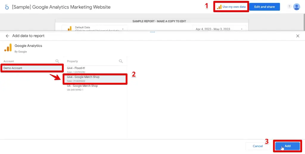
If you like any dashboard template but want to modify it, click Edit and share.

Again, click Add to Report.

Wait a few seconds. Now, we should have a copy of the Acme marketing template dashboard.

Here, you can remove charts, change colors, or implement any modifications.
To access the list of templates, go to lookerstudio.google.com/gallery.

We now have access to the Looker Studio report gallery and can use plenty of dashboards and reports straight from the box or as a jumping point for our dashboards.
Don’t forget to check out the Community section for the templates created by people from the Looker Studio community.

When we create reports for a client, we often make them from scratch since we need to keep their brand identity, like colors and logo designs, in mind. They could also have specific requirements for the data they want to see.
Understanding the Looker Studio Report Editor
Below is what you should see once you have successfully connected to a data source.
Looker Studio will add a chart to your canvas, usually a table.

First, let’s rename our report. Go to the top-left corner and type a name.

To go to the Looker Studio homepage, click the Looker Studio icon beside the report title.
We’ll focus on the menu bar and the toolbar below it.

Looker Studio Basics: Menu Bar Functions
While the menu bar contains a lot of functions, the most important features are also available in the toolbar.
In the Insert tab, we can add various charts to our canvas.

While having all chart types available in a single place is convenient, a better way to insert charts is by using the toolbar.
Next, go to Page → Current Page Settings.

Opening this setting allows you to change settings for a specific page on your report. You can have multiple pages in a single dashboard. We’ll discuss more of this later in the customization section of this tutorial.
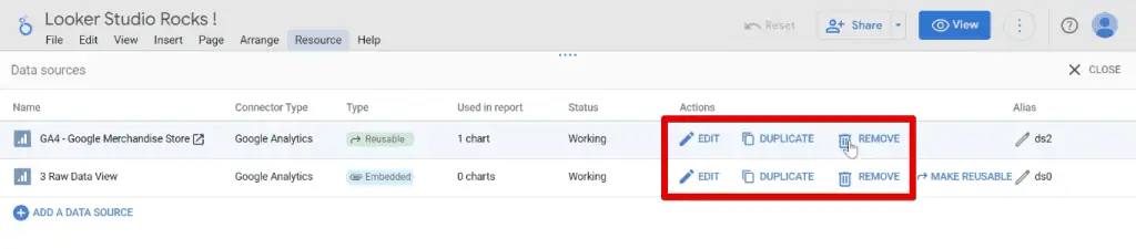
Lastly, we’ll go to the Resource tab. There are many options here, but we’ll focus on Manage Added Data Sources.

Here, you have all the data sources available in the report. You can also add a Data Source.

There are a couple of actions you can do to your data sources. You can either Edit, Duplicate or Remove any of them.
Now, let’s look at the toolbar.
Looker Studio Basics: Toolbar Functions
Starting with the basic features at the left, we have the undo and redo buttons.
Next is the selection mode button that allows you to click, select, and drag an element around the canvas.
Lastly, there is a zoom button to see charts closer or zoom out to the dashboard.

Click the arrow beside the zoom button, then select Default to zoom out and see the default view.

Looker Studio Basics: Pages and Report Navigation
We only have a single page on our report, which is what we are working on with the table chart.
To add a page, click on Add Page.

Now, you’ll see that we have two pages on our report. You can quickly rename a page by double-clicking on it or clicking on the three vertical dots beside the page you want to rename.

Here, we can access multiple page settings like renaming, duplicating, deleting, and hiding it in view mode. We’ll talk about the View mode shortly.

Lastly, you can also change the order of your pages. To reorder your pages, click and drag a page to the desired order.

The view mode lets you preview how your users see and interact with your report.
To access the view mode, click View at the top-right corner.

Here, you’ll find a page navigator at the left pane of the screen.
To return to the report editor, click Edit.

Click Page _ of _ in the toolbar to access the report pages panel.

Next, you can quickly add a new data source by clicking Add Data.

If you want to have a report that has multiple data sources or specific charts showing data from other data sources, you can use this option.
💡 Top Tip: When working with multiple data sources, you can use them separately or combine their data by creating data blends. Learn how to blend data in Looker Studio in our guide.
Next, let’s add charts to our report.
Looker Studio Basics: Charts and Controls
Click Add a Chart for a visual list of chart types we can add to our report.

This method is more convenient than the menu bar since we have icons for the different chart types.
For a quick overview – we have Tables, Scorecards, Time Series for seeing trends over time and seeing patterns, Bar and Pie Charts for understanding the distribution of your data, Maps, Line, Area, Scatter, Pivot Tables, Bullet, Treemap, Sandkey, and Gauge Charts.
Let’s select the Pie Chart.

Click anywhere on the canvas to insert the chart.

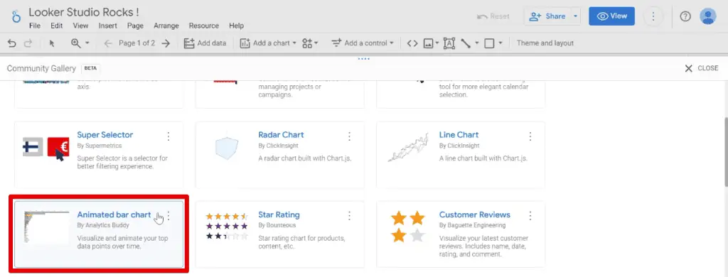
You are not limited to just these chart types for your report. We can import other charts and visualizations made by the community.
Go to Community Visualizations and Components → Explore More.

At the time of this writing, there are 40 Looker Studio visualizations and 39 Partner (Community) visualizations. To see the complete list, go to Looker Studio Visualizations.
💡 Top Tip: Check out the best community visualization charts by reading our guide on the Looker Studio Community Visualizations Best Custom Report Types.
These chart types allow you to enhance your reports. For example, a standard bar chart is one of the official Looker Studio chart types we can use. These bar charts are static.
The Animated Bar Chart visualization allows us to visualize and animate your charts.
The community visualization charts allow you to improve on and unlock new possibilities for your reporting.
Next, let’s add a control by clicking Add a Control. We have different options here. For now, select Drop-down List.

A drop-down list control allows you to filter data on your page by the control field you specify. Think of them as a way to filter components on your charts.
💡 Top Tip: Check out our guide on How to Make Looker Studio Dashboards Interactive to learn more about filter controls, date range filters, and data source controls.
As you insert the control into the canvas, the control field automatically populates with the page title dimension.
Let’s say we’re only interested in the homepage. Click Only beside Home.

Clicking outside our control will apply our filters. Here, you’ll see both the pie chart and table have now been filtered to only homepage data.

Another common control used in most dashboards is the Date Range Control.

Date range controls allow you or your users to select specific dates to inspect.
For example, let’s select data for May 2023. Next, click Apply.

You’ll see the data in our change accordingly.

Next, you can install other components like URL embeds, images, lines, or shapes.
Looker Studio Basics: URL Embed, Images, Lines, and Shapes
Let’s start with embedding a URL to our canvas.
Click Embed URL. Click anywhere in the canvas, then paste your URL in the External Content URL section.

You can also add images to Looker Studio from your computer or the web.
Click the Image icon beside the embed URL icon. Then, select Upload from Computer.

Upload an image, then place it on your canvas. The Insert link button allows you to add a link when users click the image.

Next, we can also add Lines and Shapes to our canvas. We can add an arrow or use an elbow or curved connector for lines. For shapes, we can select between rectangles or circles.
Selecting our shapes opens the Properties panel.

Here, we can edit the background color, opacity, border radius, color, thickness, etc.
Looker Studio Basics: Theme and Layout
Lastly, we’ll look at the Theme and Layout. We’ll remove the shapes and insert a table.
Click Theme and Layout to open the Theme and Layout panel.
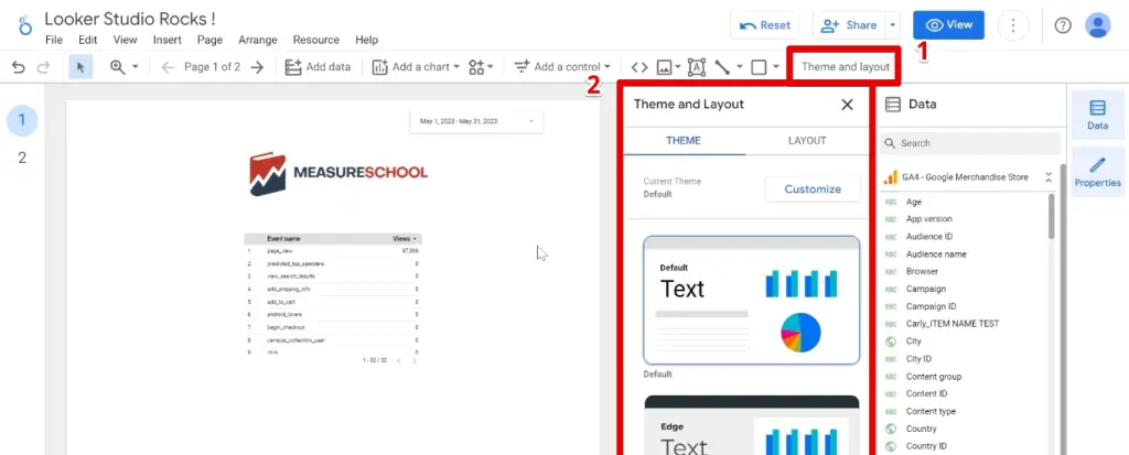
Themes are pre-defined colors and settings that you can change in Looker Studio. Currently, we have the default theme.
If we select the Groovy theme, notice the background and table header color change.

Perfect! We now know how to access Looker Studio, quickly start with templates, and start dashboards and reports from scratch. We also have a good understanding of the report editor.
Looker Studio Connectors
Let’s learn how to link your data to Looker Studio with connectors.
Connectors fetch data from a platform and send them to Looker Studio.

For example, if you have Google Analytics installed on your website and want to visualize this data, you will use the Google Analytics connector.
There are three types of connectors: Google, Partner, and Community Connectors.

Google connectors are free and give access to Google marketing products like Google Sheets, Google Analytics, and Google Ads. Partner connectors are paid and offer additional capabilities.
Examples of well-known partner connectors are from Supermetrics.

Their connectors can help pull and format data correctly for Looker Studio from various sources like Facebook Ads, Twitter Ads, Google Ads, and Google Analytics. These can then be placed in Google Sheets and used as a data source for Looker Studio.
Lastly, community connectors belong to the Looker Studio community program and allow you to access various platforms, including public and private company data.
Summary
Great! These are the Looker Studio basics you need to know to get started. We covered how to access Looker Studio, create a blank report, use a template, and understand the different functions of the Looker Studio report editor.
Ready to take your Looker Studio basics knowledge further? Check out our guide on the Looker Studio Charts: Types and Use Cases.
Which Looker Studio template do you use often? Which Looker Studio connector do you use to connect to your data? Let us know in the comments below!
Subscribe & Master the Basics with our FREE Looker Studio Course


")