
Last Modified on January 4, 2024
What if instead of looking for the data legend, you click on the variable and it shows the value it contains? Well, you can do this using Looker Studio dashboards.
Realizing the variable value in a large data set becomes key to understanding the report.
Using interactive tools from the Looker Studio on reports makes it meaningful, gives access to edit the data, and gives the opportunity to analyze and look at data in a new light.
In this guide, we’ll look at some tools and filters to polish our reports in Looker Studio (ex Google Data Studio).
An overview of what we’ll cover:
- Adding interactive elements to Looker Studio dashboards
- Data Range Filters
- Chart Data Cross Filters
- Filter Controls
- Data Source Controls
Let’s get started!
Adding Interactive Elements to Looker Studio Dashboards
Let’s see how to bring your Data Studio reports live by adding interactive elements and filters.
We have learned how to use different data connectors to connect data into different tools, and how to visualize our data using a diverse range of standard charts and community visualizations.
Now you should be able to create a report on your own.
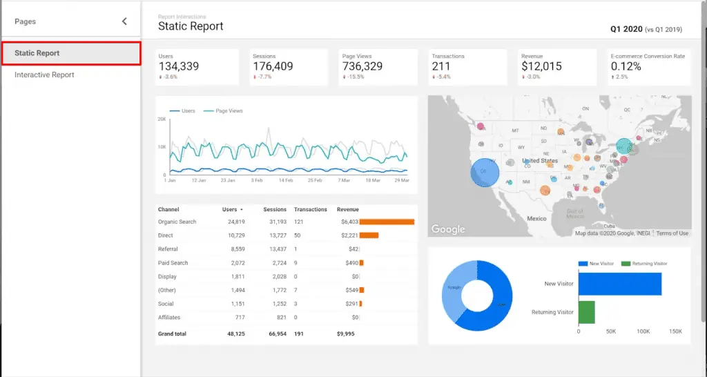
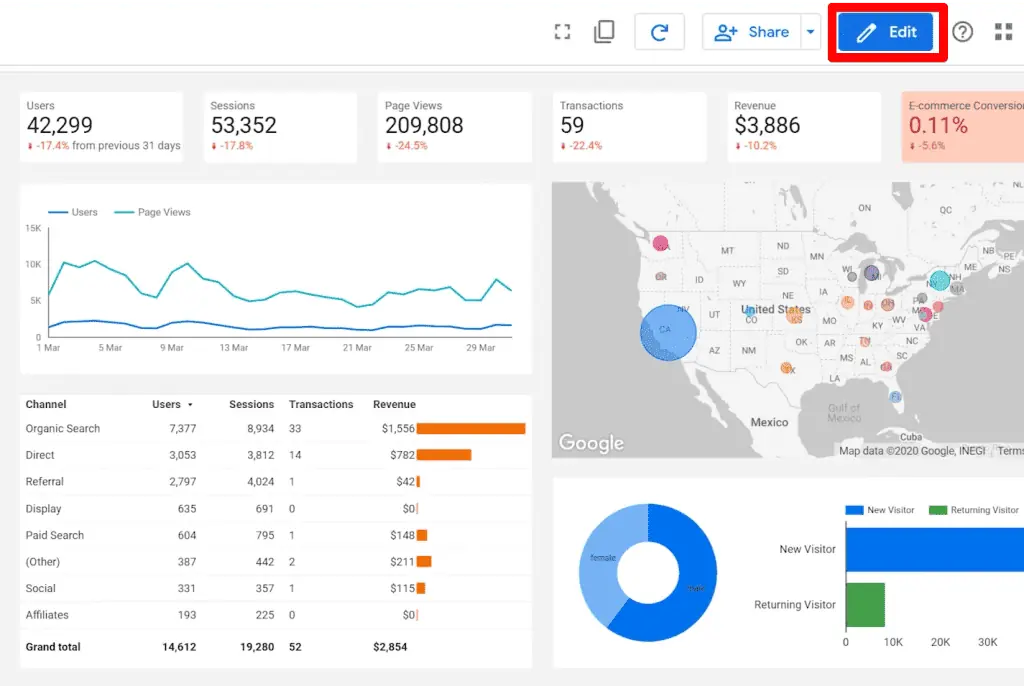
But this report is static and it is not different from a printed piece of paper. The viewer of the report cannot interact with it.
In this lesson, we’ll show you how to add interactive elements to your report to allow the report viewers to change things like the timeframe or apply filters or segments, and how to slice and dice data or analyze it and look at it differently.
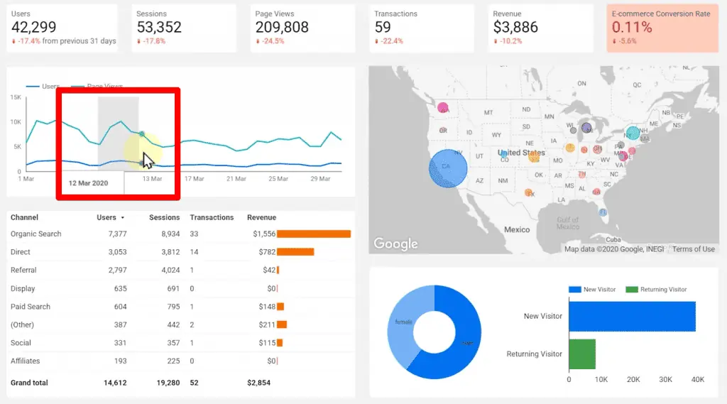
Then, we should be able to create a report where there are some scorecards at the top and a trend line with users and pageviews.
Also, we have a Google map, table, pie chart, and a horizontal bar chart.
But, let’s see what we can do with the report as a business owner after being disappointed with the team, and what they can do with the report.
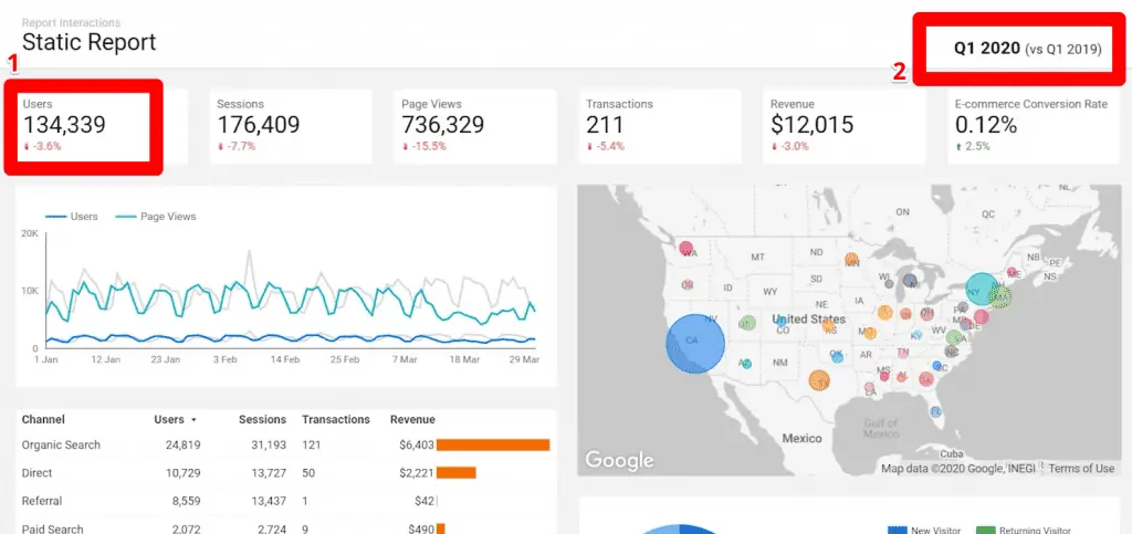
Yes, they can read the numbers and they can see the number of users which is a 2% of the change to the previous period.
If they look at the top, they can figure out that the report is for the first quarter of 2020 and the comparisons are to the first quarter of the previous year.
But besides reading the numbers and knowing for what period it is, what else can they do?
Imagine yourself as the business owner, you see some numbers here, and you want to know more about them.
For example, we can see that we’ve had many users and a large amount of revenue from California and New York.
What if we want to take a deeper look at these segments only? What if you want to see the same data for a male audience or a female audience only?
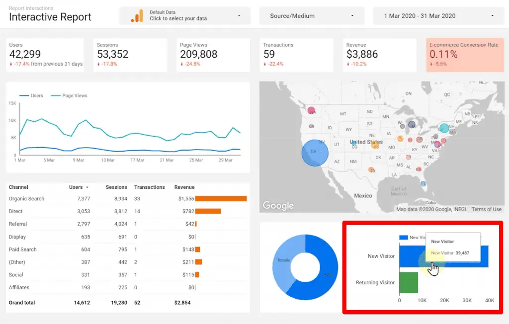
What if we want to compare how new visitors are doing in terms of revenue compared to returning visitors?
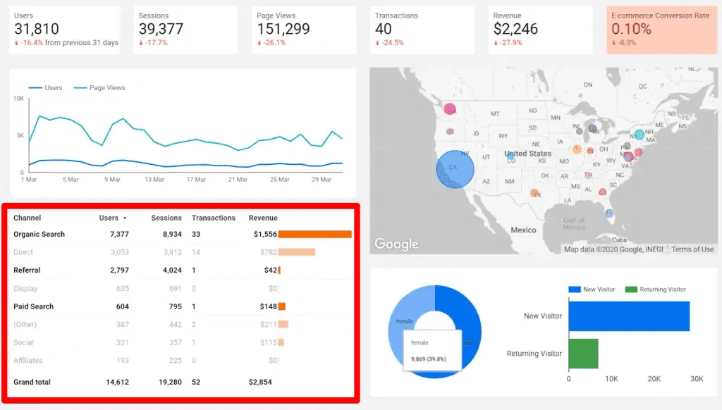
What if we just want to see the performance of paid search or referrals, or organic searches? Even more important, what if we prefer to see the same exact report for another time period?
With this report, we currently cannot do that. But as you might have guessed, there is a solution. It’s called report interactions.
Date Range Filters
Let’s take a look at another version of the same report and see how we can make it interactive.
Our sample report looks exactly the same, but it is capable of transforming itself into many different reports. Let’s see how it is possible.
The user of the report has the ability to change the date range of the report. Here we can see the report for the month of April.
But we can easily change it to take a look at another time period, for example, March.
Something as simple as that will make your clients happier because they don’t have to call you to create the same report for another time period.
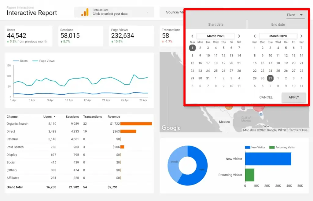
Chart Data Cross Filters
The second way of adding interactivity to your report is by enabling interactive filtration for your charts. We’ll address this later on.
But first, let’s see how it works. We’ve already enabled interactive filtering for all the charts and the report for this map, for this trendline, for this table, the pie chart, and a bar chart.
Let’s start with a map. Let’s filter the whole report to just show data for California. We just need to click on it.
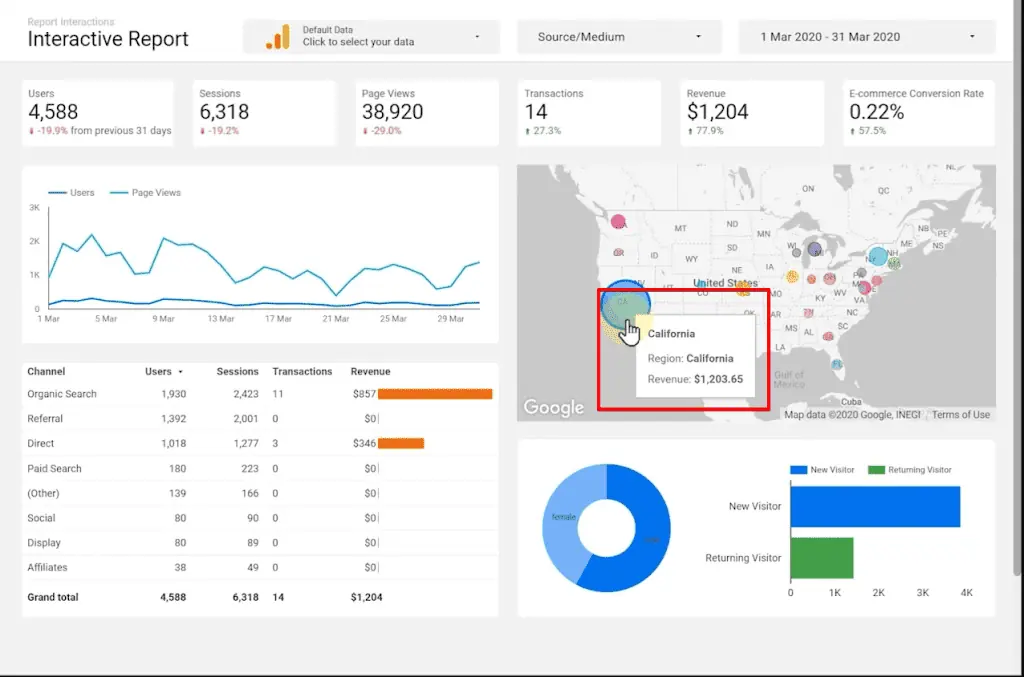
Did you notice the conditional formatting working on the eCommerce conversion rates scorecard? If you want to reset that, you can right-click and click recent action.
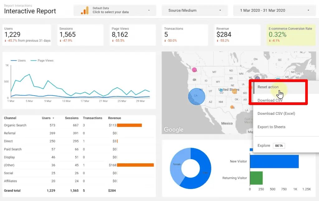
Now the report is back to the default state. How about the pie chart? Let’s just take a look at the segment of a female audience.
They seem to be mainly from D.C. and California. This shows that we cannot expect high conversion rates from this segment.

Let’s click again to reset. How about new visitors? So, click again and reset.
We can also use this table to cross-filter the rest of the reports. For example, let’s click on organic search.
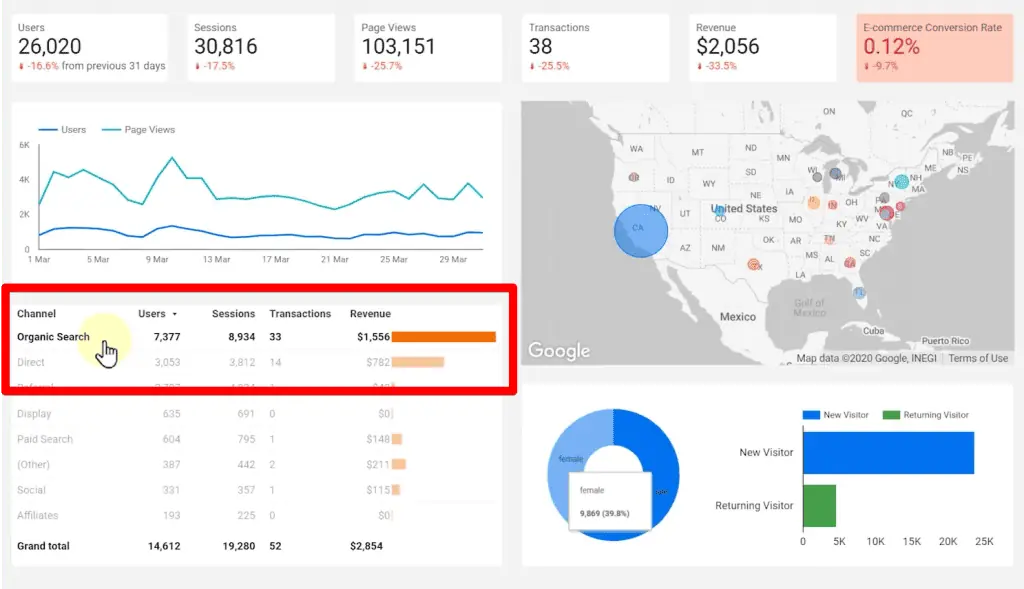
Guess what happens? We can hold down the Ctrl key or Command key and click on another row to add them to a segment.
Again, let’s right-click and recent action. Now, let’s figure out how we can use a trendline to filter the report. Where do we click? On a line, or a date range?
It’s by a process known as brushing. You start clicking on the first date, you hold your mouse button down, and you drag to the right and release.
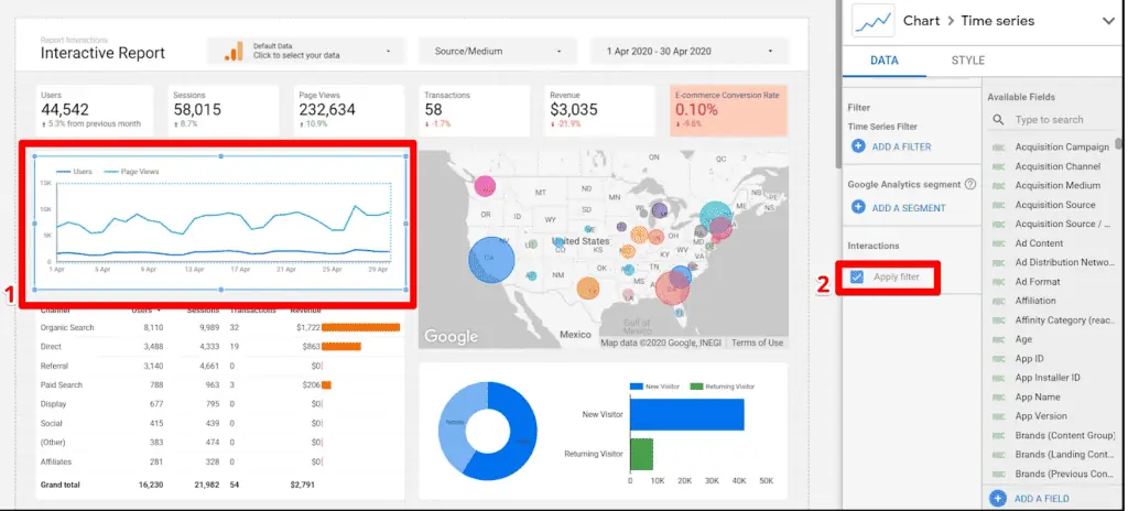
That’s it. Again, revert it back to recent action. Let’s go back to the edit mode, and we’ll show you where the setting is for almost any chart type in Data Studio.
When you click on the chart, at the bottom of the data Properties tab, you see the interactions tab with apply filters.
If you remove it, the users cannot use the chart to cross-reference the report. If you enable it, the users can use that chart to filter the report.
Let’s go back to the view mode and continue the lesson.
So far, we have learned of two ways of adding interactions to our reports using a date range selector and clicking on different charts to cross-filter the rest of the report. However, there are two more items remaining.
Filter Controls
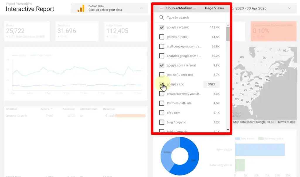
The next method of adding interaction to a report is by using a filter control. This allows the viewer of the report to filter the report by selecting different categories of a dimension.
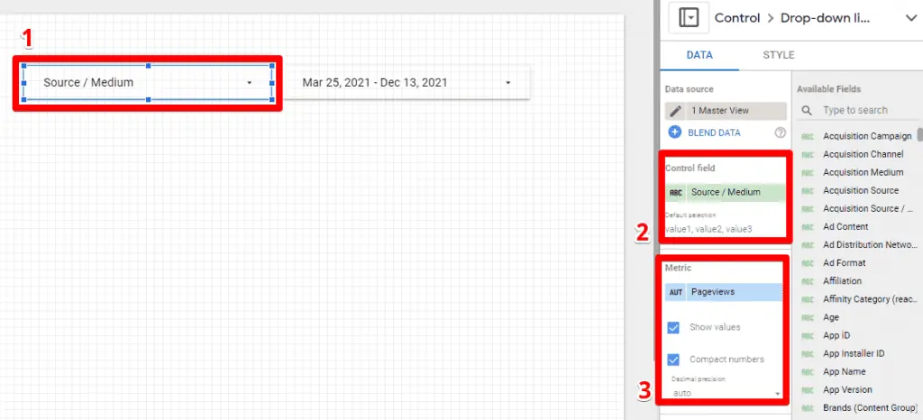
Here we have selected the Source medium as the dimension.
In the drop-down menu, we are seeing all the source medium for GA account ID, dimension, and the category that we’re interested in, or we can search for it.
When we find it, we can click only. When we click only, the report will be filtered to show only the values for that source medium.
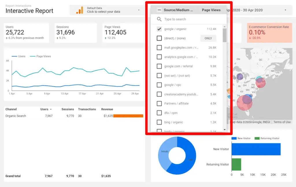
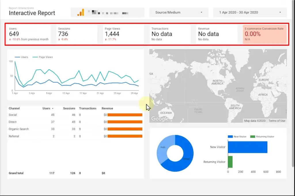
Instead of just using only, another way is to either select them all or deselect them all and then just select some of them. So for this example, let’s check the option of referral, CPC, and organic from Google.
Data Source Controls
Let’s move on to the final interactive element that we can add to a report – Data Control
The Data Control component allows the viewer of the report to change the data source for the report. Imagine that you’re a business owner who owns several eCommerce stores.
You want to see the same report with the same data for each of those stores.

This report is connected to a single Google Analytics account. However, a data control component allows you to change the Google Analytics account that this report is connected to.
Let’s see it in action. If you have access to many accounts, you can of course search for it.
Otherwise, you can just select an account to connect the whole report changes to reflect the new numbers from the new GA account that has been connected to.

As you can see, they have users, have sessions, have pageviews, but there are no transactions, and no revenue – nothing whatsoever.
Either this is not an eCommerce store, or they are not doing a good job, or any job at all.
Let’s quickly see how to add a Date Range Filter, a Filter Control Component, and a Data Control Component.
Let’s pause and reset the date control. Let’s go back to the edit mode and see how it is done.
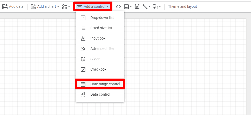
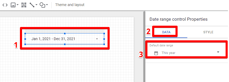
To add a Date Range Control, click on Add a control and Select Date range control from the dropdown menu.
You can place it wherever on the report canvas that you want. Go to the Data tab and set your Default date range.
To add a Filter Control, again click on Add a Control and click on Drop-down list add anywhere on the canvas report.
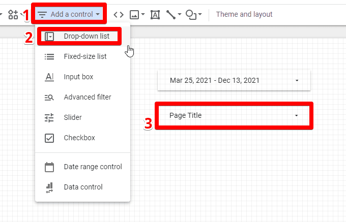
Once added, you can go to the Data Properties tab and edit dimension, some default selections, comma-separated, and optionally a metric.
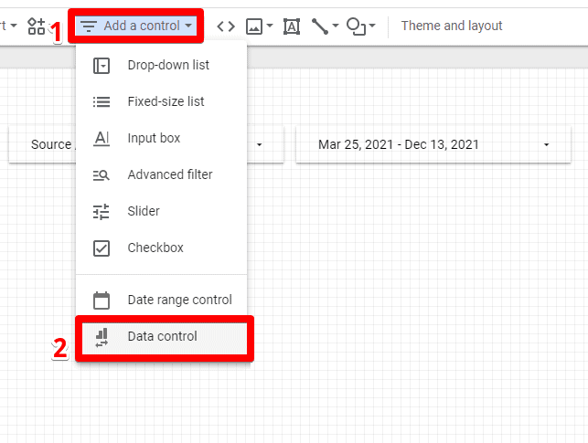
Finally, to add a Data Control Component, you click on this one and add it to the report.
The Data control components work for the Google connectors such as Google Analytics, Google ads, YouTube Analytics, campaign manager, Search Console, etc.

So with these tools, we can create an interactive dashboard on Looker Studio!
🚨 Note: To further improve your dashboards, we recommend checking out these top 3 Looker Studio dashboard enhancements.
FAQ
How can I make my Looker Studio dashboards interactive?
To make your dashboards interactive, you can utilize the following tools and filters:
1. Date Range Filters: Allow users to change the date range of the report, enabling them to view data for specific time periods.
2. Data Cross Filters: Enable interactive filtration for charts, allowing users to click on data points or segments to filter the entire report accordingly.
3. Filter Controls: Add filter controls that allow users to select different categories or dimensions to filter the report based on their preferences.
4. Data Source Controls: Use data control components to change the data source for the report, allowing users to view the same report with different data sources.
How do I use Data Source Controls in Looker Studio?
Data Source Controls enable users to change the data source for the report. To add a Data Source Control Component, click on the component and add it to the report. It works with Google connectors like Google Analytics, Google Ads, YouTube Analytics, etc. Users can select different accounts to update the report with new data.
Can I combine multiple interactive elements in my Looker Studio dashboard?
Yes, you can combine multiple interactive elements like Date Range Filters, Chart Data Cross Filters, Filter Controls, and Data Source Controls in your Looker Studio dashboard to create a highly interactive and customizable reporting experience.
Summary
The interactive dashboard on Looker Studio is one of the coolest tools one can use while creating a report for a large data set.
Applying data filters to data makes the data chiseled and clearer to viewers, enabling a quick understanding of data without worrying about the complexity.
One can look at a section of a large data set to understand and analyze data as per filters such as age, area, gender, etc.
Another useful feature is Looker Studio charts which help you create stunning reports.
Go get creative, and let us know which tool you liked the most!


")