
Last Modified on January 7, 2025
Are you interested in taking your data storytelling to the next level?
Google Looker Studio is the rebranding of Data Studio, a popular data visualization tool. If you’re interested in getting the most out of your Google workspace, then this tool is something you should start exploring.
Along with this rebranding is an update that needs special consideration. This tutorial will cover one of the first things you need to master – funnels.
Follow along as we show you how to create a funnel visualization in Looker Studio so that you better understand your conversion or drop-off rates. We’ll also show you a few additional things you can do with this data visualization tool.
Here is an overview of what we’ll cover:
Let’s dive into the world of funnel data visualization!
Community Visualization Charts
Whether you have an eCommerce shop or you sell services, your customers go through multiple stages before buying something from you.
Depending on how you want to improve your customer experience, you might choose to monitor stages, journey step levels, website pages, and so on. The funnel options to focus on are endless, but the most commonly used ones are the marketing or sales funnels.
In this tutorial, we’ll assume that you have an eCommerce store and have already implemented Google Analytics 4 on your website.
Our goal is to visualize how many users are flowing through the different stages of the funnel and what is the conversion rate for the final transaction number. In an eCommerce store, this rate is from a product view to a transaction.
Currently, there isn’t a built-in, ready-to-use funnel visualization in Looker Studio. So, the first way we can visualize funnels is through community visualization charts.
If we go to the visualization library and search for a funnel, we’ll see that there are two charts available.

For this tutorial, we’ll only cover one of these two, the one from Ayima, along with another one that is not visible here. Let’s start with the free community visualization from Ayima.
In your Looker Studio account, go to the edit mode. On the menu bar, click on the Community visualizations and components icon → Explore more.

Scroll down and select the Funnel Chart by Ayima.

You can click and drag it anywhere on the dashboard. For the chart configuration, we want to see how users went from viewing our products, adding them to the cart, then buying them.
Click on the chart. On the setup menu to the right, add the following metrics in order: Item views, Add-to-carts, and Transactions.

When creating a funnel visualization in Looker Studio, you should add the metrics of interest to the chart in a high to low order. In other words, it should be arranged in a manner that captures a customer’s journey through your store.
Logically, the first step is for people to look at a product before adding it to the cart, then purchasing it. Reversing the order will not only make the funnel look unnatural but also incorrectly reflects the flow of the user through the website.
For example, if we switch the Add-to-carts and Item views metrics, you’ll see that the chart will not resemble a funnel because the step with the highest number is in the middle.

Therefore, make sure to add your metrics in the correct order.
We’ve successfully defined the metrics, but these numbers won’t tell us much. So, we’ll go to the Style tab → Computed Values section.

Of course, you can customize your preferred colors, fonts, and backgrounds in this tab to style your chart, but we’ll focus more on the computed values section.
What are the settings in the computed values section, and what are their functions if we enable them? These two aspects will show your conversion rates from one step to the other.
We have the percentage versus the previous and the percentage versus the initial. Enable both options and notice that additional columns have been added to the chart.

The difference in the two percentages is self-explanatory. The value in the bottom-right corner will always tell you the conversion rate from the first step to the last.
In our case, the 1.71% conversion rate is from the product views to the transactions.

Great! We have successfully created a funnel visualization in Looker Studio.
However, this only covers the three predefined GA4 events. What if you want to monitor more events? Is there another option?
Funnel Chart with Drop-off Rate
Luckily, there is another free community visualization from TrueMetrics.

This one is not available in the official visualization library at the time of this writing.
So, how can you add it to your dashboard?
This can be done in a similar way to how we added the previous funnel visualization in Looker Studio. You go to the community visualizations and components and click on explore more.
Once here, you click on Build your visualization.

Since we’re not developers, we’re not going to start building our charts. Fortunately, some people have been generous to share their work. All we need to do to use them is by specifying the manifest path.
Go to the How to Build a Funnel in Data Studio article by TrueMetrics. Scroll to the bottom of the page and copy the manifest path for the FunnelGraph.

Go back to Looker Studio and paste this in the Manifest path section, then click Submit.

You should then be able to select the FunnelGraph Visualization by TrueMetrics and place it on your dashboard.

To build our funnel visualization in Looker Studio, we’ll add the Event name dimension in the Parameters section, and the Total users in the Metrics section.

We could also select the event count for the metrics presented, but we’ll select total users because we believe it is more useful to look at it this way.
Keep in mind that sorting matters for this chart. For example, if we sort by Event name, it wouldn’t be too much of a funnel.

Therefore, whenever you make a funnel visualization in Looker Studio, make sure that you sort by the same metric you used in the metrics section, arranged in descending order.
This leads us to the following graph:

Now, we could stop here, but we have an excessive amount of events in the funnel that doesn’t tell much of a story. It doesn’t help us understand how many users navigate our website and how they do this.
What we can do is filter the events by the main events that we want to see. For our example, we’ll filter the graph down to five main events.
Go to the Filters section and click on Add a Filter.

Here, we’ll select the Main 5 Events filter that contains our main 5 events.

To build this filter, we need to utilize regular expressions or RegEx. Don’t be intimidated as the concept is much simpler than you may think.
Now, we’ll set our filter to only include events with an Event name that are matching with the following regular expression:
view_item|add_to_cart|add_shipping_info|add_payment_info|purchase
If we inspect our RegEx, you’ll notice that we listed the event names of our 5 main events separated by the vertical bar | symbol. In regular expressions, this means an “or” condition.
This enables our filter to only show events with an event name that matches either one of the 5 event names we have listed in our regular expression.
Once applied, you’ll see that we have a much clearer and cleaner presentation of the events. Currently, the events shown will be in an unfriendly format with the event names having an underscore in between each word.

If you want an even cleaner look, we can go and create a new calculated field to change the default event names.
Click on the event name dimension, then click on Create Field.

For this example, we’ll be utilizing the Case statement to build our calculated field. Specifically, we’ll use the following code:
CASE
WHEN REGEXP_MATCH(Event name, "view_item") THEN "Product View"
WHEN REGEXP_MATCH(Event name, "add_to_cart") THEN "Add to Cart"
WHEN REGEXP_MATCH(Event name, "add_shipping_info") THEN "Shipping Info"
WHEN REGEXP_MATCH(Event name, "add_payment_info") THEN "Payment Info"
WHEN REGEXP_MATCH(Event name, "purchase") THEN "Transaction"
END
If we analyze our code, we first start with a WHEN expression to specify the condition to apply our function. Next, the REGEXP_MATCH() function looks for events that match the event names of our top 5 events.
Finally, the THEN expression specifies what will happen after the starting condition is met. To put it simply, we just renamed the event names to a more presentable and user-friendly format.
Paste this code to the Formula section, then click Apply.

Now, you’ll see that the event names are more intuitive for viewers of this dashboard.

Other additional chart settings for this funnel visualization in Looker Studio can be seen in the Style tab. Here, we can change the direction of the funnel, the gradient direction, etc.

You have the option to edit your colors and fonts, and an important feature that you don’t want to miss is the sub-label option.
If we enable the Display sub-label option, we’ll see the drop-off rates.

The default parameter shown is the drop-off rate, but we could overwrite this in the overwrite sub-label section. However, the parameters format is not yet available publicly, so we don’t have other ones like conversion rates, for example.
Note that this is the drop-off that happens at each step level. For example, if we look at the Add to Cart step, around 70% of users did not move forward after viewing a product.

Therefore, we recommend that you add tooltip annotations to this type of funnel visualization in Looker Studio that will explain this information to your users.
For example, if we hover over the 🛈 symbol, a tooltip appears where we tell this information to the people that use the dashboard, whether that be your client or stakeholders.

It is important to relay this information so that users are aware that the drop-off rate refers to the drop-offs happening at that specific step and not relative to the previous or initial step, compared to what we’ve seen with the Ayima funnel visualization in Looker Studio.
If we want to calculate either the conversion or drop-off rates from one step to the other, you will need to create data blends between the steps that you’re interested in.
For example, let’s look at the data blend we made to calculate the conversion rate from product view to add to cart. Click on the scorecard visualization, and then the edit button beside the data blend in the data source section.

Here, we have joined the add-to-cart metric in one table to the item view in the other table.

We have also filtered the tables to only have events that correspond to their event names.

In our case, we have around a 22% conversion rate from item view to add to cart, corresponding to a 78% drop rate.

However, what should we do if we have multiple steps in our funnel? Is there a way that does not involve creating multiple data blends?
Looker Studio Regular Table Chart
Using a regular table chart is a great alternative for creating a funnel visualization in Looker Studio.
It is a much simpler setup that avoids multiple data blends. This means faster loading time for your dashboard, reaching quotas, and so on.
🚨 Note: This method of creating a funnel visualization in Looker Studio is created by Mehdi. Check out his original How to Create a Funnel Report with a Single Google Data Studio Table Chart article.
This method will require a couple of calculated fields and one simple data blend.
First, we’ll select our chart, then click on Add a field in our GA4 Sample Data source.

For this calculated field, we’ll be utilizing a similar formula to the one we used for the main 5 events filter. Instead of renaming the event names, we’ll assign a value of one to five for the first to the last step in the funnel.
CASE
WHEN REGEXP_MATCH(Event name,"view_item") THEN 1
WHEN REGEXP_MATCH(Event name,"add_to_cart") THEN 2
WHEN REGEXP_MATCH(Event name,"add_shipping_info") THEN 3
WHEN REGEXP_MATCH(Event name,"add_payment_info") THEN 4
WHEN REGEXP_MATCH(Event name,"purchase") THEN 5
END
We’ll name this field “Funnel step [CF]”, then paste the code in the space provided for the formula.

Next, let’s look at how we should configure our data blend.
First, our two tables will be from the same data source. In our case, it’s the GA4 Sample Data. Next, the dimensions and metrics are mostly similar.
For the first table, let’s look at the Individual Funnel step [CF] dimension and see how it is different from the calculated field we made earlier.

This dimension is the same calculated field we made earlier. We just renamed this one in the first column so that it’s easier to know which is which in a formula we’ll use later.

Next, the Total users by step metric is a similar case where we essentially have the same metric as the one in the second table, but we’ve renamed it for the same reason.

To recap, we have the funnel step dimension and total users metric in both tables, along with the event name dimension in the first table.
We’ve then renamed our duplicate fields in the first table to make it easier to distinguish one from the other.
Finally, don’t forget to apply the Main 5 Events filter to both tables, and use the Cross join operator for joining the two tables.

To build our table funnel visualization in Looker Studio, we’ll use the Event name for the dimension, and for the metrics, we’ll use the following: Total users, CvR % vs. Initial step, and Dropoff % vs. previous step.
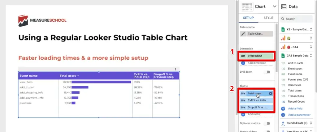
Let’s look at each metric one by one. The total users are the same metric we have used in previous funnel visualizations in Looker Studio. Simply drag this metric from the data blend to the chart.
Next, we’ll look at the conversion rate percentage vs the initial step metric. Its source field is the Total users by step metric.
Then, for the comparison calculation, we’ve set it to Percentage of max, Relative to corresponding data.

The third metric is the drop-off percentage versus the previous step. For this one, we used the following formula:
IF(Funnel step [CF] = Individual Funnel step [CF] - 1, (Total users by step - Total users)/Total users,null)Now that we’ve set up the dimensions and metrics for our table, the last thing to do is to edit the style so that we have the bars indicative of a typical funnel visualization in Looker Studio.
First, ensure that the chart type is a table with bars.
Next, go to the Style tab. In the Metrics section, select Bar/Pub for the first column which is the total users metric. Finally, enable the Show number option.
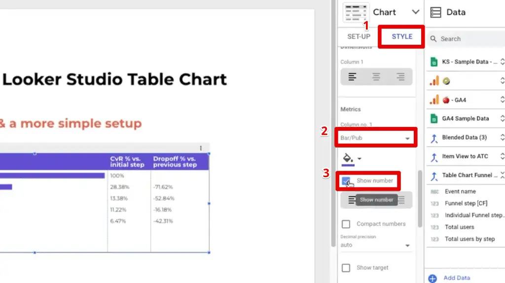
Next, our remaining two columns can remain as Numbers.

Finally, the last style setting we need to change is for the missing data. By default, if there is missing data, the table chart will show null.
To change this, set the missing data to Show “ ” (blank). A dash is also fine.

So, that’s how you use a table as an alternative to creating a funnel visualization in Looker Studio.
FAQ
How can I add a community visualization to my Looker Studio dashboard?
To add a community visualization to your Looker Studio dashboard, follow these steps:
1. Access the community visualizations and components section in Looker Studio.
2. Click on “Explore more” to access the visualization library.
3. Either choose a visualization from the library or specify a manifest path for the custom visualization you want to add.
4. If specifying a manifest path, obtain it from the developer’s documentation or website and paste it in the Manifest path section in Looker Studio.
5. Submit the manifest path to add the visualization to your available options.
6. Select the visualization and place it on your dashboard, configuring the necessary dimensions and metrics for your data.
Are there any community visualizations specifically designed for funnel analysis in Looker Studio?
Yes, Looker Studio offers community visualizations specifically designed for funnel analysis. Two popular options are the funnel chart by Ayima and the FunnelGraph visualization by TrueMetrics. These visualizations provide intuitive ways to visualize and monitor conversion rates and drop-off rates at different stages of a funnel.
Can I create a funnel visualization using a regular table chart in Looker Studio?
Yes, you can create a funnel visualization using a regular table chart in Looker Studio. While community visualizations offer dedicated funnel charts, using a regular table chart provides an alternative method.
Summary
Great! We’ve looked at how we can make a total of three types of funnel charts in Looker Studio.
Since there is currently no built-in funnel visualization in Looker Studio, we looked at how to use one from the community visualizations.
Next, we looked at how to import a custom visualization by using the manifest path.
Lastly, we used a simpler table setup to avoid making multiple data blends for calculating the drop-off and conversion rates between each funnel step.
Looking for ways to improve your dashboards? Check out our top 3 Looker Studio dashboard enhancements to get you started!
What funnels will you make in your dashboards? Which funnel type did you like the most? Let us know in the comments below!


")
The Ayima tool is not in Looker Studio any more.