
Do you want to create de-cluttered yet data-rich dashboards?

Subscribe & Master the Basics with our FREE Looker Studio Course
Adding tooltip annotations is a great way to add extra information to your Looker Studio reports!
Tooltip annotations provide direction and context to viewers and make the dashboards interactive.
In this guide, we will see how to add tooltip annotations to our charts, graphs, or reports in Looker Studio (ex Google Data Studio).
Here’s an overview of what we’ll cover:
- Why you need tooltip annotations on your Looker Studio dashboard
- Adding the tooltip component to your Looker Studio
- Configuring your tooltip component
- Adding a conditional popup
- Adding a full overlay effect in the popup component
- Using HTML to create a standard tooltip
Let’s begin.
Why You Need Tooltip Annotations on Your Looker Studio Dashboard
Tooltips are a user interface element that pops up when you hover over a component on the screen. They display additional information for the component, and they’re a great way to create meaningful yet decluttered data visualizations.
Tooltips can be used to display the definition or formula of a metric or show details about an actionable icon.
Let’s say that we have a table that shows the conversion rates for website landing pages.
This information is useful if we know what it means, but it can be kind of difficult to make sense of without any context.
This is where the tooltip annotation comes in! Check out this yellow “Attention” icon:

When you hover over this icon, it can provide additional information about the table.

Another sign that is used often is the Help sign.
Again, when you hover over it, it will pop up with some text in it.

This is known as the component. And this Tooltip/Popup component has two parts.
First is the knob or the icon, which is visible all the time. The second part is the popup that only gets visible when we hover over the icon on the knob section.
This helps us to save space on the report page and only present the information when the viewer wants to see that information.
Adding the Tooltip/Popup Component to Your Looker Studio
To add tooltip annotations to your own dashboard, start by entering Edit mode in Looker Studio.
Next, go to Community Visualizations → Explore more → Build your own visualisation.
Since the tooltip component is not yet available publicly through Looker Studio, we’ll need a different approach.
Let’s go to Test and add your community visualisation section and enter the following Manifest path from Siavak:
gs://siavak-visualizations/popup 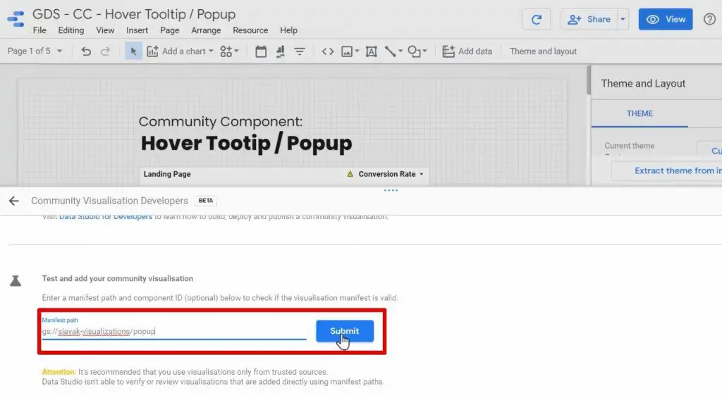
At the end, click on the Submit button.
This gives you access to Siavak’s popup component. It gives you the freedom to place the popup anywhere on your report.
Once you add your component, you will need to assign a Data source and a Metric to the component. We’ll cover more on that later in this guide!
For now, we need to edit the Data source and make sure that the Community visualizations access is set to On.
Otherwise, the component will not work and will show an error message.

Configuring the Tooltip/Popup Component
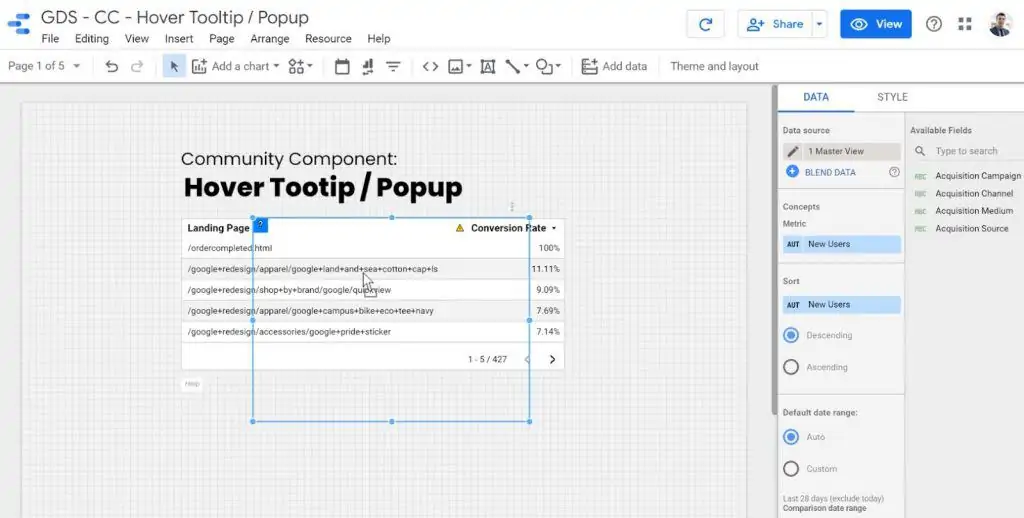
We will take our earlier example of a table for landing page conversions. Let us say we want to define the term “landing page” for people who don’t know what it is.
Firstly, we will place it near the Landing Page heading and resize it as per our requirements.
For this, we would want to access all the settings and configurations of the tooltip component.
So, let’s go to the Style tab.
Component Visibility Setting
The first checkbox that we see here is Always Visible.
We will always keep this checked. It makes designing easier and we can see how the components look and feel in real-time as we go through the configurations.

Chart Header Visibility
Let’s say we want to remove the menu on top of the component.
To do that, we’ll go to the Chart Header option and select Do not show.

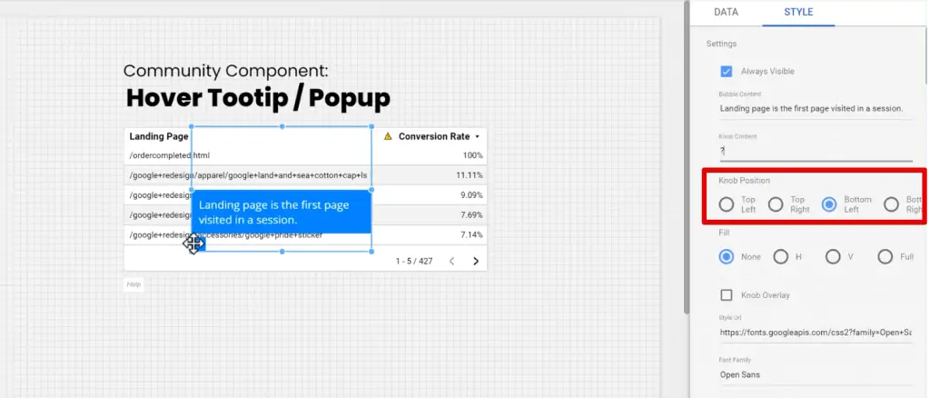
Bubble Content
The next option is the most crucial part of the popup component: the Bubble Content!

In our case, the Bubble Content is the definition of the Landing Page that we want to put.
So let’s add the definition for Bubble Content.

Knob Configuration
Next comes the visual part of the component, the icon that is displayed. This icon is called the Knob Content.

A question mark seems appropriate here. But you can also put an emoticon, exclamation mark, or even add some text.
And if you think the text is too long, you can put an i for information.
The next configuration lets you decide the position of the knob.
You can place the knob on the Top Left, Top Right, Bottom Left and Bottom Right of your tooltip box.
The next setting is Fill. This determines how the background of your popup is filled. You can fill the popup dynamically according to either the horizontal or vertical space filled by the text. Alternatively, you could also choose to fill the whole box or leave it entirely empty.
We can also check the Knob Overlay option to overlay the knob.

Font Customization
Then comes the font customization of the component.
We can adjust the style, size, and family for the font, just like with the Google font components.

Color Customization
Similarly, you have full access over the colors of the component!
You can change the Text Color, Background Color, Knob Color and Knob Background Color.
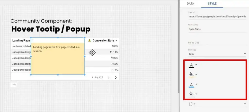
And finally, we can apply a border radius to the popup section just to make the corners a bit rounded.
That’s it! We’re done with the customization of the component.
When you’ve finished customizing your tooltip popup, you can go back and uncheck the Always Visible option.

Now, only the question mark will be visible unless you hover your mouse over it.

💡Top Tip: You can stylize the bubble content text using HTML tags.
Adding a Conditional Popup
Conditional popups appear dynamically based on the values of your metrics. With these popups, you can tell at a glance if you’re achieving your goals.
You can use conditional popups to indicate whether or not you’ve hit your target across different dimensions.
In this example, my tooltip displays a green checkmark knob when the value of my metric has surpassed a certain amount.

You can also set opposing tooltips that demonstrate when your metrics are below target.
In this example, both the knob and the bubble content are different when my metric is below a certain value.

You can set up several levels with different tooltip popups as you need to make your dashboard dynamic and informative.
Here, I use one more popup to let me know if a metric is dangerously low and needs immediate attention.

So how do you set up conditional popups?
First, go into Edit mode.
We’ll leave the Bubble Content and Knob Content with the default values. Instead, this time we will focus on the Range setting and enable Range 1. (You can set up to five ranges.)
Under the metric that you’d like to have conditional popups, set up ranges according to Minimum and Maximum values. These are the ranges under which your conditional popups will appear..

From here, you can configure the component’s bubble content, knob, and style just like earlier.

And that’s all there is to it! Conditional popups are a really simple way to make your dashboards come to life with data.
🚨 Note: To further improve your dashboards, check out our top 3 Looker Studio dashboard enhancements.
Adding a Full Overlay Effect in the Popup Component
A full overlay effect is when the pop-up completely covers the entire group of components below and displays the bubble content to the user. It is one of the best ways to display more information in a small space, and is thus clean and effective.
Coming back to our example, we have an i at the top corner which is the Knob Content. If we hover on it, it pops up a tooltip with a full overlay effect.

It’s a really nice effect, isn’t it? But there’s a small problem with it.
To create this, you’ll need to resize it to exactly the same dimensions as the group of components. And that can sometimes be really time-consuming.
This full overlay also disrupts the viewer’s ability to interact with the charts below that.
But what if you don’t really care about the fancy aesthetic? If you want a properly functioning tooltip without compromising your report’s features, then I have a workaround for you.
Using HTML to Create a Standard Tooltip
The creative solution is to put HTML under the tooltip. This creates a standard tooltip that doesn’t cover anything below it except for the area that is used to show the icon.
If you hover on the icon, you can see a standard browser-based tooltip.

Bear in mind, this also has its own limitations.
For example, we don’t have any control over the font size or colors or the background colors or any of the aesthetics. But we can show as much information as we want without worrying about spacing since it doesn’t cover anything below.
To set up a standard tooltip with HTML, go into Edit mode.
Then, use some nifty HTML and a link tag with an empty href.
It won’t be linked to any web page, but it uses the title attribute to actually place the text for the tooltip inside of it. And for the knob content, we can either put a text or an emoticon just like we did before.

And that’s how you create a standard tooltip!
Summary
So that’s it!
You can use the tooltip component to show information on a chart without making a report cluttered and busy-looking. It’s a great tool to show information only when the user actually wants to know about it.
You can also set up conditional tooltips that behave dynamically. Lastly, you can use HTML to create a tooltip that doesn’t cover any components below it.
If you really want to improve your knowledge of GDS, I’d recommend learning more about the functions for calculated fields in Looker Studio.
How do you de-clutter your dashboards? Do you use any other tools for visual presentations of your tooltips? Let us know in the comments below!
FAQ
Subscribe & Master the Basics with our FREE Looker Studio Course