
Last Modified on January 20, 2025
Want to convert your data into a format that allows you to gain informative, easy-to-read, and easy-to-share insights on your business?
Google Looker Studio, formerly Google Data Studio, is a data visualization platform that allows you to connect, visualize, and share your data story.

Subscribe & Master the Basics with our FREE Looker Studio Course
It lets you effortlessly bring in and combine sets of data from various places into a single location.
Unlock the power of your data by creating interactive dashboards and compelling reports to drive smarter business decisions.
Turn your analytics data into easy-to-understand reports for free with Looker Studio.
In this Google Looker Studio tutorial, we’ll show you how to create a dashboard that visualizes traffic data.
We’ll cover the basics, which include connecting to your data and creating charts from Looker Studio’s arsenal.
We’ll also look at tips that will help you get started to become a pro-Looker Studio user.
Here is an overview of what we’ll cover in this Google Looker Studio tutorial:
- Getting Started with Google Looker Studio
- Adding Charts to a Dashboard
- Adding Scorecards to a Google Looker Studio Dashboard
- How to View the Number of Website Visitors
- How to See the Most Popular Content on a Website
- Adding Data Control to Google Looker Studio
- Dashboards with Actionable Insights
Let’s get started!
Getting Started with Google Looker Studio
For this Google Looker Studio tutorial, we’ll be working towards recreating the following dashboard:
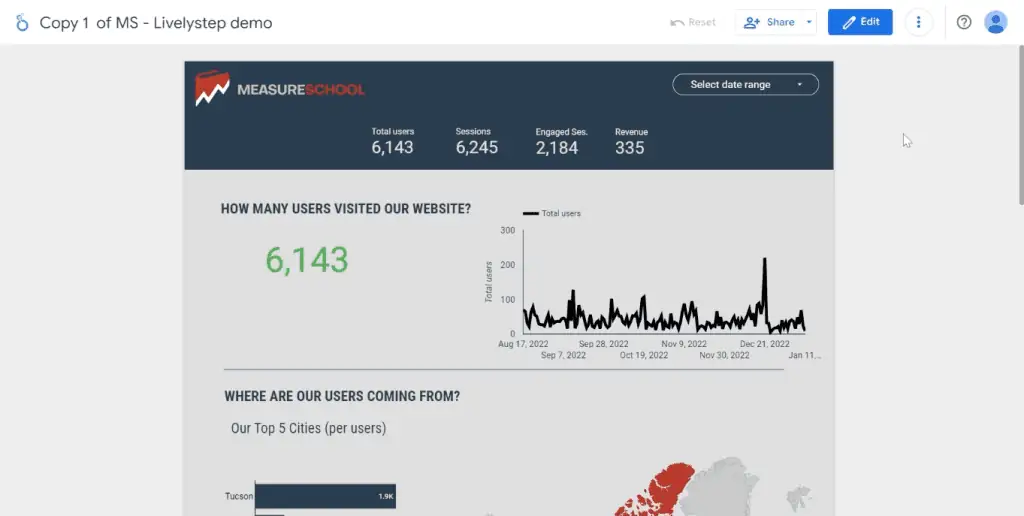
This dashboard is a simplified version of the following dashboard which we’ll discuss in more detail later on.
Don’t worry if you don’t have a website because everything we’ll cover will apply to any kind of data you have.
To start, log in to your Gmail account and head to lookerstudio.google.com. In Looker Studio, there are multiple ways to start building a dashboard.
The first method is to start with a template from the Template Gallery.
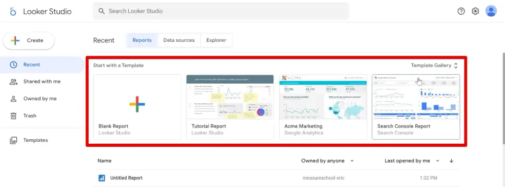
We’ll be creating a dashboard from scratch in this Google Looker Studio tutorial, so we’ll select Create → Report.

Alternatively, you could also select Blank Report with the + sign thumbnail from the list of templates in the Template Gallery.

From here, we’ll send our data to Looker Studio with the help of Connectors. You can pull data from 1000+ data sets with the use of over 730 connectors available (as of the time of this article).
💡 Top Tip: See the list of all available connections by going to the Looker Studio Connector Gallery.
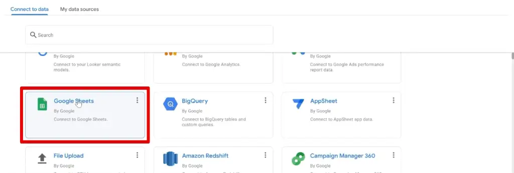
In our window, we can easily see the list of connectors starting with the Google Connectors at the top, followed by the Partner Connectors.
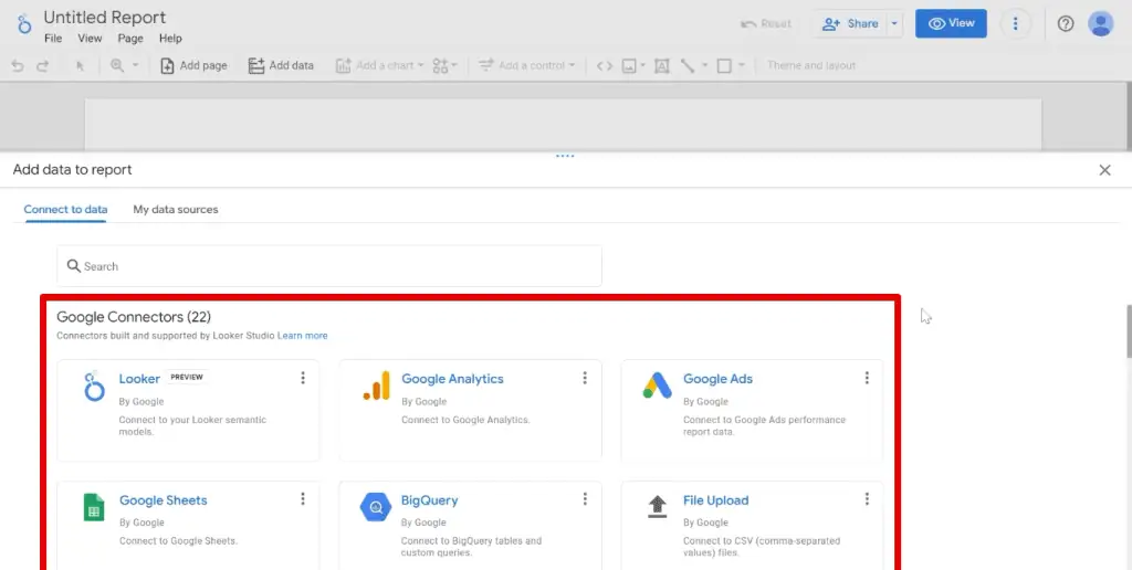
Here you can connect to various other tools in Google’s platform, like Google Analytics, Google Ads, Google Sheets, BigQuery, and more.
For this Google Looker Studio tutorial, our data is in Google Sheets, so we’ll use the Google Sheets connector.
🚨 Note: If you would like to follow along with our Google Looker Studio tutorial, you can go ahead and copy our dataset to verify if you’re doing the steps correctly.
Next, select the spreadsheet and worksheet you’re data is in, then click Add.

Finally, click on Add to Report.
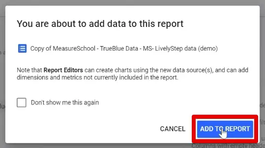
Great! We have successfully added our data to Looker Studio.
From here, we’ll see a default table which is Looker Studio’s way of showing you that it has pulled data from your data source successfully.
We’ll not be using this, so we’ll right-click on the table and click Delete.

You could also select the table and click on the delete key on your keyboard.
Now, let’s explore the interface a bit.
Adding Charts to a Dashboard
When building a dashboard, we’ll utilize various visualization types that Looker Studio collectively calls charts.
To see all available charts, click on Add to chart.
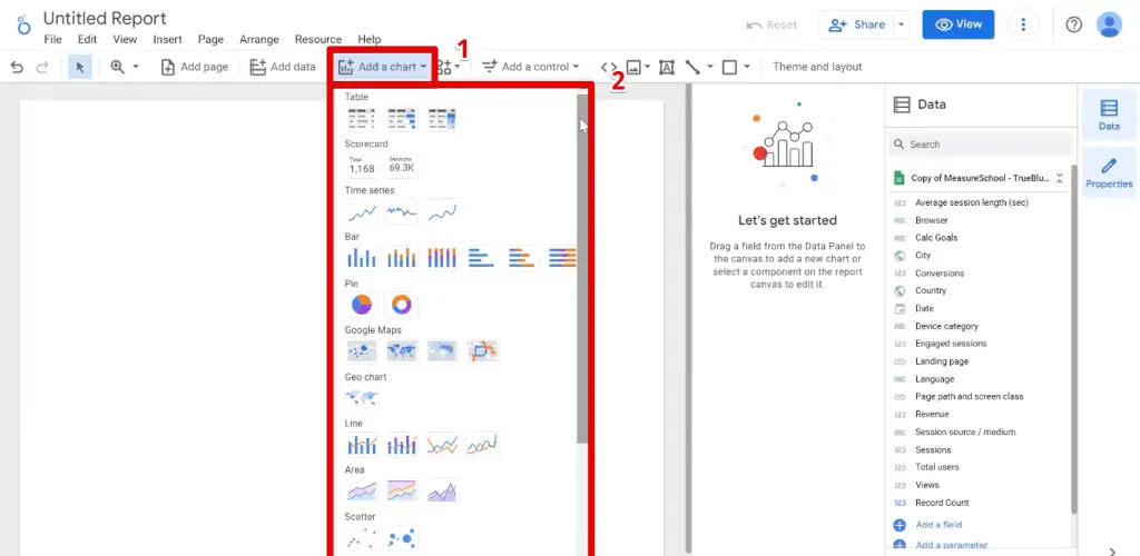
Here, we have all the common types like Tables, Scorecards, Time series, Bar charts, Pie charts, Geo charts, and more.
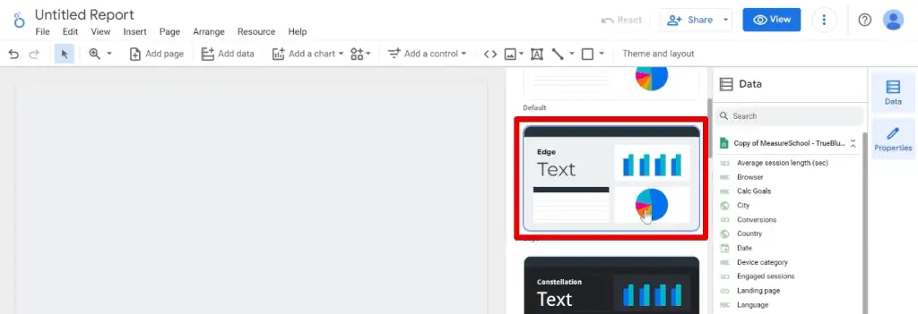
Next, let’s change how our dashboard looks by opening the Theme and Layout pane.
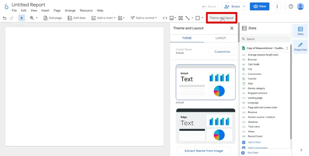
Going to the Themes tab, we are presented with a list of themes that offer different default colors for your background, text, and charts.
For example, if we select the Constellation theme, you’ll see the background change to a dark gray.

For this Google Looker Studio tutorial, we’ll use the Edge theme.
Next, we’ll increase the size of our dashboard so that we have more space to play with our data.
Go to the Layout tab. Under the canvas size section, change the height to 1500px, then click ✖ to close the Theme and Layout pane.

Now, let’s look at how to build and modify a chart.
Start with creating a Table.

After selecting the table icon from the charts list, you can click on the canvas to insert the table, or click and drag your mouse to specify how big you want your table to be.
Next, pay attention to the two columns on the right side of the screen.
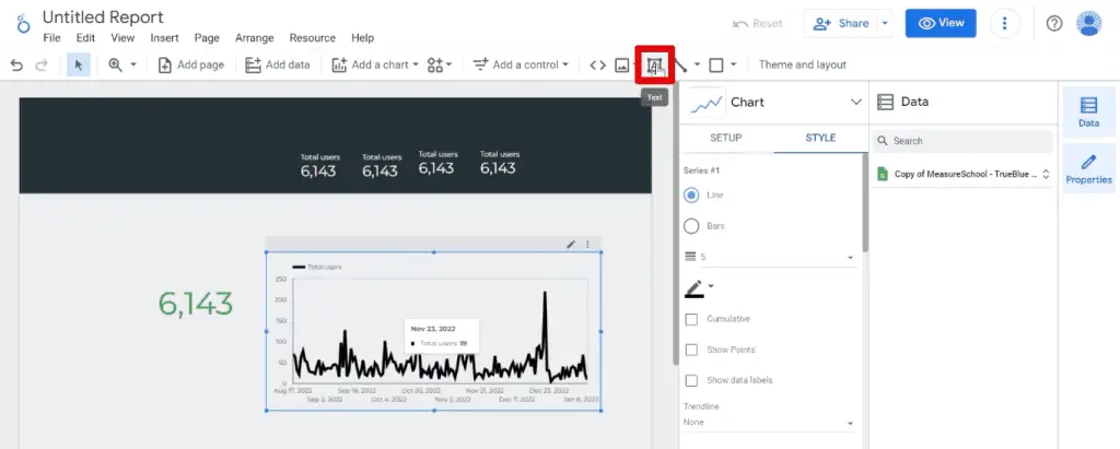
Let’s start with discussing the properties panel. Since we currently selected a table, you’ll see that we have the Chart as the title.
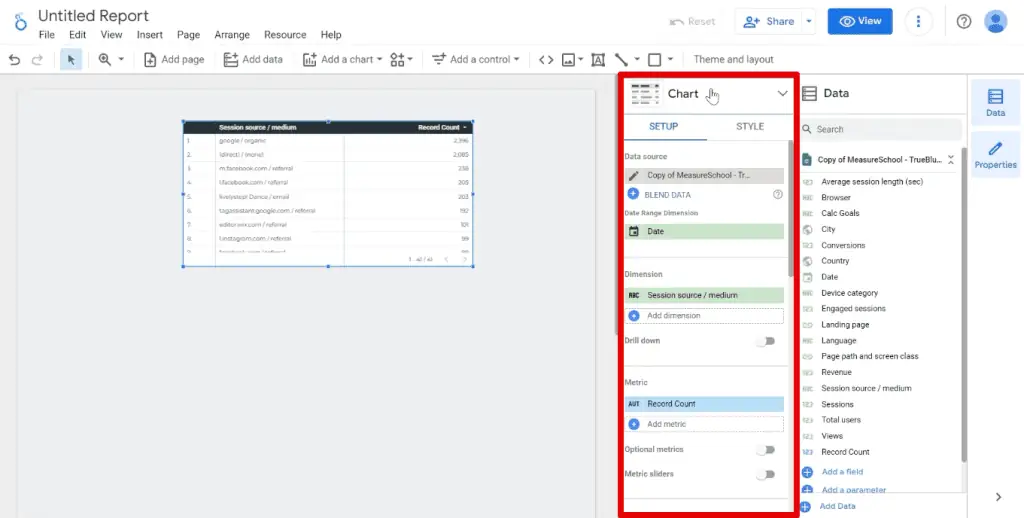
Our properties panel is usually divided further into the Setup and Style tabs. The setup tab is where to build the chart – what data is displayed, while the style tab is where we format the chart.
Next, we also have the Data panel.
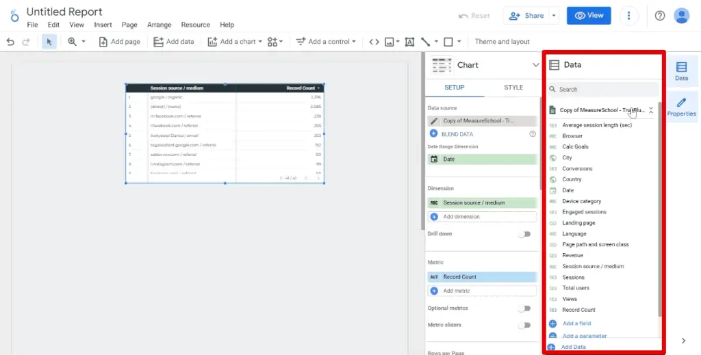
The Data panel is where you can access data from your data source. It is organized into dimensions, metrics, and other types of data.
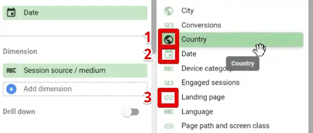
Dimensions are attributes of your data. Think of categories, colors, or anything that is in text form. You can easily distinguish different data types by looking at the icon next to them.
Looking at the browsers our visitors were using to get to our website, you’ll see that it has an icon that says ABC. This is how you know your data is a dimension.
On the other hand, metrics are the data that you can use for your calculations. These are usually the data that have numbers.
If we look at the revenue, you’ll see that metrics have a 123 icon.
Other data types include geolocation with a globe icon, dates with a calendar icon, and links with a chain icon.
In our dataset, examples of each are the Country, Date, and Landing page, respectively.
Next, let’s learn how we can modify the data in this table.
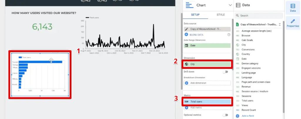
If we wanted to see the number of total users by city, we need to replace the session source/medium dimension and record count metric.
One way we can do this is to first drag and drop our City dimension to the dimensions section of the properties pane, then click on ✖ beside session source/medium.
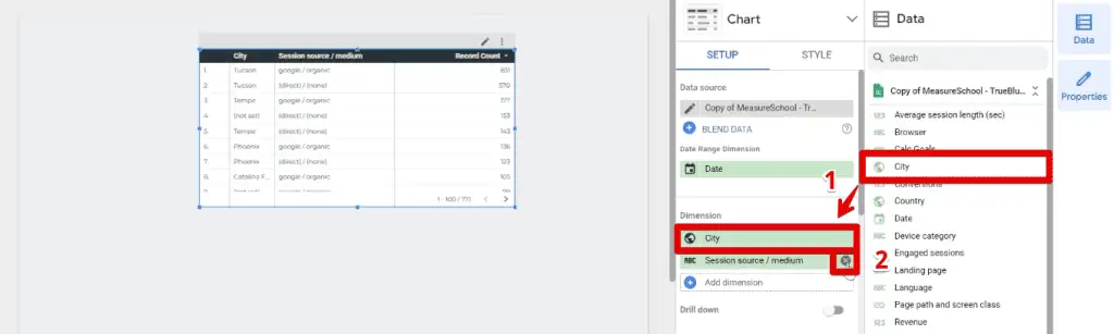
A helpful tip in finding the data you want to add to your chart, especially if you’re working with a large dataset, is by using the search bar at the top of the data panel.
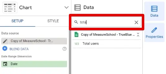
To demonstrate, let’s search for the total users.
The other way we can replace the data displayed on our chart is to click on the dimension or metric you want to replace.
This opens a mini data panel where we can search for or select the data we want to display directly.

Great! Let’s delete this chart for now and move on to recreating the dashboard we showed earlier.
Adding Scorecards to a Google Looker Studio Dashboard
Looking at the reference dashboard for this Google Looker Studio tutorial, we have a banner on top with a group of scorecards.

Scorecards are like snapshots of your key performance indicators or KPIs. You usually use them when you want to highlight a specific metric.
To start, let’s create the banner.
Click on the shapes icon beside the theme and layout button, then select Rectangle.
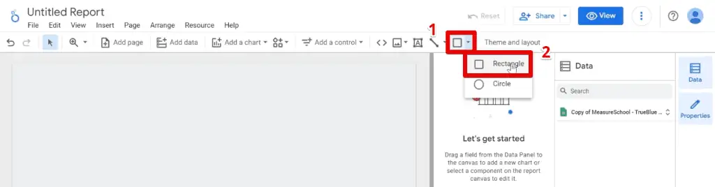
Click and drag this shape to the top of our dashboard.
Next, we’ll get to adding the Scorecards to our dashboard.

First, let’s replace the metric displayed with the Total users. You can use any of the methods we showed earlier.
Now, we need to change the format of our scorecard to fix this contrast issue.
Changes to what we want to be displayed are done in the setup tab, while changes to how they are displayed are done in the style tab.
Go to the Background and Border section in the Style tab and change the background color to Transparent.

Great! Our background is gone. However, we can’t see the numbers because both the banner and text color are dark.
To fix this, go to the Labels section and change the font color to white.

Great! Now, rather than rebuilding all these scorecards one by one, try this little trick.
Select your scorecard, right-click, and click on Duplicate.

Doing this allows you to retain the formatting we changed in the style tab, and you only need to change the metric displayed in the setup tab.
Alternatively, you can also utilize the copy-paste functionality using your keyboard.
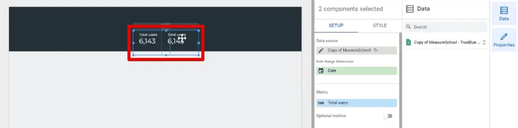
Since we have 4 scorecards on our banner, let’s select the two scorecards we have so far by holding down the CTRL key, then copy and paste them using the keyboard shortcuts.
Let’s move on to the next section of our Google Looker Studio tutorial.
How to View the Number of Website Visitors
The first section of our dashboard mainly has a scorecard showing the number of website visitors and a line graph showing the trends in the number of users per month.
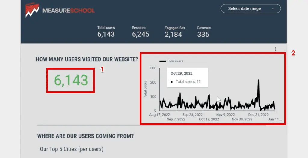
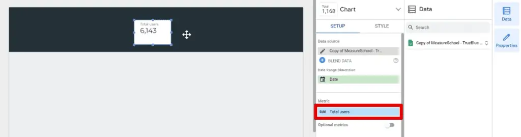
The big number displayed is just another scorecard, but with a few more tweaks than what we made earlier.
Start another scorecard with the Total users metric.
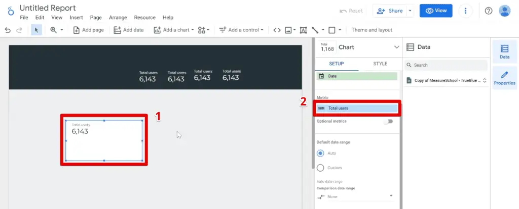
Increase the font size to around 60px, then change the font color to green. Next, remove the header that says Total Users by clicking on Hide Metric Name.

Lastly, if you started with a new scorecard, set the background color to Transparent.

Next, let’s add our line chart. While we have a section for line charts in the list of available charts, we’ll be using a Time series chart since we’ll be looking at trends per month.

Stretch the chart a bit to cover a decent portion of our dashboard, then make the lines a bit heavier. Set the line weight to about 5, and change the series color to black.
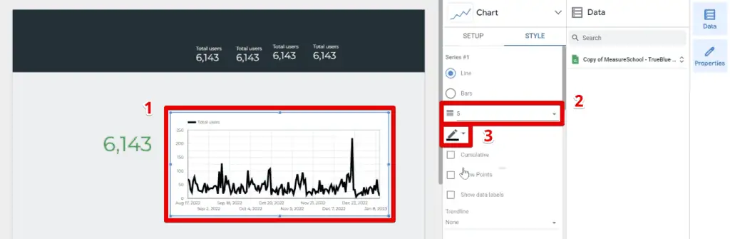
Next, we also want to remove the grid lines and the background.
Go to the Grid section and change the grid color to Transparent.

For the background, try and test if you can remove it on your own. Don’t worry if you need to go back to the previous section of our Google Looker Studio tutorial! (Hint: Look at the section names.)
To complete this section, let’s put a section header by adding Text.
Add the text “How many users visited our website?” in all caps, then increase the font size to 20px, and bold the text.

You can reorder, resize, reformat, or reposition the charts that we have so far, but at this point, we can see that we have successfully recreated the first section of our reference dashboard.
Now, let’s move on to the second section.
Here, we have a bar chart showing the top 5 cities that bring the most visitors to our website, along with a geo chart highlighting the number of users per country.

Bar and geo chart in the second section of the reference dashboard
Let’s start by inserting the Bar Chart.

Insert this bar chart at the bottom of our scorecard. Set the dimension to City and the metric to Total users.
Next, remove the background and gridlines, which we are confident that you can do at this point in our Google Looker Studio tutorial.
Next, we’ll reduce the number of bars shown in our chart because we are only interested in showing the top 5 cities.
To do this, go to the Bar chart section and change the number of bars to 5. Next, change the color in the Color bar section to black.

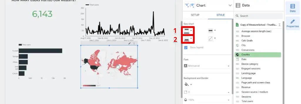
Great! Now, we could start building our geo chart from scratch, but we’ll show you another trick you can use.
Since the bar chart contains the most similar information we want to display in our geo chart, duplicate it, then click on the drop-down arrow on our properties pane.

Select the geo chart and watch Looker Studio’s magic in how it easily transforms your data.

Now, let’s change the color settings of our geo chart.
Set the maximum color value to black, and the minimum color value to pink to have some contrast.
Let’s recreate the last part of our dashboard.
How to See the Most Popular Content on a Website
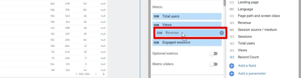
The last portion of our dashboard has a table that shows us the most popular content on our website.

To create this in our dashboard, let’s start with a table.

Next, put the Page path and screen class in the dimensions section, then the Total users, Views, Engaged sessions, and Revenue in the metrics section.

If you want to reorder the columns, you can click and hold on to any of the metrics, then position the selected metric to where you want it placed.
Adding Data Control to Google Looker Studio
Finally, we only have two things left to do to fully recreate our Google Looker Studio tutorial reference dashboard.
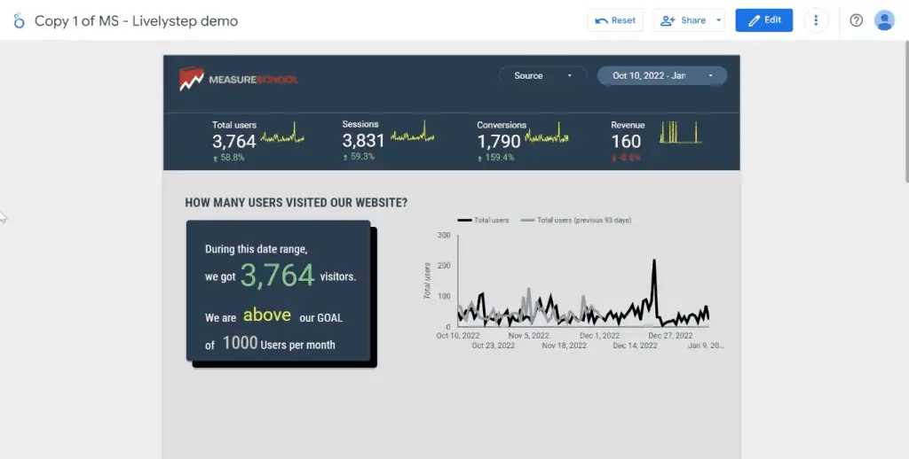
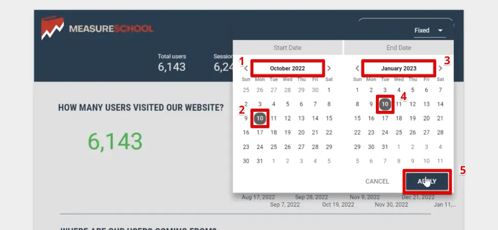
If you had been paying close attention to the elements of our reference dashboard, then you’ve noticed that it has a date range control at the top of the banner.

A date range control is a type of data control that helps you to only display the data you want based on the date range you specify.
Essentially, a data control filters your data and a date range control filters them by date.
For example, let’s set the start date to October 10, 2022, and the end date to January 10, 2023, then click Apply.
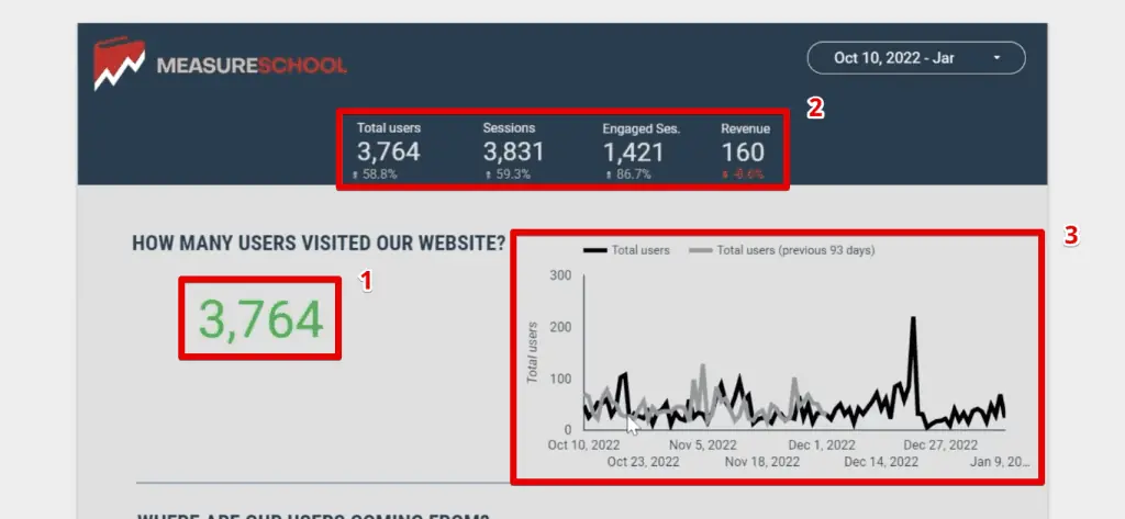
Notice the various changes this date range control made to our dashboard.
First, the scorecard showing the number of users displays a smaller value due to the narrower date range.
Next, the four scorecards on our banner have an additional line showing if there were improvements or dips in our KPIs.
Lastly, the line chart date range changed and another series is shown comparing the number of total users from the previous 93 days.
To add this on our dashboard, click on Add a control → Data range control.

Insert the date range control at the top-right portion and let’s style it a bit.
Set the background color to transparent, change the border color to white, then set the border radius to 15.

Finally, change the font color to white to fix the contrast issue.
Now, the final thing to add is an image of our logo at the top-left corner of the dashboard.
Click on the image icon → Upload from the computer.

After you select the logo and insert it into your dashboard, you’ll see that there is a contrast issue again. To change this, let’s set the background to transparent again.
Note that this only works if your image or logo already has a transparent background.
💡 Top Tip: While Google provides a myriad of charts we can use in our dashboards, you should check out the Google Looker Studio Community Visualizations to customize your reports further and show your data more clearly.
There you have it! We have completely recreated our reference dashboard, and have learned how to build a basic dashboard in Looker Studio.
There is one last thing we’d like to share with you before finishing this Google Looker Studio tutorial.
Dashboards with Actionable Insights
There are a lot of other things we could do with this Google Looker Studio Tutorial. Apart from building dashboards that display information, we also want to build dashboards that provide actionable insights.
This means creating dashboards that can guide your users and let them not only understand the state of the data, you’re analyzing but also give them an idea of where it is heading.
Remember the more comprehensive dashboard we showed earlier in this Google Looker Studio tutorial?
This is an example of a dashboard with actionable insights, as we not only can see the number of visitors coming to our site but also if we’re hitting our targets.

This tiny bit of information makes all the difference and can elevate your dashboard from a regular one to a dashboard that provides actionable insights.
💡 Top Tip: Check out our guide on the Google Looker Studio Calculated Fields to help you build dashboards with actionable insights.
FAQ
How can I start building a dashboard in Google Looker Studio?
To start building a dashboard, log in to your Gmail account and go to lookerstudio.google.com. From there, you can create a dashboard from scratch or use a template from the Template Gallery.
What data sources can I connect to in Looker Studio?
Looker Studio offers over 730 connectors, including Google Analytics, Google Ads, Google Sheets, BigQuery, and more. You can connect to various data sources and combine data from different places into a single location.
How do I view the number of website visitors in Looker Studio?
To view the number of website visitors, you can use scorecards to display key performance indicators (KPIs). You can customize the scorecards by selecting the desired metric, changing the formatting, and duplicating them for multiple metrics.
Summary
To summarize, in this Google Looker Studio tutorial, we looked at how to connect our data to Looker Studio and recreated a dashboard to learn how to build one ourselves.
We learned how to add various chart types to the dashboard like tables, scorecards, time series charts, bar charts, and geo charts, as well as other elements like shapes, texts, and images.
We also learned how to format what they show and how the data is shown.
If you would like to go further, why not make your dashboards interactive? Maybe you would also like to check out our top 3 Looker Studio dashboard enhancements to take your dashboards up a notch.
Which chart type do you think is the most effective in visualizing your data? Do you have any other tips/techniques to help in building a Looker Studio dashboard? Let us know in the comments below!
Subscribe & Master the Basics with our FREE Looker Studio Course


")