
Last Modified on January 7, 2025
Looking for ways to customize Looker Studio reports?
Looker Studio offers extensive customization options to make your dashboards unique, from changing chart colors to creating custom dimensions.

Subscribe & Master the Basics with our FREE Looker Studio Course
Instead of going through each option individually, we’ll take a more hands-on approach by building a dashboard together, focusing on essential customization features.
Here are the ways you can customize Looker Studio reports:
- Create a Custom Banner
- Add Scorecards to the Report
- Create Interactive Buttons
- Page Navigation Options
- Customize Charts
- Customize Filter Controls
Let’s dive in!
Customize Looker Studio Reports
Here is a sneak peek of the dashboard we’ll create:
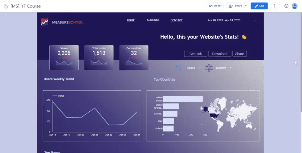
You can either sit back and read through this tutorial or follow along as we rebuild this dashboard.
Let’s start by creating a Blank Report.

For this demonstration, we stored our dataset in Google Sheets. Take note of the spreadsheet and worksheet names.

Select the Google Sheets connector.

Next, select the correct spreadsheet and worksheet. Then, click Add.
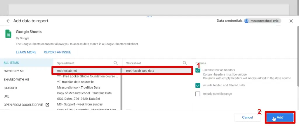
Finally, click Add to Report.

We are now in the Report Editor and ready to get started.
First, get rid of the table occupying the report by default.
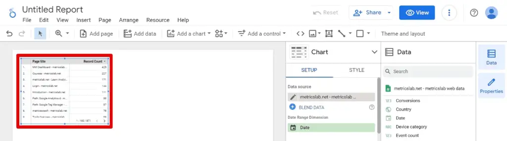
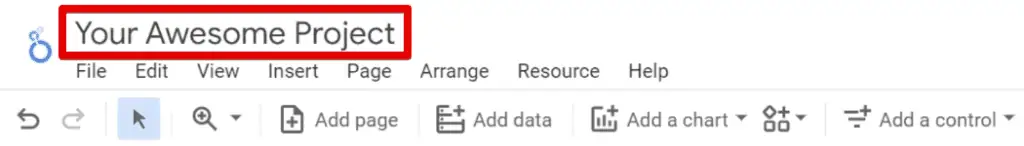
Next, provide a name for the report.
Great! Now, what we’ll do first is rebuild our banner.
Creating a Custom Banner
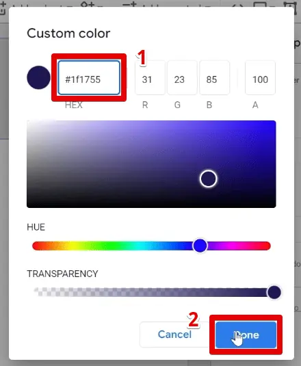
To start, let’s insert a rectangle. Click and drag over the top of the canvas. Next, let’s change the background color. Then, use a custom color by clicking +.
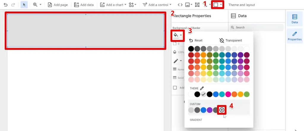
Use the #1f1755 hex code for the custom color, then click Done.
Next, add the logo. Click the image icon and upload it from your computer, then place it near the top of the canvas.
When inserting logos or any image with a transparent background, there may be instances when it gets filled with white color.
If this happens, click on the image. Go to the Style tab and set the background color to Transparent.

🚨 Note: This process only works if the original image has a transparent background. It will not work for images with filled backgrounds.
We had our logo split into two images. Quickly resize the first one, then insert the second.
Following this, group the logos so we can move and resize them freely. Select both, right-click, then click Group.

Before proceeding, let’s adjust the height of our canvas to ensure that all charts and elements we want to add will fit properly.
Go to Theme and Layout → Layout.

Scroll down and go to the canvas size section. Here, adjust the height to 1050px.

Next, let’s add a date range control. By default, the display text is black. We cannot read the text if we place it on the banner. To fix this, go to Style and change the font color to white.

Now, let’s build our scorecards.
Adding Scorecards to the Report
Add a scorecard, use the Views metric, and insert a Date sparkline.

Next, select Period for the other comparison option and Previous Period for the comparison date range.

We won’t see the comparison percentage because we haven’t selected a date range yet.
Now, let’s change the background of the scorecard. First, set the background color to the custom color we used previously. Next, select the background color again and click Gradient.
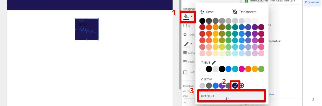
Set the gradient angle to 45°, then click Done.

With the darker background, we can barely see the information on our scorecard. To fix this, change the font color to white.

Next, change the sparkline color to light blue. Check the Fill and Smooth options.

The fill option turns the sparkline into an area chart, while the smooth option reduces the spikes in our graph.
Position the scorecard near the top left portion of the banner. Next, center the metric name, metric value, and comparison value.

Instead of repeating the formatting steps for the other charts we want to display, we will duplicate or create copies of our scorecard.

Change the metric of the second scorecard to Total Users and the third scorecard to Conversions.

Now, let’s select a date range to see the comparison percentages.
Select April 18 to 24. Notice that the negative comparison percentages don’t contrast well with our background.

So, let’s change the comparison percentage font color.
A quick trick to selecting multiple charts at once is to click and drag an area encompassing the three charts.

Next, go to the Style tab and change the Negative Change Color to yellow.

It’s time to soften the corners of the scorecards by setting the border radius to 5.

Notice the scorecards no longer have sharp corners.

Next, let’s greet our users with a welcoming text.
First, let’s go to EmojiTerra and copy the waving hand emoji.

Now, let’s add text to the dashboard. Type a welcoming message and paste the emoji. Change the font color to white, font size to 20px, and bold the text.

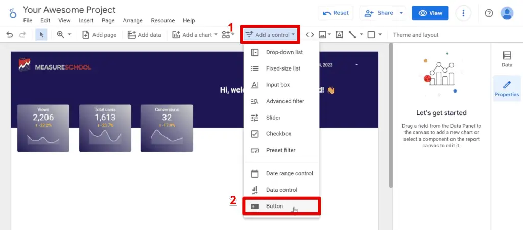
Then, add a few interactive buttons to the report.
Creating Interactive Buttons
We want to give viewers of the dashboard the option to download or share this dashboard.
First, click the Add a Control → Button.
Change the text and the formatting. Set the font color to white, font size to 18px, background color to our custom color, opacity to 70%, border color to grey, and border thickness to 2.

Looker Studio buttons have three action types: Navigation, Report Actions, and Filter.
By default, the buttons will be of the Navigation type, which we can use to navigate to a page in the report or an external URL. You will set this by clicking Insert Link.

Here, we can set dynamic page links, specific pages in the report, or an external link.

Now that we know about navigation buttons, let’s discuss the next type. The report actions buttons let users access report actions such as sharing and downloading.
To understand how they work, create a copy of the button, then select Report Actions. For the specific action, choose Download Report.

Clicking the Download button allows users to download a PDF of the dashboard.

Another report action is to let users share the dashboard.
Create another copy of the button, then select Report Actions → Invite People.

This button allows users to share the dashboard with certain people and groups and specify access roles.

The last button type is Filter. The Filter option lets you create preset filters for viewers to quickly and conveniently apply complex filter logic to charts and reports.
💡 Top Tip: Those are the default button types, but learn how to customize Looker Studio buttons by checking out our guide on How to Create Interactive Buttons in Looker Studio.
In the next section, we’ll discuss creating page navigation menus. We don’t need to make one in this example dashboard, but we’ll give you a demo if you need them for your report.
Page Navigation Options
Looker Studio has different menu options. There is the default page navigator and one where we create our own. We’ll show you how to create a basic one.
💡 Top Tip: If you want to learn more about menus, check out our guide on creating navigation bars in Looker Studio, covering everything about menu navigation.
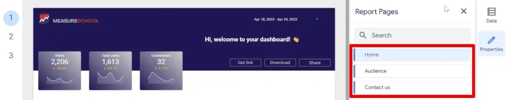
First, we need a report with more than one page. So, click Add Page.

Create three pages and rename them to Home, Audience, and Contact Us.
Now, let’s look at creating a custom page navigation.
First, insert text with the page title. Set the font color to white, then Insert Link.

We are creating a navigation button for the homepage, so select Home for the page link, then click Apply.

Since we inserted a link, the color will change to blue, and an underline will appear.
To revert this formatting, select the text again. Set the font color to white and deselect the underline option.

If the color does not change, select a different color first and then white. If that still doesn’t work, refresh the page and try again.
Center the text, then create duplicates for the other pages in the report. Change the links accordingly for each page.

We have now finished creating our custom banner.
If we preview our dashboard, you’ll see the default navigation menu at the left of the canvas.

Since we have already created our custom menu, let’s remove this default one.
Go to Theme and Layout → Layout. Set the navigation type to Hidden.

Finally, let’s change the page background color before proceeding to the next section.
To do so, go to Page → Current page settings.

Go to the Style tab and change the background color to our custom gradient.

Now, let’s build our charts.
Customizing Charts
First, let’s add a time series chart. Set the grid color to transparent and the axis color to white.

Let’s also change the line weight to 2 and the line color to light blue.

Finally, let’s style the border. Set a border radius of 5, color to light grey, and border thickness to 2.

Next, we’ll add our geo chart. But first, let’s add an outline.
Insert a rectangle. Set a transparent background and copy the border settings we implemented in the time series chart: border radius of 5, light grey border color, and border thickness of 2.

Now, let’s add the geo chart. Set the max value color to our custom color, then uncheck the Show legend option.

With geo charts, it can get difficult to determine which countries bring the results you need, especially when there is a lot of data. So, let’s add a bar chart to accompany this geo chart for clarification.
Duplicate the geo chart and change it to a bar chart in the properties panel.

Reduce the number of bars to 5 and set the bar color to light grey. Now, the bar chart will only show the top 5 countries.
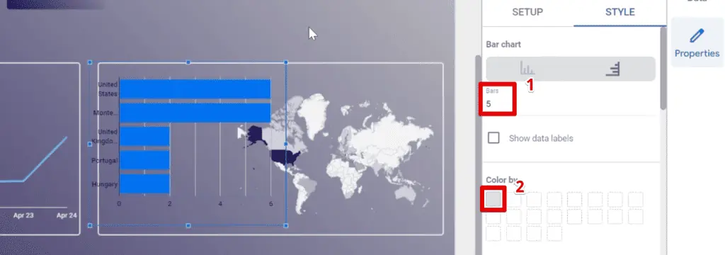
Next, change the bar chart metric to Total users.

Go to the style tab again and change the grid color to transparent and the axis color to white. Quickly resize the chart to make it fit properly.

Lastly, enable cross-filtering.

Cross-filtering allows users to filter other charts in the report based on the selection from the bar chart. For example, clicking Germany will filter the scorecards, time series, and geo charts.

Great! Next, let’s present our pages and content that brings us the most users.
First, add a table and set the header color to white.

Next, set the background and border color to transparent. Change the font color to white. Deselect the row numbers option. Finally, resize the table for the top five entries.

Replace the table dimension with the Page Title.

Deselect the Show pagination option, then resize the table accordingly.

Finally, let’s format the border to match the other charts: border radius of 5, light grey border color, and border thickness of 2.

Next, let’s add our device categories and a space for users to contact us.
Insert a donut chart and replace the dimension with the Device Category.

Next, let’s change the colors by clicking Manage dimension value colors.

Change the desktop color to grey and the mobile color to our custom color. Then, click Close.

Finally, use the same border settings: border radius of 5, light grey border color, and border thickness of 2.

If you’re limited in the space available for your chart, you can remove the legend by going to the Legend section and selecting None. Adjust the chart size accordingly.

Now, let’s move on to the contacts section. Again, start with a shape with our custom color for the background color. Resize the other charts so that all these elements fit well.

Upload an image for the Contact Us section of the dashboard.

We built this image on Canva and exported it as a PNG file with a transparent background.
Let’s add some text. Change the font color to grey, font size to 16px, and bold the text.

The last thing to do is add a link to the image, which you should know how to do now.
Finally, let’s add some filter controls.
Customizing Filter Controls
We are interested in where our users come from, so we need to add a source/medium filter.
Insert a drop-down list control and select Session source/medium for the control field.

Change the font color to white and remove the background color. Next, click the edit icon beside the control field.

Rename the dimension to Source & Medium. The source field is at the bottom.

Next, let’s add an icon beside the filter control. You can design one or look for resources online. A great site we recommend is FlatIcon.
Type a keyword and select one of the icons.
What’s great about this website is that it allows you to Edit an icon!
After this, save it in a PNG or SVG format and choose different pixel sizes.

These icons are free but have a page where you add credits to those who created these icons.
Once you’ve downloaded an icon, insert it beside the filter control.
Finally, test out your dashboard and see if everything works as intended.
For testing, let’s select a date range from April 18 to 24.

Check if your charts, buttons, and controls are working and if you’re happy with the formatting.
Summary
Great! That’s how you customize Looker Studio reports. We’ve looked at how to recreate an existing dashboard, discussing design techniques and tricks along the way.
From charts and images to filter controls, this guide has covered all the decorating tips to design your dashboard.
Do you still want to do more with your dashboards? Check out these top 3 Looker Studio dashboard enhancements to make your report stand out.
Which customization technique did you find the most interesting? Are there other design elements you can recommend? Let us know in the comments below!
Subscribe & Master the Basics with our FREE Looker Studio Course


")
How did you change the grey background color behind the report?