
Last Modified on January 7, 2025
Want to make your Google Looker Studio dashboard stand out from others?
Custom-designed buttons in Looker Studio are small yet powerful additions that, when implemented properly, could distinguish your dashboard apart from others and make it memorable to your users.
They can serve a variety of purposes, from aligning with a brand’s color to adding a unique touch to a data storytelling presentation.
While buttons in Looker Studio dashboards may seem like a negligible component, incorporating strategy and creativity into their design can greatly improve the user experience, keep users engaged, and make your dashboards interactive.
In this tutorial, we’ll look at how to create interactive buttons in Looker Studio. Don’t undervalue buttons as they are key dashboard enhancement features.
Here is an overview of what we’ll cover:
- What Can Buttons in Looker Studio Do?
- How to Build a Basic Button
- How to Build a Navigation Button
- How to Build a Button with a Hover Effect
- How to Build a Custom Button
Let’s get started!
What Can Buttons in Looker Studio Do?
Buttons in Looker Studio allow you to include a call to action, point users to certain resources and even guide them through your funnels.
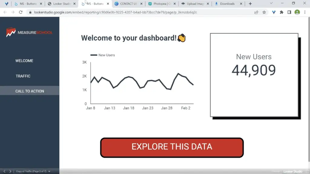
For example, we have an embedded Looker Studio dashboard on this webpage with a button that allows visitors to explore the data further and find their insights.

Once clicked, this button opens the full dashboard on a separate page.
Buttons can also help users better navigate through the pages of your report. Our example dashboard has multiple pages, and the page control is not very visible. Additional steps need to be made to get there.
First, hover over your dashboard to see the hidden menu bar at the bottom. Next, click on the ⏷ arrow to show the page control.

Here, a list of the pages of your dashboard will show up.

The effectiveness of this page control hinges on having clear and distinct page names for your dashboard, as well as on how easily users can understand and find the page they are looking for based on the page name alone.
To simplify this process, you can use navigation buttons. For this tutorial, we’ll introduce two types of navigation buttons in Looker Studio that you can implement on your dashboard.
The first type involves using a dedicated pane that lists the pages you would like to navigate to.
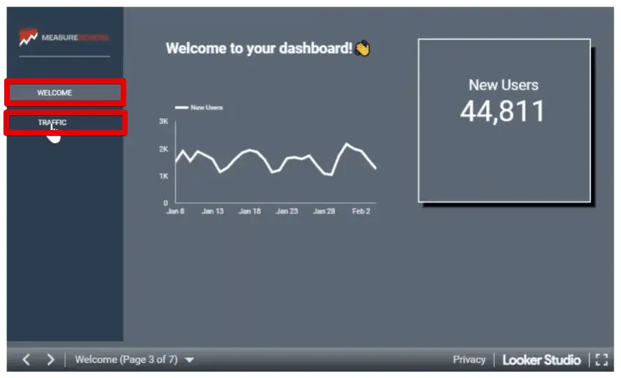
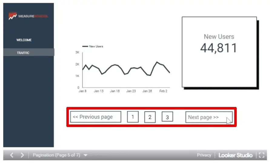
The other type involves multiple numbered pages and additional buttons for going to the previous and next pages.
Buttons in Looker Studio can also be a helpful tool in highlighting key elements of your dashboard. To illustrate, let’s have a look at buttons with hover effects.
In our example dashboard, we have a black button with the text “Learn Analytics.”

When we hover over this button, the look and color formatting of the button inverts.

Buttons with hover effects like this are especially useful for dashboards with dark themes or are overcrowded with data. They also help differentiate what elements of the dashboard are clickable.
🚨 Note: If your client is using buttons with hover effects on their website, you may want to use them again for their dashboards so that you keep the brand’s design consistent across platforms.
Let’s get started with building a basic button.
How to Build a Basic Button
To build basic buttons in Looker Studio, we’ll start with adding a textbox.
In your Looker Studio account, go to the toolbar at the top and select Text.

Insert this anywhere on your dashboard. Now, let’s format this text a bit.
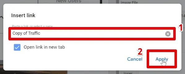
First, type your text. Next, ensure that the text is selected, then change the font size to 28px and set the alignment to center. Finally, click on the Insert link button.

Here, you’ll either paste in one of your links or select one of the pages of the report. For this example, we’ll select the page named Copy of Traffic. Click Apply.

Let’s add a border. Set the border color to black, and the border thickness to 4. Next, let’s preview this button by clicking View.

Great! We have successfully created a basic button.

This is the same technique we need to use to build the pagination navigation buttons on one of our pages.

There are, however, two issues with this technique of creating buttons in Looker Studio.
First, only the text link is clickable. When you hover the mouse over the other parts of the button within the border, you’ll see that the cursor remains the same – meaning you can’t click on these areas to open the link.

Next, the underline that appeared is probably something you want to remove.
Let’s resume editing our button by clicking on Edit.
The underline can be easily removed by deselecting the Underline icon in the style tab.

Before showing how to solve the issue of non-clickable spaces, let’s design the button further.
First, let’s change the background color to a red color from our theme chart palette.

Next, select the text and change the font color to white.

Next, you can also play around with the border’s radius to design your buttons further.
Scroll to the background and border section and change the border radius to 15.

Great! We now have a button similar to the one that you’ve seen before.
Now, we have two options to solve the issue of non-clickable spaces. You can either reduce the button size so that there are fewer empty spaces between the text and the border or add an element on top that is the same size as the button.
For this tutorial, we’ll be using transparent images on top of the buttons to solve this issue.
Go to the toolbar and click on the image icon → Upload from computer.
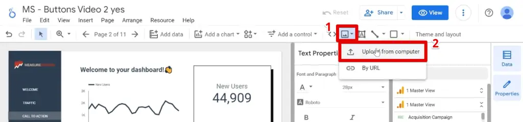
Deselect the Preserve Aspect Ratio option, then overlay and resize the image to the same location and size as the button.

Next, Insert an image link URL.

Select the same page as we used in our example earlier, then click Apply.
Finally, set the opacity of the image to 0%.

Now, the entire button can be clicked.
Let’s move on to creating navigation buttons in Looker Studio.
How to Build a Navigation Button
To build navigation buttons in Looker Studio, we’ll again start with using the text icon and use the same techniques we used earlier.
Insert and resize the textbox to the same width as the navigation pane.
Type the page name, change the font color to white, center the text, and change the background color to a blue-grey color from our theme color palette. Finally, click the Insert link button.

Select the page that is related to the text you’ve inputted. Next, click Apply.

Since we’ve inserted a link, the text will be reformatted to be blue and have an underline.
Set the font color to white again, then deselect the underline format.

Now, let’s create a copy of this button by right-clicking on it and selecting Duplicate.

You could also use the keyboard shortcuts to do the same.
Drag the second button below the first one and type our page name. Next, set the background color to transparent.

Ensure that you send your users to the right page. For this example, we have two pages, one to welcome the users and another one for traffic.
Set the link for this second navigation button to Traffic 2, then click Apply.

We need to reformat this button since we modified the link.
There may be instances where the formatting gets messed up. If this happens, simply refresh the page.
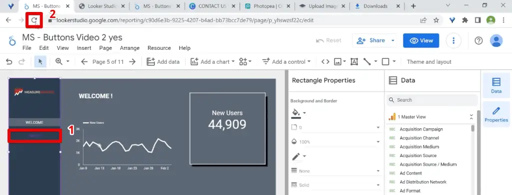
Select the text again, change the font color to white, and deselect the underline format. The formatting should work this time.

Now we have successfully created navigation buttons in Looker Studio with the use of a navigation pane.
However, these buttons only exist on our current page. Once we go to another page, these buttons will no longer be displayed.
To remedy this, select both navigation buttons by holding down the CTRL key and copy them either by right-clicking and selecting copy or using the keyboard shortcut.
Next, go to the next page by clicking on the → arrow on the toolbar.

Simply paste the navigation buttons, placing them in the same location.
Here, reverse the background formatting of the two buttons, so that the traffic button has the contracting color, indicating that the users are on the traffic page.

Now, let’s get to learning how to build buttons in Looker Studio with a hover effect.
🚨 Note: Check out our guide on creating navigation bars in Looker Studio if you want to go more in-depth and further improve your dashboards.
How to Build a Button with a Hover Effect
To build buttons with hover effects, we’ll need the help of HTML and CSS.
No need to worry if you’re not familiar with the markup language because there are plenty of resources online with pre-built buttons where you can just copy the code and use them here.
💡 Top Tip: The Creating CSS3 Button Hover Effects guide by HTML Form Guide is a great resource to check out. It provides a detailed explanation of how to build your code and also provides examples that you could try out.
To create buttons in Looker Studio with hover effects, we’ll need to utilize custom charts from the Looker Studio Community Visualizations.
Click on the Community Visualizations and Components button at the top of the toolbar → Explore more.
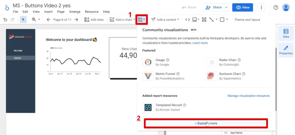
Next, look for and select the Templated Record visualization.

Insert this anywhere on your dashboard, then go to the Style tab.
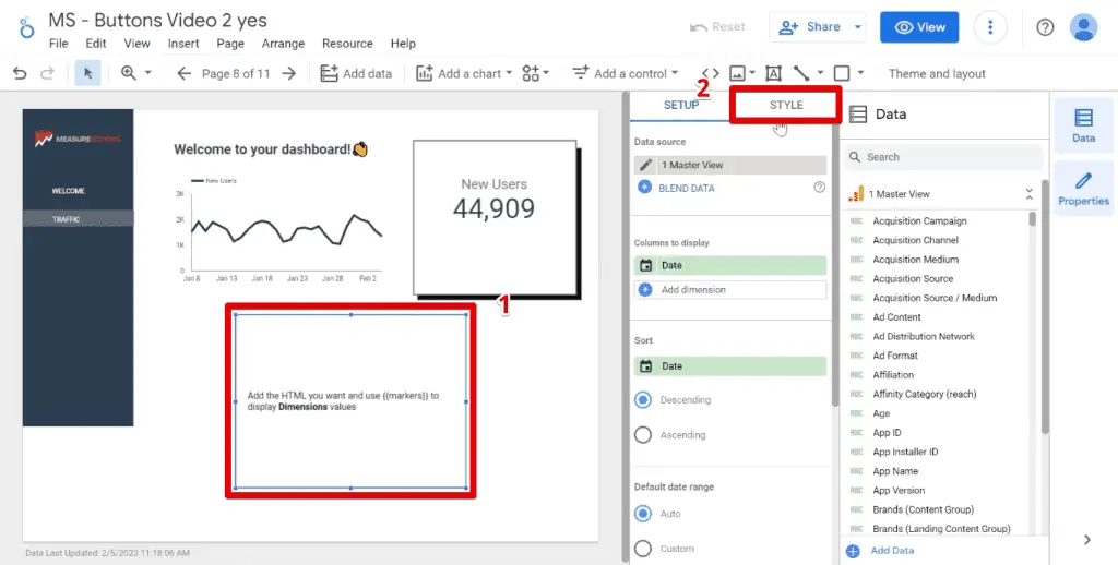
Now, let’s add our HTML and CSS code. For your convenience, we’ll provide you the following code so that you will also end up with the same button.
<!DOCTYPE html>
<html>
   <head>
      <style>
         .learn-more {
         background-color: black;
         color: white;
         border-radius: 30px;
         border: 2px solid black; /*Adds black border*/
         padding: 25px 35px;
         font-size: 20px;
         transition: background-color 0.2s ease;
         text-decoration: none;
         min-width: 100px; /*Adds a minimum width for the button*/
         display: flex;
         align-items: flex;
         justify-content: center:
         overflow: visible /*Makes sure the button is visible if it overflows*/
         }

         .learn-more:hover {
         background-color: white;
         color: black;
         cursor: pointer;
         }
      </style>
   </head>
   <body>
      <a href="https://measureschool.com" class="learn-more">LEARN ANALYTICS</a>
   </body>
</html>
Copy this code. In the HTML Template section, remove the default code and paste the above code here.

🚨 Note: Once clicked, the link that your button will lead users to is specified in the href attribute of the <a> element. If you’ll use this button type to navigate to other pages of your dashboard, then acquire a link for those pages and edit the href attribute accordingly.
Now, there are two issues to be aware of when using the Templated Record visualization.
First, you may find that sometimes the button is cut off. To remedy this, make sure that you have the min-width line in the code for your buttons in Looker Studio.
💡 Top Tip: If you want to learn more on how to format CSS buttons, W3Schools provides a detailed guide breaking down each component that also provides examples of buttons with hover effects.
The next issue is something to keep in mind for any chart from the Community Visualizations.
When you’re using a dashboard that has buttons with hover effects and you’ve embedded them in a web page, you may be prompted with the following warning message.
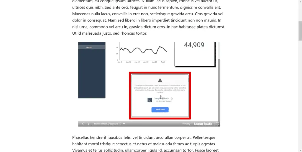
Don’t worry, the button will still work, but your users may think your dashboard has an error if they do not click on the Proceed button to allow the use of this community visualization. So, this is something to keep in mind.
How to Build a Custom Button
The last button type we’ll create is custom buttons in Looker Studio. This type allows you to let your imagination go wild.
The button we’ll recreate is one with a phone icon, text, and a drop shadow effect.

Very simply, this button is an image that was originally built in Canva.

For custom buttons in Looker Studio, we’ll mostly format them as images and use the image link URL setting to convert them to clickable buttons.
If you’ve also built your button in Canva, crop the image close to the boundary of the button and download it as a transparent image. This is a feature of Canva Pro and if you’re only using the free version, we’ll teach you a trick to have an image with a transparent background.
First, download your image from Canva. Next, we’ll use a tool like Photopea to crop the image to the surrounding areas of the button.

Once we’ve successfully uploaded and cropped the image to the appropriate size, Click on File → Exort as → JPG or PNG.

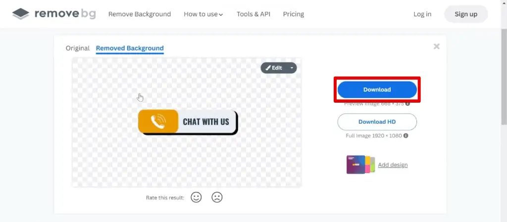
Next, we’ll use another tool that can make the background of this image transparent. There are plenty of them online, but for this tutorial, we’ll use Remove.bg.
To use this tool, simply upload the image and it will automatically detect which part of the image is the subject and remove the background for you. The only thing left to do is to download the edited image.
Upload this image to your Looker Studio dashboard and make sure that you’ve selected the one with a transparent background. Notice that by default, Looker Studio will set your image with a white background.
To remedy this, select the image and set the background color to transparent.

Resize the image to the appropriate size, then Insert an image link URL.

Paste your link, then click Apply.

That’s how you build custom buttons in Looker Studio.
FAQ
How do I build a navigation button in Looker Studio?
1. Select the text icon tool in Looker Studio.
2. Enter and format the text to appear as a button.
3. Link the text to a URL or select a specific page within the dashboard for navigation.
4. Duplicate the button if multiple navigation options are needed.
5. Position the duplicated buttons on various pages of the dashboard.
How do I build a button with a hover effect in Looker Studio?
1. Prepare the necessary HTML and CSS code for the hover effect.
2, Import a custom chart from the Google Looker Studio Community Visualizations.
3. Insert the HTML and CSS code into the Templated Record visualization.
4. Adjust the HTML and CSS code to create the desired hover effect for the button.
How do I build a custom button in Looker Studio?
1. Design a button image using tools like Canva.
2. Crop the image closely to the button boundary.
3. Save the image as a transparent PNG file.
4. Upload the transparent image to Looker Studio.
5. Assign a URL to the image for linking purposes.
6. Adjust the appearance of the button image as needed within Looker Studio.
Summary
We’ve looked at various ways of creating interactive buttons in Looker Studio. We started with a basic button, then took it further with navigation buttons. Next, we customized our buttons by adding a hover effect and finally let our imagination go wild with custom buttons.
If you want your dashboards to stand out even further, try implementing these top 3 Google Looker Studio dashboard enhancements.
Which button type do you use most often? Have you discovered any interesting hover effects that make your buttons even more engaging? Let us know in the comments below!


")
Great article. I have been trying to use a filter with a blended data source. It basically does nothing when clicked. What could I be doing wrong?