
Last Modified on January 20, 2024
Pivot tables are a magical tool in Looker Studio (Data Studio) that displays your data with multiple dimensions at the same time — perfect for summarizing trends and answering business questions!
In this guide, we’ll show you how to create Looker Studio pivot tables, plus give you the benefits, drawbacks, and special features that they offer.
An overview of what we’ll cover:
- What are Pivot Tables?
- How to Create Looker Studio Pivot Tables
- The Anatomy of a Pivot Table
- Organizing and Filtering Data in Pivot Tables
- Drawbacks to Pivot Tables
So let’s start!
💡 Top Tip: Psst… if you want pivot tables in a spreadsheet instead of a reporting tool, check out our pivot table tutorial for Google Sheets!
What are Pivot Tables?
Pivot tables are a user-friendly interface that organizes data by multiple categories at once, giving you a big-picture overview of your data.
For example, the pivot table below breaks down the number of new users on various web pages by country.

You can sort the whole table to show which page has the most new users either in total or within a single country.
This could tell you which product pages are most popular in certain regions, helping you target ad audiences more effectively.
Pivot tables are a quick and dynamic shortcut around writing formulas that summarize and analyze your data, and they’re pretty presentation-friendly.
For this reason, they’ve always been popular among data analysts in spreadsheet tools like Google Sheets or Excel.
So Google added pivot tables to their Looker Studio product in 2017, which made them even more accessible for your client-centric (or upper-management-centric) reports.
In Looker Studio, pivot tables can tell a story with data alongside other graphic representations.
💡 Top Tip: Adding tooltip annotations is a great way to add extra information to your Looker Studio reports!
Of course, for pivot tables to tell a good story, you need to know how to use them correctly.
So let’s learn how to make Looker Studio pivot tables!
How to Create Looker Studio Pivot Tables
For this tutorial, we’ll be using a prepared sample sheet that contains sample audience data from Google Analytics.
In Looker Studio, click Add a chart and scroll down to select a Pivot table. (The fancy ones can include bar graphs or heat maps.)

Voila! A pivot table will appear, pre-populated with what Looker Studio guesses might be some interesting data. This one comes with New Users as the Metric.
However, unlike a normal data table, you’ll find that the metrics don’t appear as column headers with dimensions as row headers.
Instead, the metric is a table header, while columns and rows both denote dimensions.
In this case, the Row Dimension is the Page Title, while the Column Dimension is the user’s Country.

This way, you can take an in-depth look at any metric and observe relationships between dimensions like age, location, source, ad campaign, product page, and more.
Here is where pivot tables prove to be crucial. They can organize all of the similar datasets and filter the results automatically when we use the correct features.
Let’s understand how to use them!
Pivot Table Structure in Looker Studio
Pivot tables consist of three main pieces: metrics, row dimensions, and column dimensions.
Let’s take a closer look at these three elements to see what fields we should include in each one to make the most of our pivot tables.
🚨 Note: It might take a few moments for the table to load when you change the fields in your metrics or dimensions. Be patient! It’s a lot of data to go through.
Metrics
Metrics are the numbers that describe all the things we track: how many users, pageviews, conversions, and more.
In a pivot table, your metrics are aggregated and sorted from all of your tabular data points (i.e., each row).
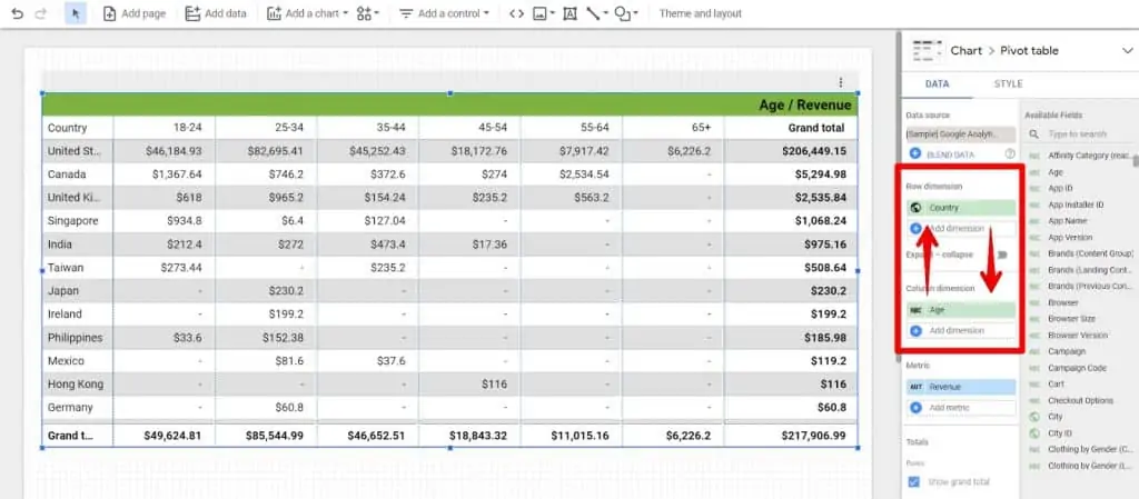
For example, the following pivot table uses Revenue as a metric, displaying the amount of revenue from all product sales across each intersection of Age and Country.

💡 Top Tip: You can include subtotals and a grand total for each dimension by checking the Show grand total box in your data panel. They take up some extra space, but they’re great for comparing smaller values to the big picture!
You can also use multiple metrics in a single pivot table, but be aware that this can get a bit cluttered depending on your data.
For example, here is a pivot table that uses the same dimensions (just one-row dimension and one column dimension) but two metrics, Unique Purchases and Revenue.

Sometimes this will be useful, but in many cases, it may be better to choose a different way to present data with multiple metrics.
Pivot tables are great for doing deep dives into a single metric.
The interesting insights come from a metric’s distribution across multiple dimensions at once.
Row and Column Dimensions
Technically, you can use your row and column dimensions interchangeably — your whole table can “pivot” (turn) to give you the same results either way, hence the name “pivot table.”
That said, there are still some good practices to bear in mind.
Let’s take a look at the pivot table we just used to demonstrate metrics: its Row Dimension is Age, and its Column Dimension is Country.

How you organize these dimensions depends on what kind of data and analysis are most important to your questions.
For example, using the above pivot table is great if you want to see the spending distribution across all age groups in the most revenue-heavy countries.
However, it’s a little clumsy if you want to focus on revenue distribution within countries.
💡 Top Tip: As a general rule, it’s also helpful to use dimensions with more groups in the Row Dimensions, and those with fewer groups in the Column Dimensions. This way, you’ll be able to see more data at a time.
Like with metrics, you can also use multiple dimensions in each row and column.
Note that you’ll probably get the most use out of this function by grouping similar or related dimensions as either rows or columns.
For example, using both Country and Region as Row Dimensions allows the revenue data to be subdivided within each country into smaller states or principalities.
Similarly, Age and Gender describe audience attributes, so they go together well as Column Dimensions.

Also like using multiple metrics, using multiple row dimensions or column dimensions can get slightly cluttered.
This makes it all the more important to group dimensions that make sense together!
Organizing and Filtering Data in Pivot Tables
Filters provide more control and creativity in data analysis, which makes your pivot tables even more accessible to clients.
Having tables on a client dashboard may not sound appealing to a lot of users — especially your clients who hired you specifically to do this for them! Lots of them don’t want to wade through numbers. They just want to see results.
However, pivot tables synthesize data into more digestible, meaningful numbers in a single table.
When properly configured with filters, the numbers in a pivot table show the big picture and help clients answer specific business questions.
There are a few ways to organize and filter data in your pivot table: sorting, date range, table filters, and dashboard controls.
The first three are configured by you in the backend of the report. However, dashboard controls allow users to explore and analyze data themselves.
Sorting, Date Ranges, and Table Filters
The Sorting fields in your pivot table’s Data sidebar put your rows and columns in order.
In our earlier example, we wanted to focus on the highest revenue groups, so we sorted the first row by Revenue in descending order.
This kept all of the biggest revenue numbers at the top of the pivot table.
But if you wanted the list of countries down the left side of the table to be alphabetized, you would select Country to be sorted in Row #1 in Ascending order.
Similarly, the age groups increase going across the column header because Row #2 Age is also sorted in Ascending order.

You can also set a Default date range for each pivot table.
When set to Auto, the default is usually the last 28 days, but you can set custom ranges using a calendar or by counting backward from the current date.

Pivot Table Filters can narrow down the data that you want to display, but since it requires access to your chart data source, we’ll skip this for this tutorial.
But if you’re familiar with RegEx in your tracking system, you’ll catch on to this quickly.
Dashboard Controls
Finally, dashboard controls give your pivot tables that special interactive quality that makes them so user-friendly for clients.
To create a new dashboard control, simply click Add a Control and select the type of control you’d like to make.
There are a few options, but we’ll demonstrate with a simple Drop-down list.

Let’s say that this pivot table includes Region as a Row Dimension.
If we wanted the user to be able to view only their selected countries, we could add a control filter for each Country.
You can also add a default setting by typing in the value (country) that you want to appear first.

When a user views your dashboard (you can preview yours by clicking the View button), they can click the control dropdown to select which filters they want to apply to the data.
Here, they can select one or more groups to include in the pivot table.

Thanks to dashboard controls, your clients can explore data and seek out the most relevant pieces for comparison, analysis, and decision-making.
Drawbacks of Looker Studio Pivot Tables
According to Google’s introductory pivot table reference for Looker Studio, users can currently only create five pivot tables per page.
Additionally, pivot tables won’t also paginate like other tables — in other words, you have to scroll, scroll, scroll. This gets tedious, especially if you have multiple row dimensions or column dimensions.
And lastly, you can’t use metric filters on the pivot tables.
For example, let’s try adding a metric filter to the pivot table that says Include Sessions Greater than (>) 1000.
We’ll Save this filter.
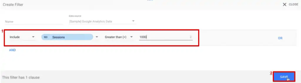
When we open the table, it will show an error message.

Moreover, you need to remove any such metric filters to analyze the data on your pivot tables.
FAQ
How do I create Looker Studio pivot tables?
To create a pivot table in Looker Studio, you need to add a chart and select the Pivot table option. Then, you can choose your metrics, row dimensions, and column dimensions to define how your data will be displayed and analyzed.
Can I customize the appearance and functionality of Looker Studio pivot tables?
Yes, you can customize Looker Studio pivot tables by sorting rows and columns, setting default date ranges, applying filters, and using dashboard controls to enhance interactivity.
What is Looker Studio?
Looker Studio is a powerful reporting and data visualization tool that allows you to create interactive and customizable dashboards and reports using data from various sources.
Summary
So that’s all you need to know to get started with Looker Studio pivot tables!
Pivot tables help create a better data experience for clients. Looker Studio used to be a poor tool for data exploration, but pivot tables have changed this.
Analysis and exploration are now far more accessible in Looker Studio.
You can pull data dynamically and don’t need the user to deal with spreadsheets.
Moreover, using pivot tables is just one excellent feature that Looker Studio provides.
There’s a lot more that you can explore with this tool. For example, you can create calculated fields using functions to take your analysis to a higher level.
The next step in mastering Looker Studio would be learning how to pull data from third-party data sources into Looker Studio using Connectors.
What are your favorite use cases for pivot tables? Do you prefer to use pivot tables in Looker Studio, or Google Sheets? Let us know in the comments below!


")
Can we not use row dimension on pivot table? only want to show the metrics and column dimension like we can do at spreadsheet