
Last Modified on September 5, 2023
Did you know that you can automate metadata analysis in Google Sheets? It’s an easy-to-use nifty feature called a pivot table.
With Google Sheets’ advanced pivot table features, you can customize and edit pivot table style with just a few clicks!
Functions, calculations, and other analyses are even simpler with pivot tables.
In this guide, we’ll teach you how to create and how to use a pivot table in Google Sheets to summarize and analyze your data effectively.
An overview of what we’ll cover:
- Importance of pivot tables in Google Sheets
- How to Create a Pivot Table in Google Sheets
- Analyzing the data on a pivot table
- Different ways to analyze the data of pivot table
- Adding filters to a pivot table
- Using slicers
So let’s dive in!
Importance of Pivot Tables
When analyzing data from multiple sources at once on Google Sheets, it can be difficult to keep track of all your data. When your data is massive enough, it’s impossible to see the big picture without summarizing and analyzing it into metadata.
Crunching all the numbers by hand is time-consuming, even with automated formulas and functions. But there’s a better and faster way to optimize your data: pivot tables.
When implemented correctly, Google Sheets pivot tables interpret your data and present it concisely so that you can understand the big picture at a glance.
How to Create a Pivot Table in Google Sheets
How does it work? Let’s demonstrate with some sample data.
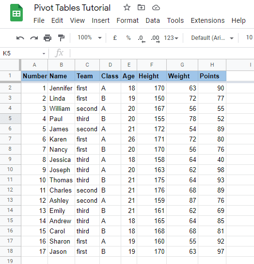
Let’s say that we have a data set containing information about seventeen different students from a school sports event.
We have each student’s team, class, age, height (in centimeters), weight (in kilograms), and points they won for their teams in the competition.
Let’s create a pivot table in Google Sheets to analyze and optimize this data!
In the top bar menu, go to Insert → Pivot table.

Once you create a pivot table, you’ll need to set a Data range for the values that you want to analyze. This range must include all cells that you want included in your pivot table analysis.
🚨 Note: When selecting your data range, make sure to include the headings of your data values as well.
Next, you can choose the destination to add your new pivot table. You can either insert it into the existing sheet, or you can choose to add it to a new sheet.
I recommend inserting the pivot table into a New sheet as it will provide sufficient space to analyze the data.
Once done, click on Create.

After you set up the pivot table parameters correctly, you’ll be able to see the pivot table in a new sheet on your screen.

But this pivot table doesn’t display much useful information yet — let’s configure it to summarize, analyze, and optimize our data!
Analyzing Data in a Pivot Table
Once we have a blank pivot table set up, we’ll choose how we want our data to appear on the table.
We have customizable Rows and Columns on the table according to our data values. Once we set the values of Rows and Columns, the pivot table will populate itself with the intermediate.
You can configure your pivot table with the sidebar on the right side of your screen, which contains the Pivot table editor. (If you close this window, you can reopen it by selecting any cell inside your pivot table.)
This editor will usually give you some Suggested values for your table customizations. These values should have you covered for most conventional analyses.
But in case you are working with an unusual data set (and because the Google AI is good but not perfect), it’s important to know how to manually insert values as well.
For this example, let’s say that we want to analyze the distribution of points among both teams and individual students at the school sports event.
To do this, we need a pivot table that displays the number of points scored, organized by both the student who scored them and the team for which they were scored.
Configuring Rows in a Pivot Table
Let’s start by configuring this pivot table’s Rows. The step will use a metric from your original data set as a row header for each row of your pivot table.
Click on the Add option beside the Rows section. You’ll see all the different headers from your original dataset listed here.
We’re interested in two characteristics of the points score: the student who earned them, and the team for which they were earned. To address the first characteristic, we’ll choose Name as the parameter for our rows.
Additionally, we’ll also keep the Show totals option checked. This is so we can also check the total score of each team (or the total of whatever value you’re analyzing in your pivot table).

Configuring Columns in a Pivot Table
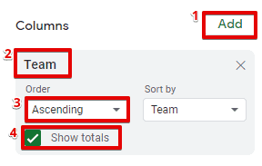
Next, we’ll set up the Columns. Your column configuration will apply a metric from your original data set as column headers for your pivot table.
Since we want to see the distribution of points across the three teams, we’ll choose Team as our column parameter.
Again, we’ll keep the totals checked. Additionally, you can also choose whether you want to organize the data in ascending or descending order. We’ve kept it in Ascending order for all our tables.
Pivot Table Values in Google Sheets
Once the Rows and Columns are set up, we’ll also choose what parameter we want to add to the Values section. This is what metric from our original dataset will populate the data cells in our pivot table.
Since we’re calculating the points secured by each student and team (our Rows and Columns), we’ll choose Points as the value parameter.
Additionally, we’ve kept the default SUM of the values as the indication in the grand total of Rows and Columns.
You could also set it up as average, product, maximum, or minimum as per your pivot table analysis requirements.

Once the parameters are set up correctly, you’ll be able to see the completed table on the left side of your screen.
As we had already chosen to see the total values, you can see the total points scored by each student, each team, and collectively by all teams and students.

In just one quick snapshot, we can see the total points made by each member for each team.
We can also see which student scored the most points, which team made the most points, and the total score made by all teams together.
Additionally, after you create the pivot table, you can still alter the values of the data range that you chose previously from the pivot table editor.
Note that if the data in your original data set changes, you won’t need to set up all the table parameters again! It will update dynamically as long as your data range still covers all the data.

Let’s also see different ways to analyze this data!
Different Ways to Analyze the Data of Pivot Table
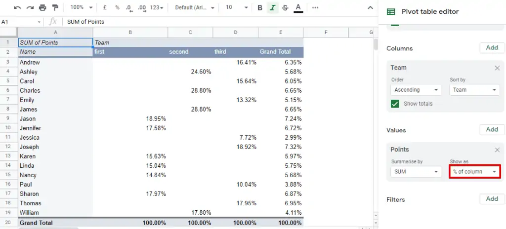
Suppose we want to check the percentage of the team’s points scored by each student. We can do this by adjusting the parameters for our Values.
We’ll choose to Show as % of column instead of the default option to display all points scored as a percentage of the total points in that column.
Let’s try another example. Let’s say that we want to add data about the points scored by each class without removing the students’ names and teams.
To do this, we’ll add the Class parameter to the Rows section of the pivot table editor without exchanging or removing the Name parameter.
Once done, we can see the table modifies itself according to the new parameter and shows the data in the same manner.
Now, the pivot table shows the names of the students categorized according to their class.
By adding another Row parameter, we can see the points scored by each class, each team, and each student — all in a single glance.

You can even hit the minus button ( – ) to expand or collapse each class list!
Even with the secondary row parameters hidden, the total scores for each class (and each team per class) will still be reflected on the table.

You can expand back the data whenever you need it again by clicking back on the plus icon ( + ).
Adding Filters to a Pivot Table
If you want even more customizations on your pivot table, read on!
You can add filters to customize and narrow your view of the data even further.
For example, suppose you want to analyze only the data of the students who are at least 20 years old.
Let’s see how to add filters in such a case.
Navigate to the Filters section on the pivot table editor and click on Add. Choose the Age parameter.
Once done, you’ll see that it’s currently Showing all items. Click on the dropdown to modify the items that you want to include in your pivot table.

In this case, you can deselect all age values less than 20. (Or, you can clear all selections and select only values greater than or equal to 20.)
Once done, click on Ok.

The pivot table will update to display data from only the chosen age group.
The total points and names of the students will also change accordingly.

Using Slicers
Similar to the filters, another handy feature is a slicer.
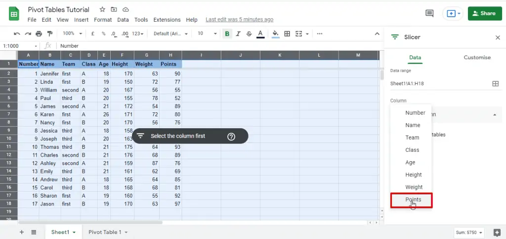
To add a slicer, select the entire range of your data set by clicking on the top left cell of your sheet and navigate to Data → Add a slicer.

Next, you’ll need to select a column. This gives you different options to slice your data. Based on your use case, select the one that fits the best.
For example, in our data we’ll choose to slice the data using the number of Points scored by each student.
Once we choose our column, we can click on the filet icon.
This further gives you the option to sort the data set based on a number of parameters. Let’s go ahead and select Filter by condition.
Next, select the condition as per which you would want to filter your data. In our case, we’ll choose the option of Greater than or equal to.
This is because we want to sort the students based on the points they scored individually.

Let’s suppose we only want to sort out the students who scored 80 or above points in the sports tournament.
To do that, we’ll add 80 as the value in this condition set.
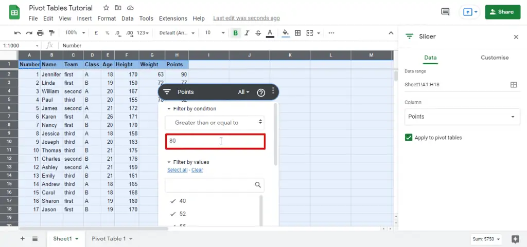
And that’s it. This will sort the data as per our filter.

This feature can be really helpful when you have sizable data and you want to filter a specific part of it.
Automation and Integration:
As you start to work with higher volumes of data, you realize that automation is key.
Tools like Zapier can help you automate data entry into Google Sheets, ensuring your pivot tables are always up-to-date.
For instance, you can set up automations to add new sales data to your sheet, which will then reflect in your pivot table.
FAQ
What is a pivot table in Google Sheets?
A pivot table in Google Sheets is a powerful tool that allows you to analyze and summarize data from a spreadsheet. It enables you to transform large sets of data into a more organized and meaningful format, providing insights and facilitating data analysis.
How do I create a pivot table in Google Sheets?
To create a pivot table in Google Sheets, you can follow these steps:
1. Select the data range that you want to analyze.
2. Go to the “Data” menu and click on “Pivot table.”
3. In the pivot table editor, specify the rows, columns, and values you want to include.
4. Customize the pivot table layout and options according to your analysis needs.
5. Click “Create” to generate the pivot table.
What can I do with a pivot table in Google Sheets?
Pivot tables offer various capabilities for data analysis in Google Sheets.
Some of the key actions you can perform with a pivot table include:
1. Summarizing data: You can aggregate and summarize numerical data using functions like sum, count, average, and more.
2. Grouping and categorizing data: Pivot tables allow you to group data by different criteria, such as dates, categories, or custom groups.
4. Filtering data: You can apply filters to focus on specific subsets of data within the pivot table.
5. Creating calculated fields: Pivot tables enable you to create custom calculations based on the existing data fields.
6. Visualizing data: You can easily generate charts and graphs from your pivot table to visualize trends and patterns.
Summary
So that’s all you need to know about pivot tables in Google Sheets!
This is especially useful when you have a massive amount of data that you want to summarize and analyze quickly.
Additionally, once you start creating different customized tables on your Google Sheets using your website data, you can even analyze that data using Google Analytics to create a better version of your site!
Marketers, what are your favorite use cases for pivot tables? Do you have any favorite tips or tricks for pivot table analysis? Let us know in the comments below!


")