Last Modified on January 30, 2025
What would you do with the data you’ve collected in your Google Analytics 4 property? Ideally, use it to analyze and gain insights, right?
The thing with GA4 and other analytical tools is that they are pretty good at collecting data and providing reports, but it comes down to us to use them to gain valuable insights.
For eCommerce, things can get pretty granular and it’s important to optimize user experience throughout the user’s journey on the website.
One such report is the Google Analytics 4 checkout journey report, which we can use to understand what’s happening with the potential buyers on our website.
This report was also found in Universal Analytics (UA), so are there any differences in GA4? We’ll cover that and other topics as mentioned below:
- Universal Analytics vs Google Analytics 4 Checkout Reports
- Interpreting the Google Analytics 4 Checkout Journey Report
- Limitations of the Checkout Journey Report in GA4
- Customizing Google Analytics 4 Checkout Journey Reports
Let’s dive in.
Universal Analytics vs Google Analytics 4 Checkout Reports
The checkout journey report isn’t something entirely new to GA4, and the community of GA4 users has been a little surprised that it took some time for this report to be available in GA4.
It’s a funnel report that shows the flow of users between different checkout steps, so you can see how users proceed from one step to another.
Generally, it contains several steps in the checkout flow: billing, shipping, payment, and transaction/purchase.
In UA, it is tucked away under Conversions → Ecommerce → Checkout Behavior.

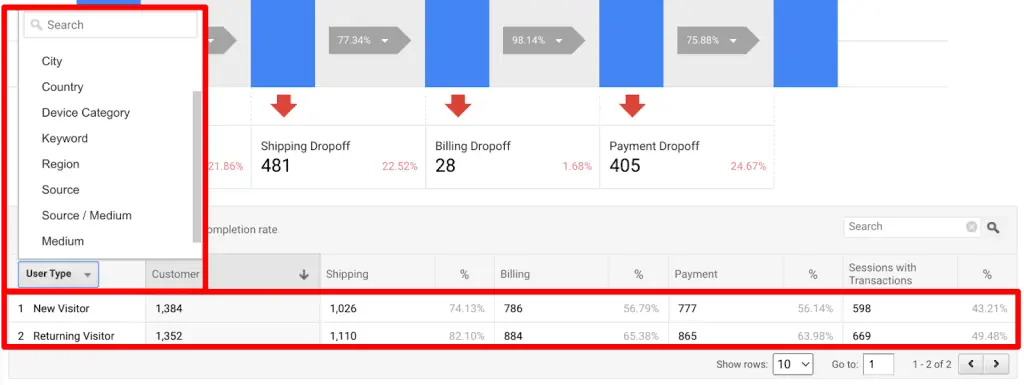
The report is somewhat customizable as well in UA, like the one shown below where the Customer is also added to the flow in this account.

The table below the graph shows the funnel breakdown into user types (returning vs new). Still, you can select other dimensions like city, country, device category, and so on.

These steps could be labeled in the eCommerce settings found under the UA account’s view settings based on your eCommerce tracking.

If you click anywhere on the blue bars, then you can create segments from them. The grey transition arrows allow you to create segments based on their chosen options for that specific step.

This is how the segment setup interface would look like:

In your GA4 account, the report is found under Reports → Monetization → Checkout Journey.

In some cases, the report is not available by default. However, you can add it by going to the Library in the bottom left → Edit collection → Add to the Monetization, or Drive online sales report, depending on which ones you’ve published.
If you don’t see the Library option, then you don’t have permission to add reports.

So, how does the Google Analytics 4 checkout journey report differ from the Universal Analytics checkout behavior report? In core principle, not much.
There isn’t much customization of the steps in GA4 as we saw for the labels in UA. It follows the standard GA4 eCommerce checkout events based on how you’ve implemented GA4 eCommerce event tracking.
These events are begin_checkout, add_shipping_info, add_payment_info, and purchase.
🚨Note: You cannot change the Google Analytics 4 funnel steps. It’s a closed funnel which means it includes users who started with the begin_checkout event and not any other step in the flow.
Hovering over the funnel bars shows the number of users each step has.

Unlike the UA report, you can’t create segments with specific steps, and in general, you can only add filters or comparisons to get more context. To do more with this type of funnel report, you have to go into Explorations.
The table below looks similar to UA but has its differences. E.g., the dimensions in GA4 are eight vs eleven in UA and there’s no separate tab for ‘Abandonments.’

The available dimensions are:
- Device category
- Country
- Region
- Town/City
- Language
- Age
- Gender
- Browser
GA4 allows you to adjust the size of the chart by clicking on the + and – buttons at the bottom right, which makes it easier to see the smaller bars. However, it is not available for smaller data sets. This action was not possible in UA.
When you zoom in too much so that the height of the bar is greater than the graph, GA4 adds a curve to the bar which indicates that the bar is not drawn to scale.

Now that we’ve looked at the differences, let’s see how we can interpret this report to gain useful insights.
Interpreting the Google Analytics 4 Checkout Journey Report
While it’s important to have the data come into your GA4 account, it isn’t very useful if you’re not sure how to read the data and use it to your advantage. Let’s slice and dice it.
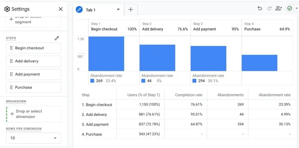
In the header of the graph, you can see each step in the funnel with the percentage of the users retained in that step, so 76.6% were retained in Add delivery (aka shipping) from Begin = checkout.

Below each bar, you can see the count of users who dropped off at each step, for instance at Begin checkout 257 users dropped off which is 23.4%, and the remaining 76.4% proceeded to the next step as we noticed above.
The table below the graph shows the absolute number of users in each step, which is further broken down by the dimension you’ve selected.

This interpretation is important because it allows you to understand user behavior through each step in the checkout.
Why? We can then optimize each step by investigating further with user tests, customer interviews, surveys, and/or incentivizing users to complete the conversion, especially as part of experimentation aka CRO program.
Otherwise, spending a lot of money on ads to bring users to your website and having them drop off at the bottom of the funnel will be an expensive adventure.
Another benefit of this report is that if the data in the flow doesn’t make sense, then you would know that there’s something wrong with your analytics setup which could be easily overlooked.
But, as we discussed, the report is somewhat limited on its own.
Limitations of the Checkout Journey Report in GA4
While the report can be quite helpful in understanding what’s happening in your checkout funnel, there are some limitations to this report.
- You cannot edit the funnel steps. They are fixed, which doesn’t make it possible to add or remove any steps you want.
- It’s not possible to use any more dimensions other than the ones available.
- You cannot add segments, which means you can’t do a lot of advanced analysis.
- The funnel cannot be changed into an open funnel where users can enter at any step.
- You cannot see how much time a user spends on one step on average.
- There’s only one type of visualization available, which is the steps or vertical bars.
- You cannot see if there are any other actions users took at any given step.
Thankfully, it’s not all doom and gloom and we can overcome all these limitations.
Customizing Google Analytics 4 Checkout Journey Reports
There are two ways to customize the report: the first one is through the Google Analytics 4 checkout journey report and the second way is creating a funnel exploration from scratch by defining the checkout steps.
Both lead to explorations. We will focus on the first one.
Once you’ve opened the report, click on the pencil icon that says Edit comparisons on the top right.

This will open the Edit comparisons interface in the sidebar, where we will click on the Explore button at the bottom right.

Now your checkout behavior report will open as an Exploration.

The Settings column lets you customize a few things. You can change the type of visualization from standard (steps) to trended (line chart).

With the trended funnel, you can also look at the timeline for all or each step.

Here you also have the option to make the closed funnel into an open one, i.e., the users could enter at any step. This understandably changes the number of users you see from step 2 onwards.

In the Steps, you can do a lot more customization from editing the steps to any other specific details those events should have by clicking on the pencil icon.

This gives you the list of all the events in the funnel steps as well as other conditions that you can play with, like their parameters or whether they are indirectly followed by or directly, etc.

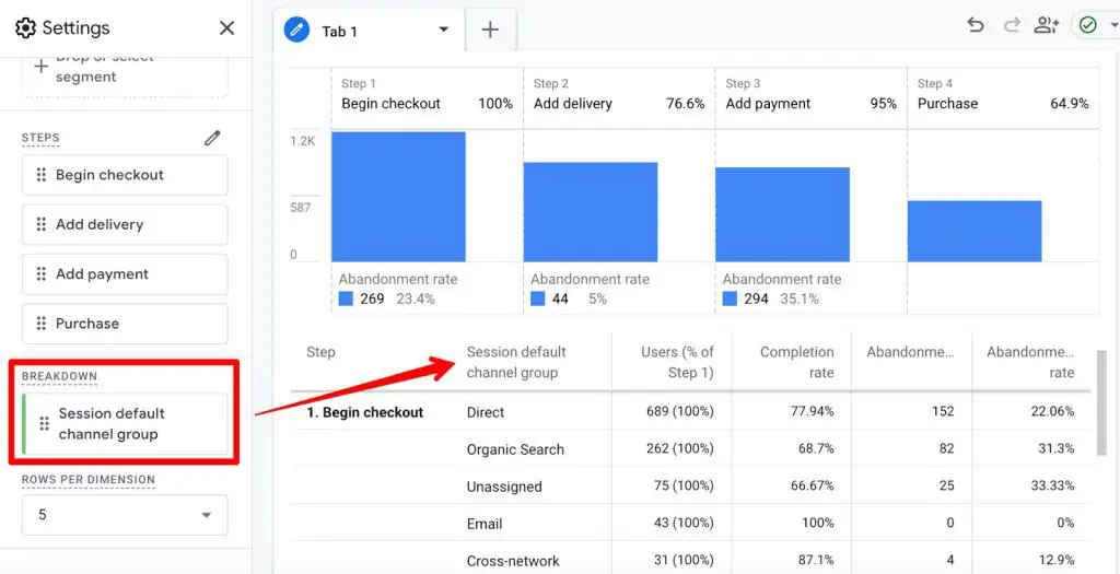
The breakdown of users into different dimensions here will give you more options than the eight dimensions in the standard report.
For instance, we can add the Session default channel group (mind the scope of dimensions) as our breakdown dimension.

We could also simply choose to not have any breakdown dimension for the sake of simplicity.

Rows per dimension applies to the breakdown dimension and simply limits the number of rows shown for that dimension. It’s handy if the chosen dimension has a lot of value.
The Show elapsed time toggle shows the average elapsed time for each step except the first one. The cool thing about it is that it shows the time for the breakdown dimension as well.

The Next action option generally works well with the Event name dimension, as it shows the Top 5 Next Actions users take at that funnel step apart from the main funnel event.
These events are only shown by hovering over the bars.

Filters will help you to filter out any data based on your specified conditions.
Lastly, the Variables column is where you can choose the exploration name and date range. You can also add Segments that you can use in the Segment Comparisons in the Settings column.
This is where you can choose the breakdown dimension as well, but you cannot choose metrics as funnels are only based on users (which are the Active users in GA4).

Remember the zoom-in zoom-out option we saw in the standard checkout behavior report? It’s also available in the funnel exploration, if there’s more data and the bars are quite small.
So, as you’ve learned, taking the checkout report to the explorations fuels the customization part and there’s a lot more we can do compared to the standard Google Analytics 4 checkout journey report.
If you want to just get a quick idea about your checkout funnel’s performance, the standard report should be good enough. But if you want to get more out of it, then explorations are your friend.
Summary
So, we learned about how the Google Analytics 4 checkout journey report is different from its predecessor.
We also learned how to interpret the data in the checkout journey report because collecting it is just half the job, and we touched on why it’s important to understand user behavior through each funnel step.
The limitations of the report gave us an idea of when it’s a good idea to use the standard report and when we should take things to the explorations.
Quick and dirty analysis can be done with the standard report, but if you want to get some juicy insights then it’s time to move to the explorations.
Funnel exploration is where we learned about customizing this report and giving it superpowers like changing the funnel visualization, editing the funnel steps, making it open or closed, and adding segments.
These powers extend to selecting breakdown dimensions apart from the ones available in the standard report, showing elapsed time, top 5 next actions, and adding any filters.
If you’re in the market to learn more about GA4’s reporting capabilities then our Google Analytics 4 Reports Guide will take you on quite a ride!
Have you used the Google Analytics 4 checkout journey report? How helpful have you found it on its own and in explorations? Let us know in the comments below!


