
Last Modified on November 16, 2023
Are you constantly setting new custom date ranges every time you update your data reports?
If you are…did you know that Looker Studio (ex Google Data Studio) can configure those rolling dates for you automatically?

Subscribe & Master the Basics with our FREE Looker Studio Course
Using the Advanced Date Filters feature, you can input rolling dates into any of your dashboards on Looker Studio.
For example, you can create a data visualization based on the last two weeks, without having to update your date range each day.
In this tutorial, I will teach you how to configure a dashboard with a timeframe that is always relative to the current date using Looker Studio’s Advanced Date functionality.
💡 Top Tip: Adding tooltip annotations is also a great way to provide direction and context to viewers and make the dashboards interactive.
Learn the three most important elements to rolling timeframes:
- Adding a date range to your Looker Studio report
- Customizing your rolling timeframe using advanced settings
- Comparing metrics over advanced date ranges
Ready to get started? Then let’s dive in!
Add Standard Date Filters to Your Looker Studio Report
Rolling Time Frame with Static and Dynamic Dates
The Advanced Date Functionality, can now be found in all the date pickers that we have in Looker Studio.
This tool allows for uniting all marketer data in one place (spreadsheets, Google Analytics, Google BigQuery, Google Ads, etc.), building detailed, easy-to-understand data reports, visualizing results with charts and graphs, and allows teams to work on dashboards and reports through permissions.

Open the report that you want to give a rolling timeframe.
If you don’t have a report with a data source attached, check out our Looker Studio Tutorial to get started.

Click on Edit.
Next, we want a chart that will be relevant to our rolling time frame. Let’s create a time series chart to see what options we have for selecting the date range.
Under Add as chart, select Time series chart.

On the Looker Studio space, the time series chart will be displayed.

We want to see the number of sessions over time for this website. To see more sessions, drag the lower right side of the time series chart to the right to extend it.

By default, the date range that is applied to a chart in Looker Studio is Auto. This default range lasts 28 days.
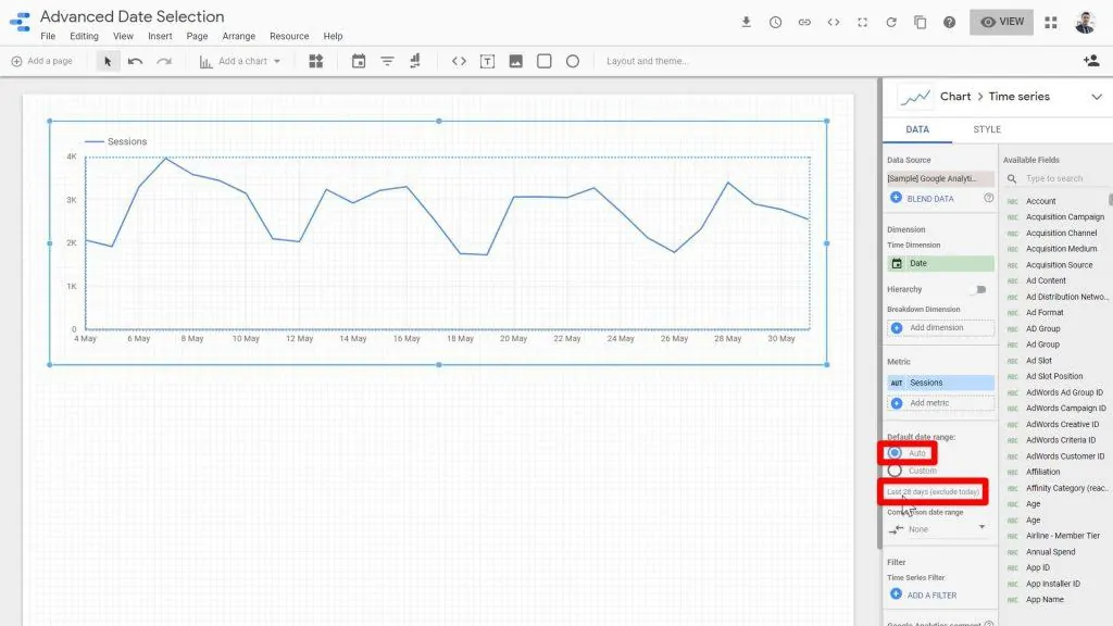
However, we have a variety of customizable options. So we can choose for this to show other periods of time by clicking on the Custom default data range.

Let’s see what our options are. We’ll click on the date range selector below the Custom date range option.

Then, click on the date range dropdown menu at the top right section of the window.

There are several types of dates in the dropdown menu. Among them is Fixed which is a simple range set by a specific start date and end date.
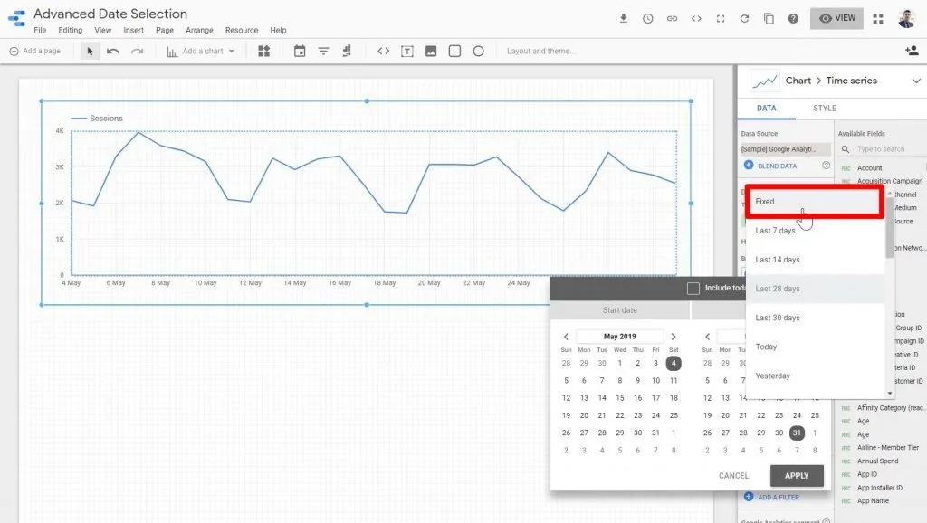
Instead of the last 28 days, we can choose this to always show, for example, May 1st to May 14th.
After selecting a specific date range, click Apply.

Click on View to see a preview of the date range selected.

Regardless of the date when the end-user accesses this chart and views this report, they’re always going to see the report from the first of May to the 14th of May.

Rolling Time Frame with Dynamic Dates
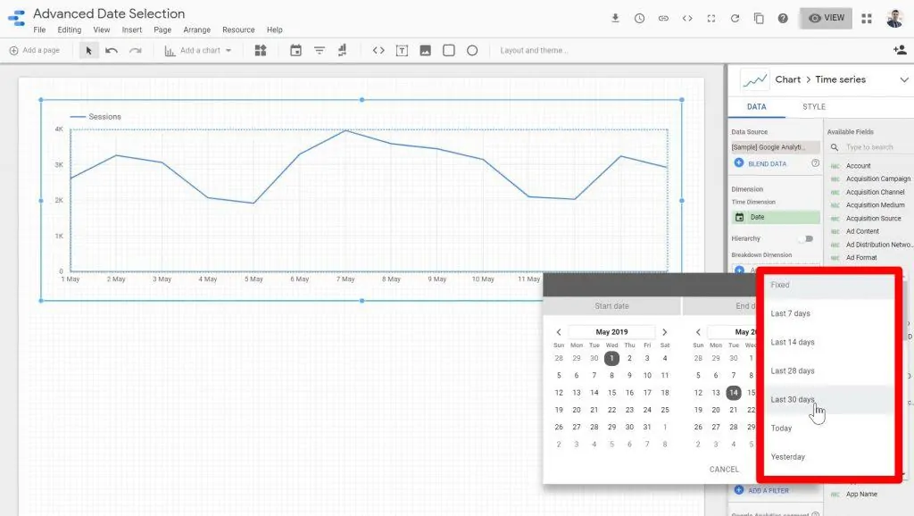
The fixed date option is static, but we also have some dynamic options that are based on the date that the report is being accessed.
Some of these standard settings allow you to display data from the last seven, fourteen, twenty-eight, and thirty days.
There are also options for reporting on the last calendar week, calendar month, quarter, and year.
But what if we wanted to set the date range for this chart from two months ago until two weeks ago? Or the last week before yesterday instead of today?
What about data from the last three weeks, but not including the days from the current week?
We can’t do any of those with standard date filters. Instead, we’ll need to customize our rolling timeframe using the advanced settings.
Advanced Date Selection
With advanced date selection, we can customize all kinds of date ranges and timeframes for our data reports.
When you open your date range control, click on the Advanced option from the dropdown.

First of all, we need to select the start date. For the date type, we can choose a fixed date.

For example, we want to report all data from the first day of January 2019 all the way up until last week.
The start date will be Fixed. You can toggle or type in the year, then select the month January.

Then, click on the date for the month where you want your data report to start.
So the first day included in our report would be January 1, 2019.

Select the end date for Today.
We don’t want our report to actually include all data up to today, but we’ll address that next.
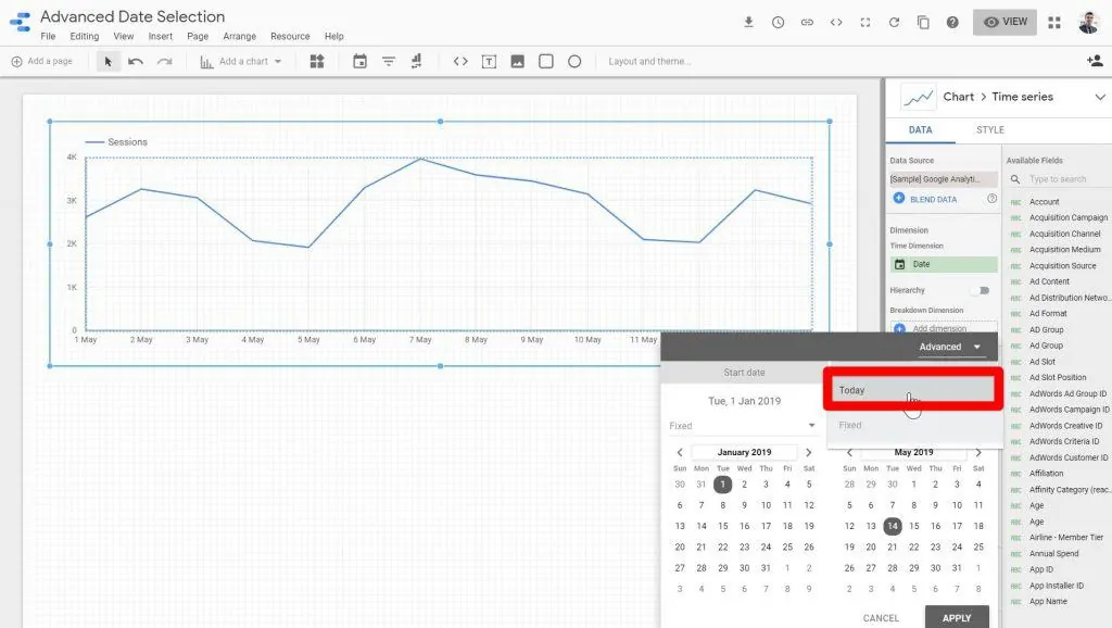
The option for Weeks (starts Monday) seems like a better choice, so we’ll replace the Day option with that.

Then, click Apply.

Once you’re back on the Looker Studio page, click on the View button.

Now, whenever a user views this report, they will see that the report starts on January 1st and shows data all the way up to the last week.

You can also set a dynamic start date for your reports. Let’s try this out.
Again, click on the date range menu.

Let’s say we want to see the data from four weeks ago to last week.
On the start date section, we’ll select Today, click on Minus, input 4 on the text window, and then select Weeks.
Then, on the end date section, we’ll select Today, click on Minus, input 1 on the text window, and then select Month.

Click Apply to save the changes.

After applying the changes, the chart will now reflect the data from the first of February until the end of May.

💡 Top Tip: To make your reports stand out, you can create interactive buttons in Looker Studio.
Comparing Metrics for Advanced Date Ranges
We can use the advanced date range settings for more than just time series charts.
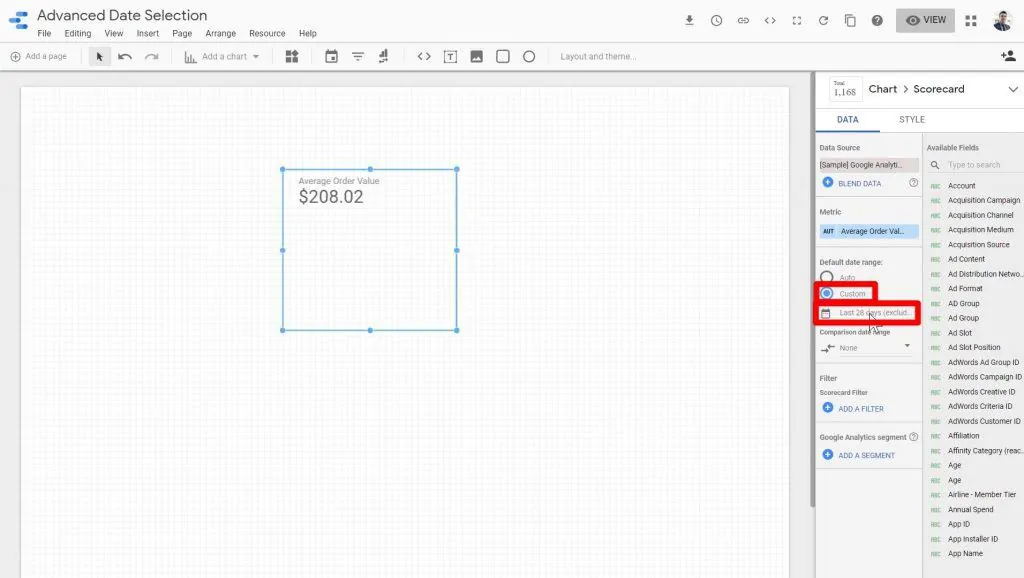
Let’s try adding a scorecard to demonstrate changes in statistics (like an average) between custom time periods.
Click on the Add a chart dropdown then select Scorecard.

Since a scorecard shows you a single number, it’s good for things like important total counts and averages.
In this case, I’d like a scorecard that shows me the average of a metric called Order Value.
Under the Available Fields section, type the metric that you want to include in the search bar.
Once the desired metric shows up, drag it to the left under the Metric section.

To start off, click on the radio button for Custom and the date range section.
Then, click on the date range dropdown menu.

Let’s think about this hypothetical situation where the client wants to see the performance of their website in terms of Average Order Value over the last seven days compared to how it performed from January 1st to the last seven days.
For this, we want to first set the custom date range for the actual value of this scorecard to be from the last seven days until today.
To do this, select the Last 7 days option on the dropdown menu.

Click Apply.

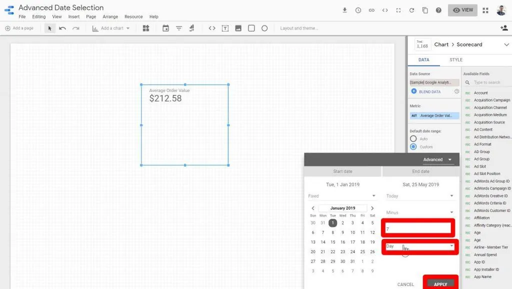
Then, we want to compare it to the Average Order Value from the first of January, up to eight days ago.
Click on the Comparison date range dropdown.

To create a custom comparison date range, let’s click on the date range dropdown menu again.

Then, click on Fixed under the start date section.

We also need to set the date which is the first of January 2019.

Set the end date to Today minus seven days. Then, click Apply.
Now, the workspace shows the Average Order Value for the last seven days.
It also shows that the value is lower compared to the Average Order Value performance from the beginning of the year to the last seven days.
There’s still one slight problem—it’s not really clear to the viewer what the comparison date range is.
Let’s format our charts so that our information is clear. In the right sidebar, click the Style tab.

Uncheck the box for Hide Comparison Label so that our scorecard actually shows us what the main value is being compared to.
We can see here that the domain value has decreased by 1.3% compared to our custom comparison date range.
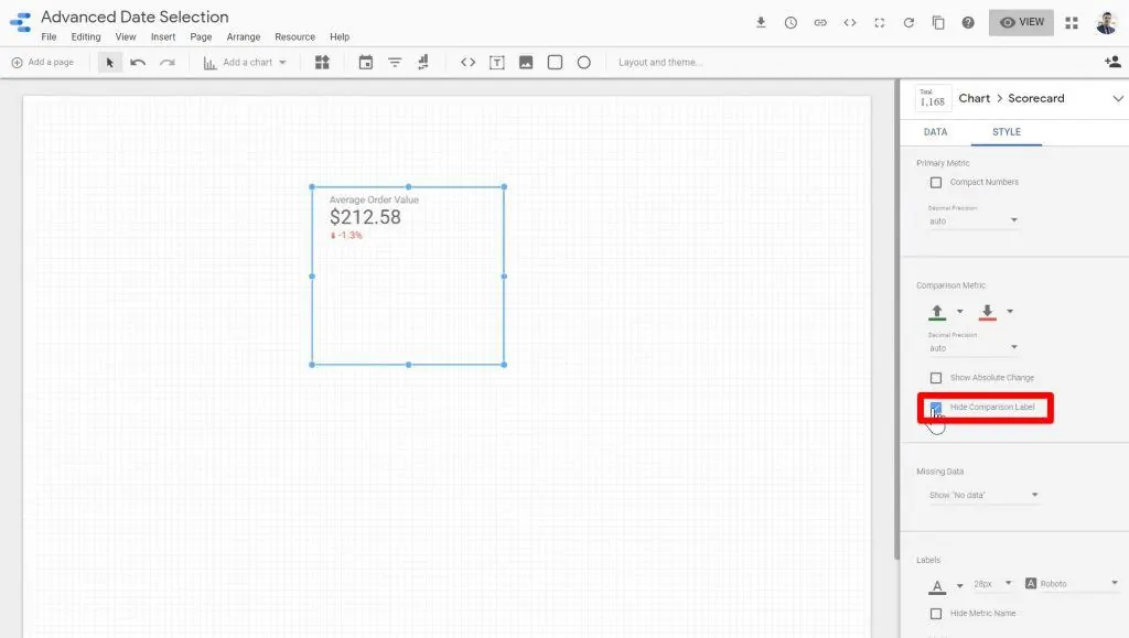
If you’d like, you can also check the box for Show Absolute Change. In this case, it shows us that the Average Order Value is about $3 less than it was from January 1st to May 21st.

So as you can see, not only can we use the advanced date ranges for our main charts, but we can also use them for comparison date ranges.
If you feel like upgrading your GDS game, I’d recommend learning how to pull data from third-party data sources into Looker Studio using Connectors.
FAQ
How can I add a date range to my Looker Studio report?
To add a date range to your Looker Studio report, open the report in edit mode, select the chart or visualization you want to apply the date range to, and choose the desired date range option from the date picker.
How can I compare metrics over advanced date ranges?
To compare metrics over advanced date ranges, you can add a scorecard to your Looker Studio report. Specify the metric you want to compare, set the custom date range for the main value, and define the comparison date range. This allows you to analyze changes and performance trends over different time periods.
How can I make my data reports more interactive using Advanced Date Filters?
To make your data reports more interactive, you can add tooltip annotations and create interactive buttons in Looker Studio (formerly Looker Studio). These features provide direction, context, and enhanced interactivity to engage viewers and improve their understanding of the data.
Summary
In conclusion, Looker Studio’s Advanced Date Filters have a variety of features and functions that are perfect for displaying your data in an informative and easy-to-read format.
This tool is a great help for marketers who want to specify the performance of their campaigns over a given time period.
Its features include the rolling time frame with static and dynamic dates, advanced date selection, and metric comparison.
The rolling time frame with static and dynamic dates presents a combined feature that allows users to use a fixed date when generating reports.
The rolling time frame with dynamic dates is flexible in a way that users can specify specific date ranges per week, month, and day.
The Advanced Data Selection, however, can help users generate a very specific report with a mix of both dynamic (fixed) and static features.
Metrics per given dates may be compared using the scorecard feature which compares two reports’ statistical changes over a given amount of time.
Interested to explore all the other features of Looker Studio? Learn more about it when you read through our Getting Started Guide.
What are your favorite date range tricks? Do you have a favorite use case for rolling timeframes? Let us know in the comments!
Subscribe & Master the Basics with our FREE Looker Studio Course


")
Can date range control filter the score card for current quarter? Example; 1st November to 15th November I have selected in date range control but I need my score card to show 1st October to 15th November data. Will this be possible dynamically
My company’s fiscal calendar starts in May, and the fiscal weeks go from Friday to Thursday. Obviously not ideal for showing any sort of trend or WOW, MOM, YOY delta in Data Studio.
Do you know of a workaround for this?
This is a great function and really well explained. Unfortunately I cannot see the “Default Date Range” option in my settings. Is it only available in the PRO version? Or do I have to set presettings for this?