
Last Modified on June 6, 2024
Did you know that 60% of global internet users use a mobile device to go online?
Mobile devices have become a staple of everyday life for millions of people. According to Statista, mobile ownership, and internet usage are forecasted to keep growing in the future. Currently, more than 90% of internet users use a mobile device at least some of the time.
Additionally, Google predominantly uses a site’s mobile version for indexing and ranking, also known as mobile-first indexing. All this means is that it’s essential to build mobile-friendly dashboards when working with Google Looker Studio.
If you value user experience and retention, your Looker Studio dashboards should cater to mobile users. We’ll show you strategies for mobile audience targeting and the suggested practices to build mobile-friendly dashboards.
Here is an overview of what we’ll cover:
- Mobile-Friendly Dashboard Process
- Screen Resolution for Target Audience
- Screen Resolution for the Whole World
- Build Mobile-Friendly Dashboards from Scratch
- Previewing Dashboards in Mobile Mode
- Embedding Dashboards
- Instant Mobile-Friendly Dashboards with One Code
Let’s get started!
Mobile-Friendly Dashboard Process
Some of you may be thinking: surely a button must be available somewhere to make our dashboards mobile-friendly, right?
Maybe it’s hidden somewhere or needs a few tweaks to the settings first.
Unfortunately, this option is not yet available in Looker Studio. So, let’s look at two ways of making mobile dashboards:
- Building from scratch
- Convert using CSS
When building from scratch, it is important to know who the target audience is so that we can design our dashboard accordingly. Also, do not be intimidated by using CSS, as it can help us build mobile-friendly dashboards in no time.
Screen Resolution for Target Audience
First, ask yourself: Do you want to optimize for a specific target audience, or do you need to optimize for the whole world?

Selecting a subset of users allows you to accommodate the specific needs of your target audience. On the other hand, optimizing for the whole world lets you reach the most people.
First, target audiences are the users most valuable to your business or who meet specific criteria. How do you determine the mobile screen resolution they use? You can use an analytics platform like Google Analytics 4 to answer that.
In GA4, go to Reports → Tech → Overview.

This report details the technologies your visitors used when they viewed your website. Here is a bar graph with the number of users by screen resolution.

Screens for designing mobile dashboards can go from 360 pixels to 414 pixels wide. In our case, we’re only interested in the width, not the height.
As you can see, the most popular mobile screen resolution our users use is 390×844.

To view a more detailed report on our screen resolutions, click View screen resolutions.

You’ll redirect to Tech details. Here, you’ll see a detailed table for our screen resolutions.

If you’re having difficulty finding your mobile screen resolutions because you have a lot of desktop users, add a secondary dimension to the table.
Click on + beside the screen resolution.
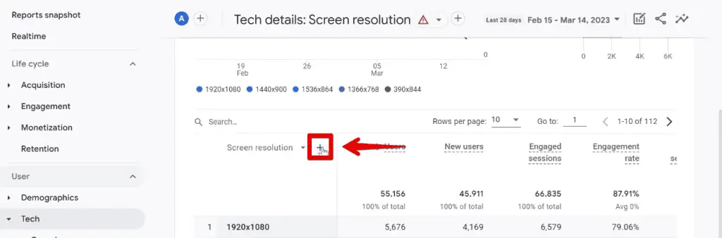
Next, select Platform/device → Device category.

With this, you can quickly differentiate between desktop and mobile screen resolutions. As confirmation, the 390×844 dimension is the top mobile resolution in this table.

You could also use this table to optimize for specific users. If you have users that come from a given region of your target market, you can add them in.
First, you need to remove the device category dimension by clicking ✖.

Now, we can add a new one. Select Geography → Country.

The good thing with this is that we can now analyze each screen resolution. We can see the number of Users, New Users, and Engaged Sessions for each.

Additionally, you could sort the list by which is more valuable for Conversions or Total Revenue.

If you want to dive into your data further, you can start building exploration reports.
Add the screen resolution dimension to the rows section and the relevant metrics to the columns section. The only thing left to do is to add a filter for device categories that match mobile.
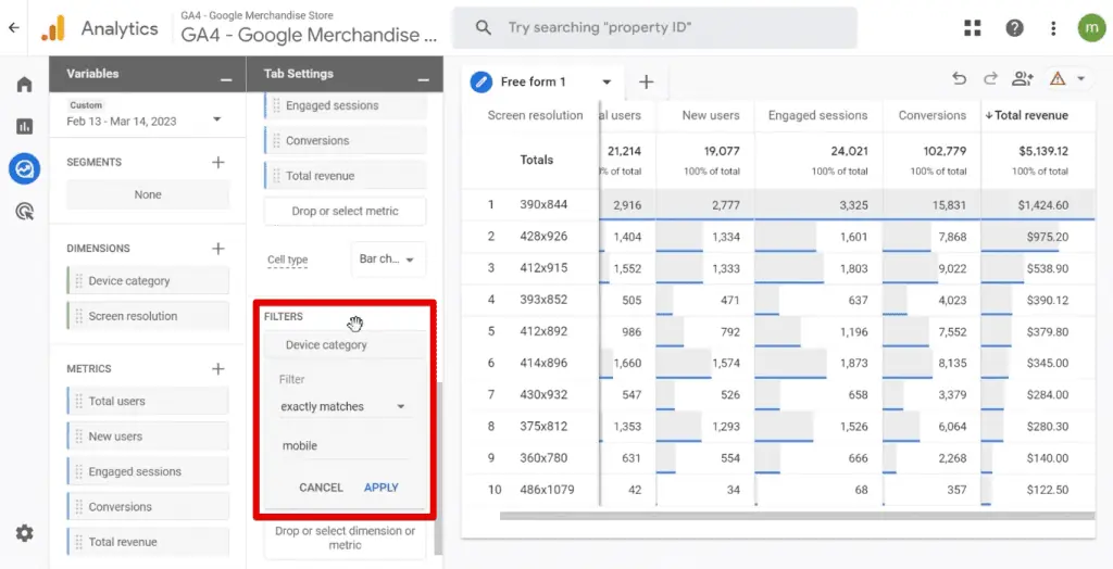
As you can see, the 390 x 844 screen resolution is the top for all the metrics we have listed.
Screen Resolution for the Whole World
What if you don’t have a target audience yet? In this case, you should optimize for the whole world or share information with a general audience.
Let’s look at statistics websites like StatCounter to determine the most used screen resolutions worldwide.

Here, we can look at a specific platform and region.

Since we’re building mobile-friendly dashboards, let’s only look at the mobile screen resolutions.

Pointing our cursor to the top line, the most used mobile screen resolution is 360×800.

For this example, we’ll build mobile-friendly dashboards based on the 390×844 screen resolution, since it caters to most mobile visitors to our website.
Build Mobile-Friendly Dashboards from Scratch
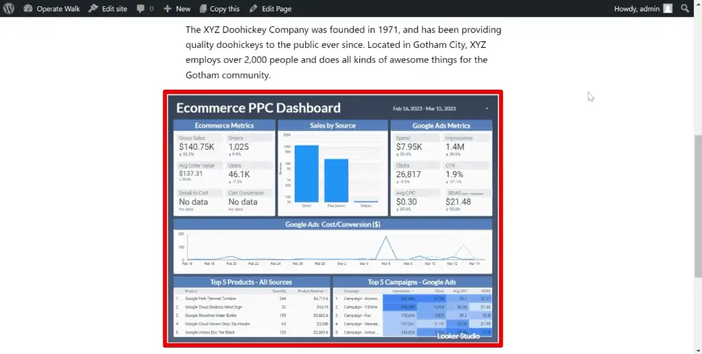
We’ll rebuild this dashboard in Looker Studio:

We assume you already know how to build a basic dashboard on your desktop. If you have any problems following along, you may check out our Google Looker Studio tutorial first.
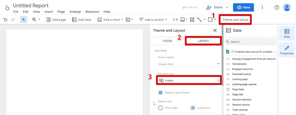
First, let’s go to Theme and Layout → Layout. Set the navigation type to Hidden.
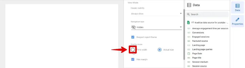
Next, set the display mode to Fit to width.
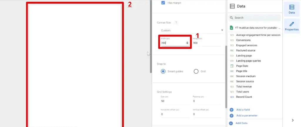
Next, we’ll set our canvas size. We have decided to base this on the most used resolution from our GA4 account. In addition, we’re only interested in changing the canvas width.
Set the width to 390 and notice how the canvas size changes.
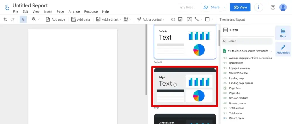
Next, we’ll select the Edge theme.
Now, we are ready to start building our dashboard. First, let’s add a rectangle as a banner on top. Next, add our logos.

Select both logos and go to the Style tab. Next, change the background color.

By default, any uploaded image will have a background color set to white. Change this to transparent.

🚨 Note: Your logos should still have a transparent background before uploading to the dashboard. Setting a transparent background color will not change anything if the original background is colored.
Resize the logos and position them on top of our dashboard.

💡 Top Tip: When you build mobile-friendly dashboards, you shouldn’t overcrowd them. Compared to dashboards made for desktops, do your best to summarize data and only keep what’s essential. A great way to summarize data is to use scorecards.
Insert a scorecard into the dashboard, then change the metric to Total users.

Next, we’ll add a comparison date range.

Select the Previous period, then click Apply.

Duplicate the scorecard, then change the second metric to Total revenue.

Next, select Add a control → Date range control.

An issue can arise when you decrease the size of the date range control. As a result, users may find it hard to understand what’s happening.

Here’s a trick on how to deal with this issue.
Insert another rectangle. Change the background color to transparent and the border color to white.

Next, insert text and type DATE. Set the font color to white.

Insert a date range control, then set the opacity to 0%.

Finally, position the date range control over the rectangle and date label.

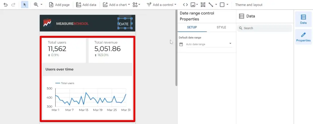
Now, let’s add a section showing the number of users over time. First, add a section header. Next, add a time series chart.

Now, select a date range. For this example, let’s set it to the whole of March 2022 and click Apply.

Notice the changes to the scorecards and time series chart. The data in the scorecards is lower, and a comparison percentage from the previous period shows.
Similarly, the time series chart only shows data for the selected period.
Great! You should now have a good idea of how to build mobile-friendly dashboards in Looker Studio.
Previewing Dashboards in Mobile Mode
Let’s see how this dashboard will look on mobile. First, let’s go to the View mode.

To preview dashboards in mobile mode, we’ll need to toggle the device toolbar from our Chrome Developer Tools.
Right-click on the page, then click Inspect. Alternatively, you can click CTRL + Shift + I on Windows or Cmd + Shift + I on Mac.

We’ll toggle the device toolbar by clicking on the button beside the Elements tab. Next, let’s change the width to 390.

Another great addition when you build mobile-friendly dashboards is to have navigation menus.

If you want a smaller footprint on your dashboard, you could create another type where you have navigation bars.

Embedding Dashboards
Now, let’s see how to embed dashboards on our website.
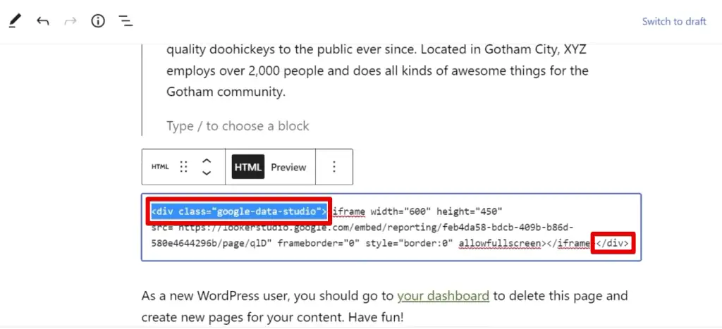
Go to File → Embed report.

Select the code and copy it, or click Copy to Clipboard.

Paste this in your webpage source code, and enclose it in a <center> tag – one at the beginning and one at the end with a forward slash.

Here is the result we should see:

Instant Mobile-Friendly Dashboards with One Code
Let’s look at the second method of how to build mobile-friendly dashboards. The key difference is you can start with an existing dashboard for this method.
Here, we have a dashboard, and we’ll force it to be responsive on a mobile display.

To achieve this, we’ll look at a fantastic tip shared by Elliott Mellichamp for having responsive Google Looker Studio embedded dashboards. Here, we only have to add some HTML and CSS.
First, we need to copy the code to embed this report. Next, paste this code on your web page builder. The only difference is you need to add a div container at the start and close it at the end.
In the div container, rename the class name to anything that can help you distinguish this container from other elements on your webpage.
Let’s preview our webpage and verify that we’ve embedded the report.
Let’s see how this looks on mobile. First, let’s open the developer tools. When you interact with the dashboard, you can see that it has not been made responsive.

This is because we did not add the CSS code yet. Go back and copy the code in step 3 of Elliot Mellichamp’s guide. Paste this CSS rule on your page.

Before saving these changes, pay attention to the naming you have for your div container. This name should be the same in your CSS code.
If we preview our website, we can now interact with the elements of our dashboard.

This method will work best if you don’t have much data on your dashboard. Otherwise, you’ll still have to zoom in when you use your mobile.
If you have an existing dashboard that displays multiple data, it may be better to build one from scratch and use the first method we covered.
🚨 Note: Simplify and improve the effectiveness of your dashboards with our handy guide.
FAQ
How can I determine the screen resolution for my target audience?
You can use an analytics platform like Google Analytics 4 to determine the screen resolution used by your target audience.
In GA4, navigate to Reports → Tech → Overview to view a report showing the number of users by screen resolution.
How can I optimize my dashboard for the whole world?
If you don’t have a specific target audience, you can optimize your dashboard for the whole world. You can use statistics websites like StatCounter to determine the most used screen resolutions worldwide.
How can I embed dashboards created in Looker Studio on my website?
1. Go to File in Looker Studio.
2. Select “Embed report”.
3. Copy the provided code.
4. Paste the copied code into your webpage’s source code.
5. Optionally, enclose the code in a <center> tag to center the dashboard on the page.
Summary
Those are two methods on how to build mobile-friendly dashboards in Looker Studio. We’ve looked at how to create one from scratch and how to convert an existing dashboard using CSS code.
Aside from ensuring your audience understands the content of your dashboard, you should also pay attention to creating a good user experience.
Check out these top 3 Looker Studio dashboard enhancements and techniques to make your dashboards interactive and stand out.
Are your dashboards mobile-friendly? Which method did you prefer to use? Let us know in the comments below!


")