
Last Modified on January 7, 2025
Do you want to create effective dashboards?
No matter how proud you are of the dashboards you’ve built, the effectiveness of your dashboards depends on whether your clients readily gain insights from them.
One of the dashboard design best practices is to avoid overcrowding your reports. If the intended users no longer know where to look due to the multiple elements on your dashboard, you should go through our checklist for decluttering your dashboard.
We’ll cover the process of removing distractions in Looker Studio, so your work can help users focus on what truly matters and provide a much more comprehensive analysis of your data.
Here are the ways you can create effective dashboards in Looker Studio:
- Decluttering Shapes
- Decluttering Maps
- Target Market Filters
- Reducing Report Height
- Reducing Overcrowded Charts
Let’s dive in!
Decluttering Shapes
For this guide, we’ll use one of my favorite dashboards from the template gallery: Acme Marketing.
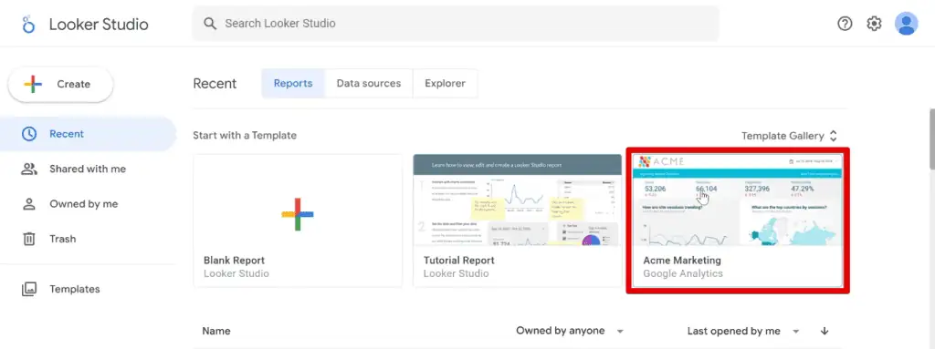
Here is the dashboard we’ll be working on in this tutorial:
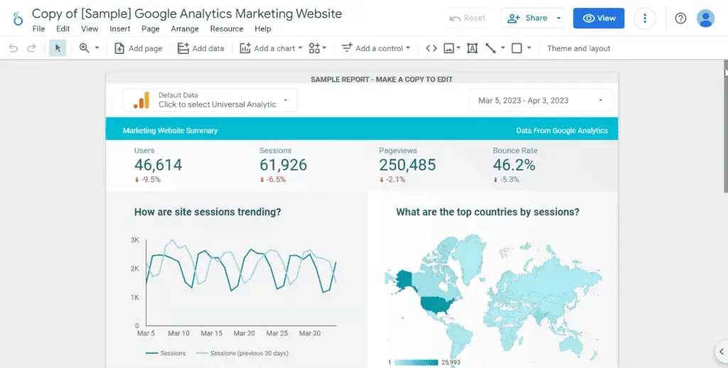
I can tell you that we can remove or modify at least five components to improve your analysis and design. What if we could reduce all of the information here into a dashboard less than half its size, like this one?

Let’s see how to achieve this and create effective dashboards in Looker Studio. First, we have this blue header bar.
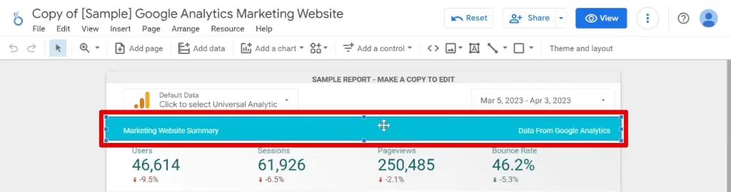
Header bars are standard in most dashboards. They tend to be a bit larger and have a logo added somewhere. This header bar is small and doesn’t pose much of a problem.
However, if I ask you to close your eyes and tell me what insights you remember, this header bar will likely be lingering at the back of your mind.
💡 Top Tip: Some header bars can act not only as a decorative element but also as a functional one for your dashboard. One example you should try is having navigation bars, especially if your report has multiple pages.
Part of removing distractions to create effective dashboards is to remove shapes or backgrounds that have high contrast.
Let’s delete the header bar and move the scorecards up to fit the space left behind.

Decluttering Maps
Maps are the next element we must remove to create effective dashboards.

We all love maps, and I am guilty of adding them wherever because they look nice. However, are they relevant enough to place them in your reports?
The answer lies with your target audience.
For example, if sessions and page views are significant metrics for your business, the United States brings in the highest figures.
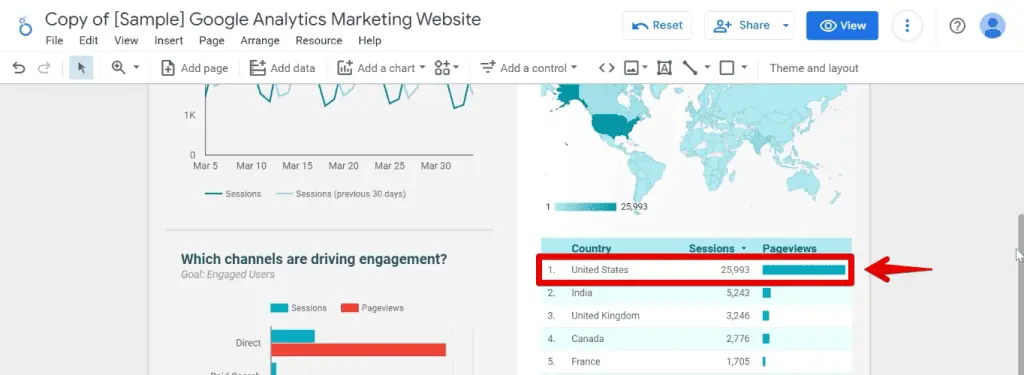
Unless you already have or are exploring new target markets, the United States will likely be your primary target market. Therefore, why should you dedicate a large section of your report to listing other countries?
It may be difficult, but let’s remove the map and move up the table.

For this table, we have two choices. If you have other target markets, you can reduce the rows in this table and only show the top 5 countries.

However, if the US is the only country where you provide goods and services, we can delete this table and add a filter instead.
Target Market Filters
We can create a filter, and then apply it to each chart or add a filter at the report level.
Go to Page → Current Page Settings.

Next, click Add a Filter.

To ensure we only see data from the US, we need to create a country filter. Start the formula with:
Include Country Equal to (=)This formula will keep the data where the country field equals our target market.
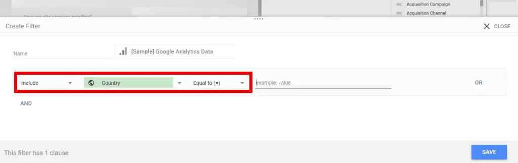
To finish our filter, type Unites States, then click Save.

Next, let’s keep the section for the channels driving engagement. Select the header text and bar chart, then move them up to where our map was previously.

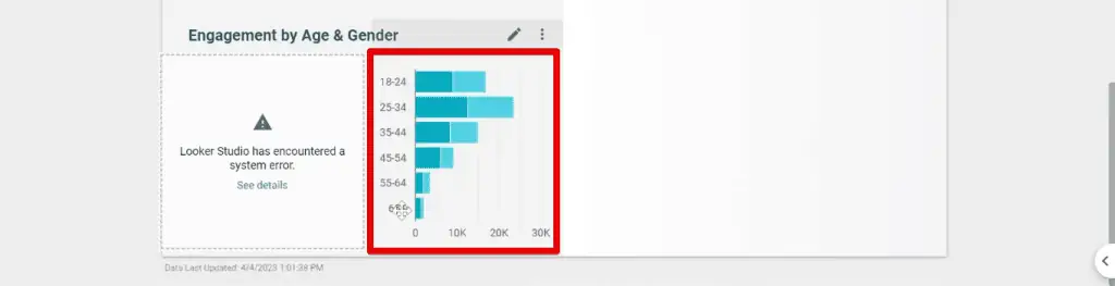
Checking the remaining elements in our dashboard, we have a section showing demographic data. We have a bar chart showing different age groups, divided further by male or female.
For age, we could use a data control instead of this chart.
💡 Top Tip: Check out our guide on How to Make Looker Studio Dashboards Interactive to learn more about data controls, date range filters, and data source controls.
Click Add a Control → Drop-down List.

Place it on top, beside our other controls. Next, change the control field to age.

Now, your users can select their age groups of interest. For example, we can filter only those aged 18 to 44.

Let’s say we are interested in the second group, those aged between 25 and 34. More specifically, we want to look at the female demographic instead of the male one.

We could use filters to select this specific demographic. Let’s delete these charts and headers.
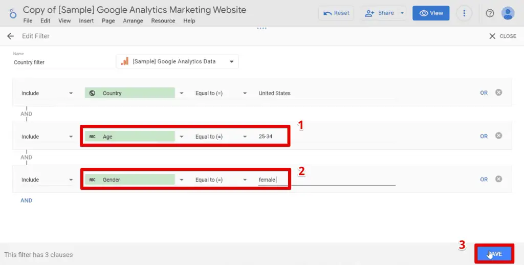
Next, go back to our initial filter by going to Resource → Manage filters.

Let’s Edit our initial filter.

To add another condition, click AND.

These are the formulas for our additional conditions:
Age Equal to (=) 25-34
Gender Equal to (=) female
Add these conditions to the filter. Next, click Save.
Now, we can delete our age data control.

Reducing Report Height
The last step in learning how to create effective dashboards that apply to our example dashboard is to remove the blank space below our dashboard.

For this, we’ll reduce the height of our canvas.
Go to Page → Current page settings.

In the Style tab, reduce the height to around 500 px.

Let’s preview this by clicking View.

Now, we should no longer have blank spaces on our dashboard.

Reducing Overcrowded Charts
Here’s another tip for learning how to create effective dashboards that involve overcrowded charts.
The idea behind creating dashboards is to summarize your data and present them to your users in a way that makes it easy to gain insights.
As such, your goal should be to avoid overwhelming your users with so much information that they no longer know where to locate the information they need. One way to do this is to present the most relevant data to your client.
However, there may be instances when one of the dashboard users wants to view more information in your charts. When you add them in, it becomes difficult to read the data since the chart has become too overcrowded.
You can avoid overcrowding your charts by adding optional metrics. Optional metrics allow you to add dimensions and metrics to a chart. Users can toggle these on and off to select only the ones they want to be displayed.
Since our example dashboard doesn’t have this issue, let’s bring up our table presenting the top countries by session. Next, let’s add additional dimensions and metrics to overcrowd this table.
First, let’s add the Default Channel Grouping dimension to see the channels that drive engagement.

💡 Top Tip: To learn more about Looker Studio charts, their properties, and types, check out our Looker Studio Charts to Create Stunning Reports guide.
Next, to know the revenue per country, let’s add the Revenue metric. Notice how the table is starting to get overcrowded, with some details hard to read.

Some country names and dimension/metric headers are cut off, making it difficult to understand the data displayed if you’re unfamiliar with the dataset.
Let’s solve this with optional metrics.
Below the metrics section, enable the Optional metrics option. When enabled, you’ll notice the optional metrics icon appearing on top of the table when you hover over it.

To add optional metrics, you can either click on the add metrics or drag existing dimensions/metrics to this field.
🚨 Note: You cannot add optional metrics to scatter charts or Google Maps. Additionally, you can only have a maximum of 10 optional metrics per chart.
Move Default Channel Grouping and Revenue to the optional metrics section.

Notice that these dimensions and metrics are no longer in the table.
To see this information, hover on the chart and click the optional metrics icon. You’ll find a list of all the dimensions and metrics we have added.

💡 Top Tip: To ensure users know how to toggle optional metrics, learn How to Add Tooltip Annotations to Your Looker Studio Reports.
Here, you can toggle the optional metrics on and off and the default dimensions and metrics displayed on our chart.
How & When to Declutter
At its core, learning how to create effective dashboards lies in making sure that the user focuses on what matters most by decluttering.
How do you go about this? First is by removing distractions, and next, by reducing user efforts to a minimum, down to scrolling if you can.
It’s also worth mentioning that decluttering just for the sake of decluttering may not always be the way to go. For example, financial dashboards may seem overcrowded, but all this information is relevant to those who use them.
Tactical dashboards should be more detailed since you share them with your team. On the other hand, dashboards you share with a CEO should be decluttered for faster and more effective decision-making.
🚨 Note: If you see missing value in your dashboard data, then this guide can help you sort it out.
FAQ
How can I declutter shapes in Looker Studio?
To declutter shapes, remove or modify any shapes or backgrounds with high contrast that may be visually distracting. Focus on keeping the design clean and minimalist to direct the user’s attention to the data.
Should I include maps in my dashboards?
The relevance of maps in your dashboards depends on your target audience and the specific insights you want to convey. If certain regions or countries are not significant to your target market, consider removing or minimizing the prominence of the map to avoid unnecessary clutter.
How can I avoid overcrowded charts in Looker Studio?
To avoid overcrowded charts, consider using optional metrics. These allow users to toggle dimensions and metrics on and off, selecting only the ones they want to view. This helps prevent information overload and ensures that the most relevant data is presented clearly and concisely.
Summary
Learning how to create effective dashboards starts with decluttering. For this guide, we looked at five decluttering techniques and discussed how and when you need to declutter.
Set your dashboards apart by learning these Top 3 Google Looker Studio Dashboard Enhancements and applying them to your reports.
Which decluttering technique did you enjoy the most? Do you have others you’d like to recommend? Let us know in the comments below!


")