

Last Modified on February 28, 2024
Are you unsure which Looker Studio chart to use for your data visualization needs?
Look no further as we discuss the different Looker Studio charts. The most essential chart types include tables, line charts, bar charts, geo charts, and scorecards.

Subscribe & Master the Basics with our FREE Looker Studio Course
We’ll also share valuable pro tips and tricks to make your visualizations effective.
🚨 Note: Make sure to check our previous post in which we covered the Looker Studio basics.
Here is an overview of what we’ll cover:
- Dimensions and Metrics
- Adding Fields to Your Looker Studio Charts
- Table Charts and Scorecards
- Time Series Charts
- Bar and Column Charts
- Pie and Geo Charts
- Other Chart Types
Let’s dive in!
Dimensions and Metrics
Let’s first discuss the two features needed to build your charts in Looker Studio: dimensions and metrics, collectively referred to as fields. We’ll discuss what they are, where you can find them, and how to use them to build your charts.
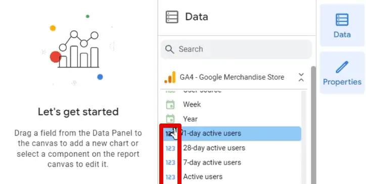
First, let’s focus on the data panel at the right.
Here is where you’ll find the available data sources in your report.

Here, we have two data sources. The first uses Google Analytics 4, and the latter uses Universal Analytics data.
If you click on one of your sources, you’ll find a list of all the data available in your data source.

What are dimensions and metrics, and how do you differentiate the two?
Let’s start with the dimensions. Dimensions, simply put, are attributes of your data. They are usually texts or any other representation that aren’t numbers. The dimensions you add to a chart determine how to group the data in that chart.
For example, we have the Age dimension with the ABC icon.

This icon represents a text data type. There are other data types for dimensions, and they all have green icons.
We can also have regional data like cities or countries. These have a globe icon.

Another data type is dates with the calendar icon.

Metrics, on the other hand, are numerical values that you can do calculations with. They measure the data in dimensions and have 123 icons in blue.
To use these data to build your charts, you need to send them to the properties panel.
Adding Fields to Your Looker Studio Charts
Click on your chart to open the properties panel at the left of the data panel.

The properties panel has two sections: Setup and Style. We’ll focus on setup for now.
Here we can change the data source by clicking on it, opening a list of the added data sources to our report, and other available data sources.

Alternatively, you can edit the data source by clicking on the pencil icon beside the data source.
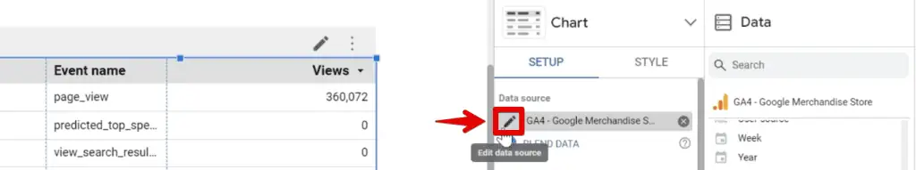
Next, we can see the Event name dimension and Views metric added to our chart.

To simulate adding fields to the chart for the first time, we’ll remove the event name dimension by clicking on ✖.

There are multiple ways to add fields to a chart.
First, go to the data panel and search for the field you want to add. For this example, let’s search Event name. Next, click and drag the event name dimension to the Dimensions section in the properties panel.

You can also add a dimension without leaving the properties panel by clicking Add Dimension.

Similarly, clicking this will open a list of available dimensions. Let’s select Age.

If you want to replace any field, click on it to show a similar drop-down list, then select the one you want to add.
Another method is dragging a dimension on top of the one you want to replace.

All methods discussed above also apply to metrics.
Let’s now look at the charts available in Looker Studio and in which context you should use them.
Table Charts and Scorecards
The first chart type we have is the table chart. This chart is what we used to demonstrate how to add fields and is the default chart that populates our report.
To add a new table chart, go to Add a chart, then select one of the available table charts.

Tabe charts are basic charts that arrange data into rows and columns. They are used to present numerical data that is difficult to show visually.
Next, we have Scorecards.

Scorecards give you a snapshot of your data and can be used to display key performance indicators.

There are two types of scorecards, one that shows the entire figure (like the one above), and the other has compact numbers.
To better illustrate their difference, create a copy of the chart, then click the drop-down arrow beside the chart header of the properties panel.

Next, select Scorecard with Compact Numbers. Notice the difference between the two scorecard types.

Looker Studio also allows you to add comparisons to your scorecards. You can look at your data for a specific period and compare it to the previous period.
For this, start by adding a date range control.

Select one week’s worth of data from May 1 to May 7. Notice the number of views in the scorecard drop.

Next, select the scorecard and scroll to the Comparison date range section of the properties panel.

Click None to see other options for the comparison date range.

Select Previous Period.

This selection calculates how long the current period selection is and obtains the metric value for the same period before the current period. For example, if we selected four days, the comparison date range would be the four days before.
Back to our demonstration, the start and end dates are automatically selected for April 24 and April 30, respectively. Click Apply.

💡 Top Tip: If you require more specific date range filters, check out our guide on Using the Advanced Date Filters in Looker Studio. Here, we discuss multiple features, like the rolling time frame with static and dynamic dates and advanced date selection.
Adding a comparison date range to scorecards will show the percent difference between the selected comparison date range and the current period.

Here, we can readily see the views decreased by 13.6% compared to the previous week.
💡 Top Tip: If you will use custom dates in the comparison date range, learn How to Add Tooltip Annotations to Your Looker Studio Reports. These allow you to provide additional information for a small footprint.
Next, let’s look at time series charts.
Time Series Charts
Time series charts display how data trends over time.
Select any one of the available time series charts.

Insert the chart into the report. Set the date range for the Last 30 days, then click Apply.

We now have an idea of how our views trend over time.

At this point, you might wonder: are time series and line charts the same? Essentially, they show how data fluctuates or changes using lines but differ in some aspects. Think of them as being more similar than different.
Let’s quickly discuss the differences between time series and line charts.
- You can only use the Date or Date & Time dimension on the X-axis for time series charts. You can use any dimension type for the X-axis in a Line chart.
- When using Date or Date & Time dimensions in a line chart, gaps will display if those fields are missing data for the selected date range. A time series chart will provide continuous dates on the X-axis. You also have options on how to handle missing data.
- Time series charts can display trendlines, while line charts can’t.
Both charts help identify trends and patterns. Use time series charts for dates and line charts for other categorical dimensions.
You can also detect anomalies by looking at spikes or dips in your data.
For example, we can see a sharp decrease in views from May 5 to 6.

Noticing this pattern allows us to determine if an investigation is needed to check what caused this anomaly in our data.
There are other types of time series charts: sparklines and smooth lines.
Sparklines are great for showing a quick snapshot of your data. You usually add them along with scorecards as a supplement.

We could insert sparklines by going to the toolbar again, but we’ll show you another trick to do this. What we can do is change the style of one chart to another.
Duplicate the scorecard and remove the comparison date range by selecting None. Next, click the drop-down arrow beside the chart header of the properties panel.

Switch the style of the scorecard to a Sparkline Chart. Notice the change to our chart.

Now, let’s look at bar charts.
Bar and Column Charts
Bar charts compare data across categories.
There are two main types of bar charts: column charts – the bars are displayed vertically, and bar charts – the bars are displayed horizontally.

Generally, selecting which type to use depends on personal preference. Though for specific size/space requirements, one type may be better. For example, a column chart is better if your chart should have a larger width than the height.
Let’s insert a bar chart. Again, bar charts work well with categorical data, so let’s use the Country dimension.

Now, we can see our top countries by views.
We can make our bar charts more interactive by enabling the Cross-filtering option in the chart interactions section of the properties panel. Next, click View.

From the name, cross-filtering allows users to filter other charts in the report using elements in the bar chart.
For example, selecting India will filter the scorecard, time series, and sparkline charts.

Another way to look at the distribution of categorical data across time is to use column charts.
Here, we want to know how views trend over time for our different device categories. Insert a column chart into the report. Add the Device Category dimension to the breakdown dimension section.

We have different device categories: desktop, mobile, tablet, smart tv, and others. Each is assigned a different color, making it easy to differentiate one from the other.
If you’re only interested in looking at data for specific device categories, inserting a filter helps narrow your data.
Insert a filter control and use the Device Category dimension as the control field.

Let’s say we’re interested in only looking at data for desktop and mobile. Select these categories in our filter control. Notice the columns reduce to only show desktop and mobile data.

Next, let’s move to pie charts.
Pie and Geo Charts
Pie charts are popular for conveying proportions and percentages.
If you have several categories for your data, then pie charts are a great visualization option for displaying them. Compared to bar charts, we’re not interested in how they trend over time or identifying patterns, just the proportions.
There are two types of pie charts you can use: pie and donut charts.

Insert a pie chart into the report.

Here, we can see the proportion of views by device category. Since we filtered the report earlier, we can only see desktop and mobile data.
Next, let’s talk about geo charts. Geo charts display data on a map, showing how data varies geographically.
There are multiple geo chart types: bubble maps, filled maps, heat maps, line maps, and geo charts.

Let’s insert a geo chart into the report.

Here, you can see visually how many views each country brings based on the color contrast. We can see that the United States is the highest, as indicated by the dark blue color.
Other Chart Types
There are many more chart types available in Looker Studio. We will no longer go in-depth on each one but will briefly describe each.
The remaining chart types include Area, Scatter, Pivot Table, Bullet, Treemap, Sankey, and Gauge charts.

Area charts are similar to line charts but are less common. They also show how data trends over time but fill the region below the line, which helps users better understand the quantities of your data.
Next, scatter charts help users understand the relationship between two dimensions. Pivot tables are similar to the table chart, but here, you can add dimensions/metrics for the rows.
Bullet and gauge charts quickly show how well a given metric performs against target benchmarks. Treemaps show your data organized into dimension hierarchies. Lastly, Sankey charts display a flow from one set of values to another.
Summary
Great! We now know the different Looker Studio charts, how to insert them into our report, and which chart to use in showcasing your data.
Do you feel limited by the default chart types in Looker Studio? Check out these Looker Studio Community Visualizations!
Check out the third part of this 3 part series which explains how to customize Looker Studio Reports.
Which chart type is a must in your reports? Are there other charts you want us to highlight? Let us know in the comments below!
Subscribe & Master the Basics with our FREE Looker Studio Course


")